更新记录
1.0.4(2024-02-19)
1.0.3(2024-02-19)
1.0.2(2024-02-19)
查看更多
平台兼容性
| App |
快应用 |
微信小程序 |
支付宝小程序 |
百度小程序 |
字节小程序 |
QQ小程序 |
| HBuilderX 3.7.0,Android:11.0,iOS:不确定 |
× |
× |
× |
× |
× |
× |
| 钉钉小程序 |
快手小程序 |
飞书小程序 |
京东小程序 |
| × |
× |
× |
× |
| H5-Safari |
Android Browser |
微信浏览器(Android) |
QQ浏览器(Android) |
Chrome |
IE |
Edge |
Firefox |
PC-Safari |
| × |
× |
× |
× |
× |
× |
× |
× |
× |
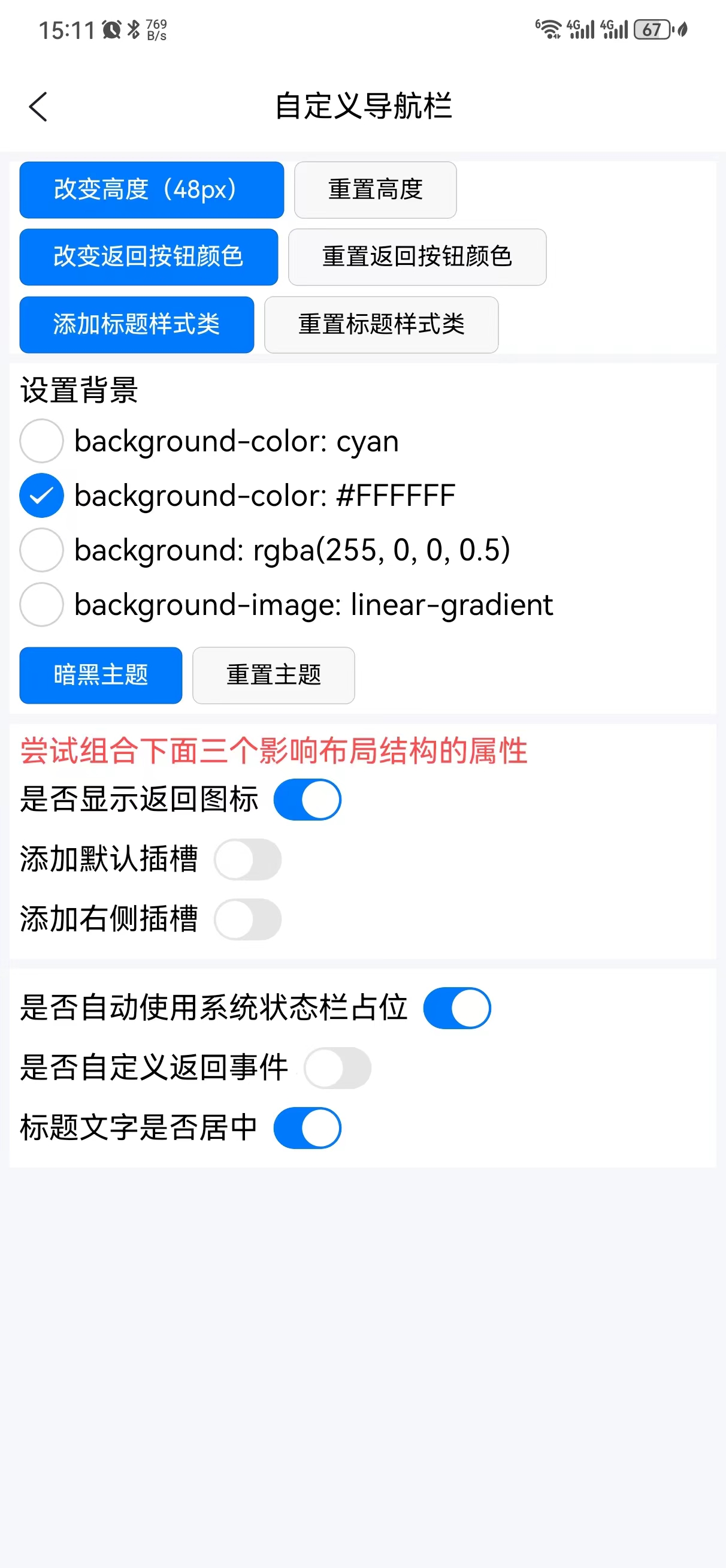
导航栏
组件关系
- 依赖组件
dep-status-bar
- 依赖组件
dep-icons
快速使用
<!-- 常规用法 -->
<dep-navigation-bar title-text="标题"></dep-navigation-bar>

<!-- 自定义高度 -->
<dep-navigation-bar title-text="自定义高度" :height="100"></dep-navigation-bar>
<dep-navigation-bar title-text="取消系统状态栏占位高度" :status-bar="false"></dep-navigation-bar>

<!-- 自定义背景颜色 -->
<dep-navigation-bar title-text="自定义背景颜色" background="cyan"></dep-navigation-bar>
<dep-navigation-bar title-text="自定义背景颜色" background="#007AFF"></dep-navigation-bar>

<!-- 自定义渐变色背景 linear-gradient(<direction>, <color-start>, <color-stop>) -->
<dep-navigation-bar title-text="自定义渐变背景" background="linear-gradient(to right, cyan, yellow)"></dep-navigation-bar>

<!-- 添加标题样式类 -->
<dep-navigation-bar title-text="自定义返回图标颜色" back-icon-color="#ff0000"></dep-navigation-bar>
<dep-navigation-bar title-text="自定义标题样式" title-classes="color-primary font-20"></dep-navigation-bar>

<!-- 暗黑主题配置 -->
<dep-navigation-bar title-text="自定义主题色彩-暗黑模式" background="#000000" back-icon-color="#ffffff" title-classes="color-white"></dep-navigation-bar>

<!-- 返回按钮或事件 -->
<dep-navigation-bar title-text="移除返回按钮" :back-icon="false"></dep-navigation-bar>
<dep-navigation-bar title-text="自定义返回事件" :back-event="true" @backclick="onCustomBack"></dep-navigation-bar>

<!-- 右侧插槽 -->
<dep-navigation-bar title-text="右侧插槽" :rightIcon="100">
    <template v-slot:right>
        <view class="flex-1 flex-row justify-center">
            <dep-icons type="copy" :size="24"></dep-icons>
        </view>
    </template>
</dep-navigation-bar>

<!-- 默认插槽 -->
<dep-navigation-bar :rightIcon="100">
    <template v-slot:default>
        <view class="bg-light px-24 py-12 radius-40">
            <input class="input" type="text" placeholder="请输入" placeholder-class="placeholder" />
        </view>
    </template>
</dep-navigation-bar>

<!-- 混合插槽 -->
<dep-navigation-bar :rightIcon="100">
    <template v-slot:default>
        <view class="bg-light px-24 py-12 radius-40">
            <input class="input" type="text" placeholder="请输入" placeholder-class="placeholder" />
        </view>
    </template>
    <template v-slot:right>
        <view class="flex-1 flex-row justify-center">
            <dep-icons type="copy" :size="24"></dep-icons>
        </view>
    </template>
</dep-navigation-bar>
属性
| 名称 |
类型 |
默认值 |
描述 |
备注 |
| background |
string |
transparent |
背景颜色 ,支持渐变 |
|
| backIcon |
boolean |
true |
是否显示返回按钮 |
|
| backIconColor |
string |
- |
返回按钮颜色 |
|
| backEvent |
boolean |
false |
是否自定义返回事件 |
默认返回上级页面 |
| height |
number |
48 |
导航栏高度,单位px,不含状态栏 |
|
| titleText |
string |
- |
标题文字 |
标题为空时可自定义默认插槽内容 |
| titleClasses |
string |
- |
标题自定义样式类 |
外部定义并拼接成字符 |
| titleCenter |
boolean |
true |
是否标题居中 |
|
| rightIcon |
number |
0 |
右侧插槽(通常为按钮) |
值大于0时开启右侧插槽 |
| statusBar |
boolean |
true |
是否包含状态栏占位空间 |
|
| dark |
boolean |
false |
暗黑模式 |
|
方法
-
设置组件背景 setElementBackground(propertyStyle : string) : void {}
<dep-navigation-bar ref="navigation-bar" :background="background"></dep-navigation-bar>
const element = this.$refs['navigation-bar']! as ComponentPublicInstance
this.background = 'rgba(0,0,0,1)'
element.$callMethod('setElementBackground', this.background)
-
设置组件样式 setElementStyle(propertyName : string, propertyStyle : any) : void {}
<dep-navigation-bar ref="navigation-bar" background="cyan"></dep-navigation-bar>
const element = this.$refs['navigation-bar']! as ComponentPublicInstance
// 设置背景
element.$callMethod('setElementStyle', 'background-image', e.detail.value)
// 设置高度
const height : int = (Math.random() * 100).toInt()
element.$callMethod('setElementStyle', 'height', height)
变量
语雀文档


 收藏人数:
收藏人数:
 赞赏(0)
赞赏(0)
 下载 9
下载 9
 赞赏 0
赞赏 0

 下载 7766376
 赞赏 920


 赞赏
赞赏
 京公网安备:11010802035340号