


 收藏人数:
收藏人数:
 下载插件并导入HBuilderX
 下载插件ZIP
 赞赏(0)
赞赏(0)
更新记录
1.0.1(2024-05-08)
支持tabItem插槽自定义内容
1.0.0(2024-05-08)
初始发布
平台兼容性
| Vue2 | Vue3 |
|---|---|
| × | √ |
| App | 快应用 | 微信小程序 | 支付宝小程序 | 百度小程序 | 字节小程序 | QQ小程序 |
|---|---|---|---|---|---|---|
| HBuilderX 3.1.0 app-vue | × | × | × | × | × | × |
| 钉钉小程序 | 快手小程序 | 飞书小程序 | 京东小程序 |
|---|---|---|---|
| × | × | × | × |
| H5-Safari | Android Browser | 微信浏览器(Android) | QQ浏览器(Android) | Chrome | IE | Edge | Firefox | PC-Safari |
|---|---|---|---|---|---|---|---|---|
| × | × | × | × | × | × | × | × | × |
HR Tabs 组件文档
hr-tabs是一个灵活的 Vue 组件,用于创建水平或垂直的标签页导航。该组件支持可滚动的标签列表和自定义标签宽度,允许开发者自定义样式和行为。
安装
点击这里下载安装
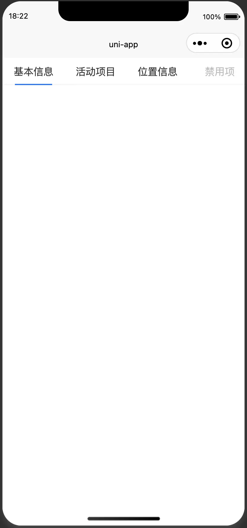
基本用法
<template>
  <view class="content">
    <view class="tab-wrap">
      <hr-tabs
        tabPosition="left"
        :line-width="60"
        :items="mainTabList"
        v-model="current"
        @change="handleMainTabsChange"
      />
    </view>
  </view>
</template>

<script>
export default {
  data() {
    return {
      current: 0,
      mainTabList: [
        {
          id: "base",
          label: "基本信息",
        },
        {
          id: "activity",
          label: "活动项目",
        },
        {
          id: "location",
          label: "位置信息",
        },
        {
          id: "base1",
          label: "禁用项",
          disabled: true,
        },
        {
          id: "activity1",
          label: "活动项目",
        },
        {
          id: "location1",
          label: "位置信息",
        },
        {
          id: "base2",
          label: "基本信息",
        },
        {
          id: "activity2",
          label: "活动项目",
        },
        {
          id: "location2",
          label: "位置信息",
        },
      ],
    };
  },
  methods: {
    handleMainTabsChange({ index }) {
      this.current = index;
    },
  },
};
</script>

<style>
.content {
  width: 100%;
  height: 100%;
}
.tab-wrap {
  width: 100%;
  height: 200px;
}
</style>
API
hr-tabs组件支持以下 props(属性):
| 参数 | 类型 | 默认值 | 描述 |
|---|---|---|---|
modelValue |
Number | 0 | 当前选中的标签索引。 |
items |
Array | [] | TabItemType |
tabItemWidth |
Number | 100 | 每个标签的宽度。 |
tabItemHeight |
Number | 44 | 每个标签的高度。 |
tabPosition |
String | 'top' | 标签位置,可为top、bottom、left或right。 |
indicatorMainSize |
String, Number | 60 | 滑块长度。 |
indicatorThickness |
Number | 2 | 滑块厚度。 |
indicatorColor |
String | '#007aff' | 滑块颜色。 |
indicatorBackgroundColor |
String | '#f8f8f8' | 滑块背景颜色。 |
TabItemType 组件用于定义单个选项卡的属性。以下表格详细列出了其所有可用的属性。
属性
| 参数 | 说明 | 类型 | 默认值 | 版本 |
|---|---|---|---|---|
disabled |
禁用某一项。 | boolean | false |
|
key |
对应 activeKey。 |
string | - | |
label |
选项卡头显示文字。 | ReactNode | - |
使用说明
每个 TabItemType 定义了一个选项卡的所有必要信息。通过设置这些属性,你可以控制选项卡的行为和外观,例如禁用选项卡,自定义关闭图标,以及控制选项卡内容的渲染与销毁。
事件
| 事件名 | 描述 | 参数 |
|---|---|---|
click |
当一个标签被点击时触发。 | { item, index } - 被点击的标签信息。 |
update:modelValue |
当当前激活的标签变更时触发,用于支持v-model双向绑定。 |
index - 新的激活标签索引。 |
Slots
| 名称 | 说明 |
|---|---|
tab-item |
用于自定义每个标签内容的插槽。传入item和index。 |
插槽使用示例【使用了 uni-icons,请检查是否安装】
<
<template>
  <view class="content">
    <view class="tab-wrap">
      <hr-tabs
        tabPosition="top"
        :line-width="60"
        :items="mainTabList"
        v-model="current"
        @change="handleMainTabsChange"
      >
        <template v-slot:tab-item="{ item }">
          <!-- 完全自定义的标签项 -->
          <view class="custom-tab-item">
            <uni-icons :type="item.icon" size="30"></uni-icons>
            <text>{{ item.label }}</text>
          </view>
        </template>
      </hr-tabs>
    </view>
  </view>
</template>

<script>
export default {
  data() {
    return {
      current: 0,
      mainTabList: [
        {
          id: "base",
          label: "基本信息",
          icon: "contact",
        },
        {
          id: "activity",
          label: "活动项目",
          icon: "contact",
        },
        {
          id: "location",
          label: "位置信息",
          icon: "contact",
        },
        {
          id: "base1",
          label: "禁用项",
          disabled: true,
          icon: "camera",
        },
        {
          id: "activity1",
          label: "活动项目",
          icon: "chatboxes",
        },
        {
          id: "location1",
          label: "位置信息",
          icon: "cloud-download",
        },
        {
          id: "base2",
          label: "基本信息",
          icon: "gift",
        },
        {
          id: "activity2",
          label: "活动项目",
          icon: "mic",
        },
        {
          id: "location2",
          label: "位置信息",
          icon: "phone",
        },
      ],
    };
  },
  methods: {
    handleMainTabsChange({ index }) {
      this.current = index;
    },
  },
};
</script>

<style>
.content {
  width: 100%;
  height: 100%;
}
.tab-wrap {
  width: 100%;
  height: 200px;
}
.custom-tab-item {
  width: 100px;
  height: 100px;
  display: flex;
  flex-flow: column nowrap;
  justify-content: center;
  align-items: center;
}
</style>
样式
使用hidden-scroll-style类来隐藏滚动条,保持滚动功能
。 若要自定义标签和其他元素的样式,请使用标准 CSS 或 SCSS。


 下载 160
 赞赏 1
赞赏 1

 下载 7890307
 赞赏 954


 赞赏
赞赏
 京公网安备:11010802035340号