

 收藏人数:
收藏人数:
 下载插件并导入HBuilderX
 下载插件ZIP
 赞赏(0)
赞赏(0)
更新记录
1.4.0(2020-07-20)
- 修复显示问题
- 颜色没遇到呢
- 一些机型我没法测试,抱歉哈。
1.3.5(2019-11-14)
- 取消custom插槽,更新示例
- 补充canvas绘制圈、仪表盘组件
1.3(2019-06-22)
最近好多问题都是颜色不显示还有改不了的问题,但是我自己测试过了都没问题。 [+] 加入custom属性,支持自定义格式插槽
查看更多平台兼容性
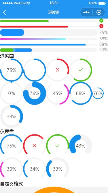
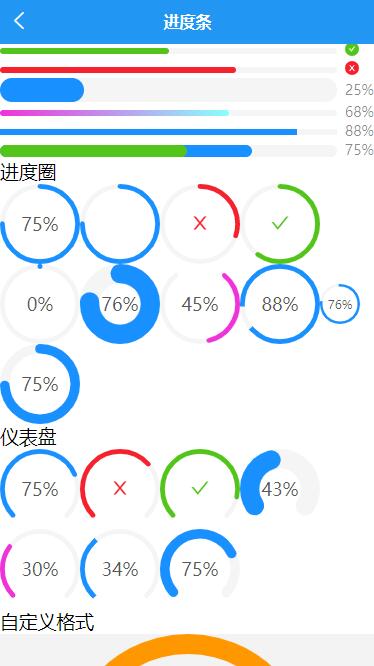
Progress 进度条
进度条组件,组件名:cmd-progress,代码块: cmdProgress。
介绍
- 非H5端使用image/svg+xml背景方式,H5端正常使用svg。
- 非H5端可能不显示,请改用canvas绘制的进度圈
- 运行测试过
H5、APP、MP-WEIXIN三个端的,其他机型没测。 - 更多需求功能图表实现,请使用 uCharts高性能跨全端图表
使用方式:
在 script 中引用组件
import cmdProgress from "@/components/cmd-progress/cmd-progress.vue"
export default {
    components: {cmdProgress}
}
用法:
<view class="">进度条</view>
<cmd-progress :percent="30"></cmd-progress>
<cmd-progress :percent="100"></cmd-progress>
<cmd-progress :percent="16" :success-percent="10"></cmd-progress>
<cmd-progress :percent="0"></cmd-progress>
<cmd-progress :percent="50" :showInfo="false"></cmd-progress>
<cmd-progress :percent="80" status="active"></cmd-progress>
<cmd-progress :percent="50" status="success"></cmd-progress>
<cmd-progress :percent="70" status="exception"></cmd-progress>
<cmd-progress :percent="25" :stroke-width="24"></cmd-progress>
<cmd-progress :percent="68" stroke-color="linear-gradient(to right, #ef32d9, #89fffd)"></cmd-progress>
<cmd-progress :percent="88" stroke-shape="square"></cmd-progress>
<cmd-progress :percent="动态值" :success-percent="动态底值" :stroke-width="12" status="active"></cmd-progress>
<view>进度圈</view>
<cmd-progress type="circle" :percent="75"></cmd-progress>
<cmd-progress type="circle" :percent="75" :showInfo="false"></cmd-progress>
<cmd-progress type="circle" :percent="30" status="exception"></cmd-progress>
<cmd-progress type="circle" :percent="60" status="success"></cmd-progress>
<cmd-progress type="circle" :percent="0"></cmd-progress>
<cmd-progress type="circle" :percent="76" :stroke-width="24"></cmd-progress>
<cmd-progress type="circle" :percent="45" :gapDegree="66" stroke-color="#ef32d9"></cmd-progress>
<cmd-progress type="circle" :percent="88" gap-position="left" stroke-shape="square"></cmd-progress>
<cmd-progress type="circle" :percent="76" :width="40" stroke-shape="square"></cmd-progress>
<cmd-progress type="circle" :percent="动态值" :stroke-width="12"></cmd-progress>
<view>仪表盘</view>
<cmd-progress type="dashboard" :percent="75"></cmd-progress>
<cmd-progress type="dashboard" :percent="68" status="exception"></cmd-progress>
<cmd-progress type="dashboard" :percent="88" status="success"></cmd-progress>
<cmd-progress type="dashboard" :percent="43" :stroke-width="24"></cmd-progress>
<cmd-progress type="dashboard" :percent="30" stroke-color="#ef32d9"></cmd-progress>
<cmd-progress type="dashboard" :percent="34" stroke-shape="square"></cmd-progress>
<cmd-progress type="dashboard" :percent="动态值" :stroke-width="12"></cmd-progress>
<view>自定义格式</view>
<view style="display: flex;justify-content: center;position: relative;background: #f3f3f3;">
  <cmd-progress type="dashboard" :percent="19.23 / 20 * 100" stroke-color="#ff9800" :stroke-width="8" :width="250" stroke-shape="square" :showInfo="false"></cmd-progress>
  <view style="position: absolute;text-align: center;top: 30%;">
    <view style="font-size:36rpx;">亲,流量告急</view>
    <view style="font-size:72rpx;font-weight: bold;">19.23</view>
    <view style="font-size:32rpx;">MB</view>
  </view>
</view>
<view style="display: flex;justify-content: center;position: relative;">
  <cmd-progress type="circle" :percent="3.33/ 20 * 100" stroke-color="#009688" :stroke-width="12" :width="250" :showInfo="false"></cmd-progress>
  <view style="position: absolute;text-align: center;top: 30%;">
    <view style="font-size:36rpx;">已使用/GB</view>
    <view style="font-size:72rpx;font-weight: bold;line-height: 1;padding-bottom: 28rpx;">3.33</view>
    <view style="font-size:32rpx;">总流量畅享</view>
  </view>
</view>
属性说明:
| 属性名 | 类型 | 默认值 | 说明 |
|---|---|---|---|
| type | String | line | 进度类型 - 线型:line、圆圈形:circle、仪表盘:dashboard |
| percent | Number | 0 | 进度百分比值 - 显示范围0-100 ,可能数比较大就需要自己转成百分比的值 |
| success-percent | Number | 0 | 进度已完成的百分几 - 仅支持进度线型:line |
| status | String | normal | 进度状态 - 涌动:active(仅支持线型:line)、正常:normal、完成:success、失败:exception |
| show-info | Boolean | true | 进度状态信息 - 是否显示进度数值或状态图标 |
| stroke-width | Number | 6 | 进度线条的宽度 - 建议在条线的宽度范围:1-50,与进度条显示宽度有关 |
| stroke-color | String | - | 进度线条的颜色 - 渐变色仅支持线型:line |
| stroke-shape | String | round | 进度线条两端的形状 - 圆:round、方块直角:square |
| width | Number | 80 | 进度画布宽度 - 仅支持圆圈形:circle、仪表盘:dashboard |
| gap-degree | Number | 0 | 进度圆形缺口角度 - 可取值 0 ~ 360,仅支持圆圈形:circle、仪表盘:dashboard |
| gap-position | String | top | 进度圆形缺口位置 - 可取值'top', 'bottom', 'left', 'right',仅支持圆圈形:circle、仪表盘:dashboard |


 下载 12319
 赞赏 2
赞赏 2

 下载 7747147
 赞赏 916


 赞赏
赞赏
 京公网安备:11010802035340号