更新记录
1.0.5(2024-09-14)
下载此版本
更新说明
1.0.4(2023-12-08)
下载此版本
增加弹层宽度可配置
1.0.3(2023-12-08)
下载此版本
更新使用事件说明
查看更多
平台兼容性
uni-app
| Vue2 |
Vue3 |
Chrome |
Safari |
app-vue |
app-nvue |
Android |
iOS |
鸿蒙 |
| √ |
√ |
√ |
- |
× |
× |
- |
- |
- |
| 微信小程序 |
支付宝小程序 |
抖音小程序 |
百度小程序 |
快手小程序 |
京东小程序 |
鸿蒙元服务 |
QQ小程序 |
飞书小程序 |
小红书小程序 |
快应用-华为 |
快应用-联盟 |
| √ |
- |
- |
- |
- |
- |
- |
- |
- |
- |
× |
× |
其他
next-modal --modal弹层
遇到问题或有建议可以加入***(455948571)反馈
如果觉得组件不错,给五星鼓励鼓励咯!
如果有使用问题请加群
注意:如果插件问题,请务必给一个完整的复现demo,谢谢配合;
点击链接加入群聊前端开发(uniapp插件)】
预览
| 功能预览 |
 |
使用
从uniapp插件市场导入
vue3 使用实例
<template>
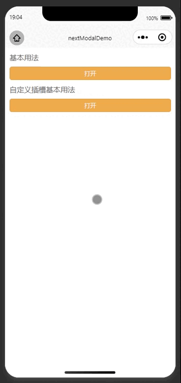
<view style="font-size: 16px;color: #666;padding: 10px"><text>基本用法</text></view>
<button size="mini" class="btn" @click="modalBasicShow=true">打开</button>
<view style="font-size: 16px;color: #666;padding: 10px"><text>自定义插槽基本用法</text></view>
<button size="mini" class="btn" @click="opencustom">打开</button>
<next-modal
:show="modalBasicShow"
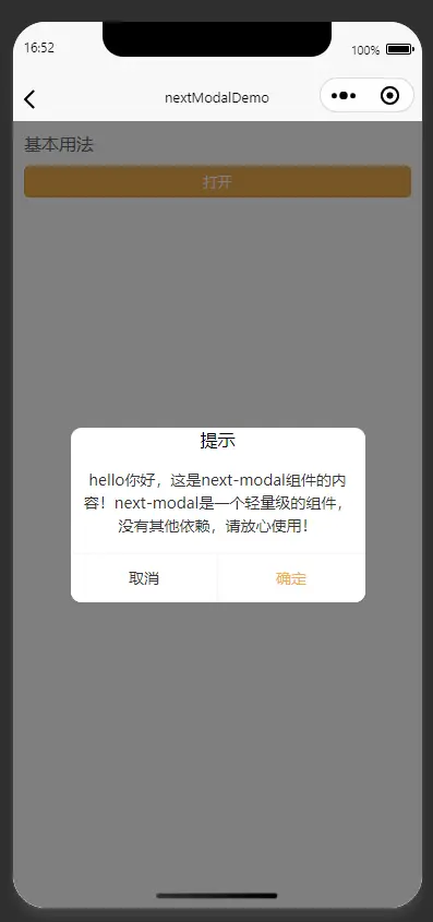
content="感谢你使用next-modal组件"
title="提示"
@close="modalBasicShow=false"
@cancel="modalBasicShow=false"
@confirm="modalBasicShow=false"
/>
<next-modal
@close="close"
@cancel="cancel"
@confirm="confirm"
:show="modalCustomShow"
:title="modalTitle"
:content="modalContent"
>
<!--注意插槽的使用的优先级大于next-modal组件的props的值-->
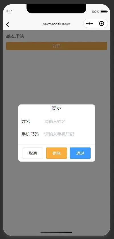
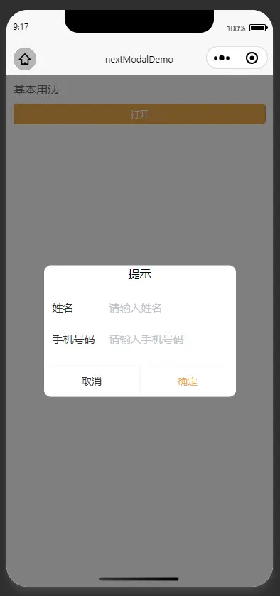
<template #title><view style="text-align: center;padding:20rpx"><text>自定义标题-提示</text></view></template>
<!-- <template #content><view style="text-align: center;"><text>hello你好,这是next-modal组件的内容!next-modal是一个轻量级的组件,没有其他依赖,请放心使用!</text></view></template> -->
<!--自定义content内容-->
<template #content>
<u--form
labelPosition="left"
:model="userInfo"
ref="form1"
labelWidth="80"
>
<u-form-item
label="姓名"
prop="name"
:borderBottom="false"
>
<u--input
v-model="userInfo.name"
border="none"
placeholder="请输入姓名"
></u--input>
</u-form-item>
<u-form-item
label="手机号码"
prop="phone"
:borderBottom="false"
>
<u--input
v-model="userInfo.phone"
border="none"
placeholder="请输入手机号码"
></u--input>
</u-form-item>
</u--form>
</template>
<!--自定义footer内容-->
<template #footer>
<view style="display: flex;padding: 20rpx;justify-content: space-around;width:100%">
<u-button @click="modalCustomShow=false" :customStyle="{margin: '0 10rpx'}">取消</u-button>
<u-button @click="reject" :customStyle="{margin: '0 10rpx'}" type="warning">拒绝</u-button>
<u-button @click="allow" :customStyle="{margin: '0 10rpx'}" type="primary">通过</u-button>
</view>
</template>
</next-modal>
</template>
<script lang="ts">
import { ref } from 'vue'

export default {
    setup() {
        const modalCustomShow = ref(false)
        const modalBasicShow = ref(false)
        const modalTitle = ref('提示')
        const modalContent = ref('hello你好,这是next-modal组件的内容!')
        const userInfo = ref({})
        function openbasic() {

        }
        function opencustom() {
            modalCustomShow.value = true
        }
        function close() {
            modalCustomShow.value = false
        }
        function cancel() {
            modalCustomShow.value = false
        }
        function confirm() {
            modalCustomShow.value = false
        }
        function reject() {
            uni.showModal({
                title: '确定要进行拒绝操作',
                success: (res) => {
                    if (res.confirm) {
                        modalCustomShow.value = false
                    }
                }
            })
        }
        function allow() {
            uni.showModal({
                title: '确定要进行通过操作',
                success: (res) => {
                    if (res.confirm) {
                        modalCustomShow.value = false
                    }
                }
            })
        }
        return {
            userInfo,
            modalCustomShow,
            openbasic,
            opencustom,
            modalBasicShow,
            modalTitle,
            modalContent,
            close,
            cancel,
            confirm,
            reject,
            allow
        }
    }
}
</script>
<style lang="scss">
.btn {
    box-sizing: border-box;
    flex: 1;
    margin: 0 20rpx;
    background-color: #f0ad4e;
    color:#fff;
}

</style>
vue2 使用实例
<template>
    <view style="font-size: 16px;color: #666;padding: 10px"><text>基本用法</text></view>
    <button size="mini" class="btn" @click="modalBasicShow=true">打开</button>
    <view style="font-size: 16px;color: #666;padding: 10px"><text>自定义插槽基本用法</text></view>
    <button size="mini" class="btn" @click="opencustom">打开</button>
    <next-modal
        :show="modalBasicShow"
        content="感谢你使用next-modal组件"
        title="提示"
        @close="modalBasicShow=false"
        @cancel="modalBasicShow=false"
        @confirm="modalBasicShow=false"
    />
    <next-modal
        @close="close"
        @cancel="cancel"
        @confirm="confirm"
        :show="modalCustomShow"
        :title="modalTitle"
        :content="modalContent"
    >
        <!--注意插槽的使用的优先级大于next-modal组件的props的值-->
        <view slot="title"><view style="text-align: center;padding:20rpx"><text>自定义标题-提示</text></view></view>
        <!-- <template #content><view style="text-align: center;"><text>hello你好,这是next-modal组件的内容!next-modal是一个轻量级的组件,没有其他依赖,请放心使用!</text></view></template> -->
        <!--自定义content内容-->
        <view slot="content">
            <u--form
                    labelPosition="left"
                    :model="userInfo"
                    ref="form1"
                    labelWidth="80"
            >
                <u-form-item
                        label="姓名"
                        prop="name"
                        :borderBottom="false"
                >
                    <u--input
                        v-model="userInfo.name"
                        border="none"
                        placeholder="请输入姓名"

                    ></u--input>
                </u-form-item>
                <u-form-item
                        label="手机号码"
                        prop="phone"
                        :borderBottom="false"
                >
                    <u--input
                        v-model="userInfo.phone"
                        border="none"
                        placeholder="请输入手机号码"
                    ></u--input>
                </u-form-item>
            </u--form>
        </view>
        <!--自定义footer内容-->
        <view slot="footer">
            <view style="display: flex;padding: 20rpx;justify-content: space-around;width:100%">
                <u-button @click="modalCustomShow=false" :customStyle="{margin: '0 10rpx'}">取消</u-button>
                <u-button @click="reject" :customStyle="{margin: '0 10rpx'}" type="warning">拒绝</u-button>
                <u-button @click="allow" :customStyle="{margin: '0 10rpx'}" type="primary">通过</u-button>
            </view>
        </view>
    </next-modal>
</template>
<script>

export default {
    data: () => {
        return {
            modalCustomShow: false,
            modalBasicShow: false,
            modalTitle: '提示',
            modalContent: 'hello你好,这是next-modal组件的内容!',
            userInfo: {}
        }
    },
    methods: {
        openbasic() {

        },
        opencustom() {
            this.modalCustomShow = true
        },
        close() {
            this.modalCustomShow = true
        },
        cancel() {
            this.modalCustomShow = true
        },
        confirm() {
            this.modalCustomShow = true
        },
        reject() {
            uni.showModal({
                title: '确定要进行拒绝操作',
                success: (res) => {
                    if (res.confirm) {
                        this.modalCustomShow = true
                    }
                }
            })
        },
        allow() {
            uni.showModal({
                title: '确定要进行通过操作',
                success: (res) => {
                    if (res.confirm) {
                        this.modalCustomShow = true
                    }
                }
            })
        }
    }
}
</script>
<style lang="scss">
.btn {
    box-sizing: border-box;
    flex: 1;
    margin: 0 20rpx;
    background-color: #f0ad4e;
    color:#fff;
}

</style>
参数
next-search-more Props
可选参数属性列表
| 参数名 |
说明 |
类型 |
是否必填 |
默认值 |
可选值 |
| title |
弹层标题 |
String |
否 |
'' |
- |
| content |
弹层内容 |
String |
否 |
'' |
- |
| align |
弹层内容的对齐方式 |
String |
否 |
left |
- |
| cancelText |
取消按钮的文字,默认为"取消" |
String |
否 |
取消 |
- |
| cancelColor |
取消按钮文字颜色 |
String |
否 |
#333333 |
- |
| confirmText |
确定按钮的文字,默认为"确定" |
String |
否 |
确定 |
- |
| confirmColor |
确认按钮文字颜色 |
String |
否 |
#f0ad4e |
- |
| showCancel |
是否显示取消按钮,默认为 true |
Boolean |
否 |
true |
false |
| show |
显示弹层 |
Boolean |
否 |
false |
true |
| autoClose |
点击遮罩是否自动关闭弹窗 |
Boolean |
否 |
true |
false |
| width |
弹层内容宽度(只支持字符串,必须要带单位) |
String |
否 |
- |
- |
Slot 插槽
| (注意: 插槽的优先级大于组件的props配置的值) |
名称 |
说明 |
参数 |
| title |
title插槽 |
无 |
| content |
content插槽 |
无 |
| footer |
footer插槽 |
无 |
| default |
default插槽 |
无 |
Event 事件
| 事件名 |
说明 |
类型 |
回调参数 |
| confirm |
确认的回调事件 |
emit |
- |
| cancel |
取消的回调事件 |
emit |
- |


 收藏人数:
收藏人数:
 下载插件并导入HBuilderX
 赞赏(5)
赞赏(5)
 下载 5495
 赞赏 54
赞赏 54

 下载 12288439
 赞赏 1922


 赞赏
赞赏


 京公网安备:11010802035340号