

 收藏人数:
收藏人数:
 下载插件并导入HBuilderX
 赞赏(0)
赞赏(0)
更新记录
1.0.2(2024-07-05) 下载此版本
修复圆环首尾有间隙的问题
1.0.1(2024-07-05) 下载此版本
修复文挡错误
1.0.0(2024-07-05) 下载此版本
新增
查看更多平台兼容性
uni-app
| Vue2 | Vue3 | Chrome | Safari | app-vue | app-nvue | Android | iOS | 鸿蒙 |
|---|---|---|---|---|---|---|---|---|
| √ | √ | √ | √ | - | - | - | - | - |
| 微信小程序 | 支付宝小程序 | 抖音小程序 | 百度小程序 | 快手小程序 | 京东小程序 | 鸿蒙元服务 | QQ小程序 | 飞书小程序 | 小红书小程序 | 快应用-华为 | 快应用-联盟 |
|---|---|---|---|---|---|---|---|---|---|---|---|
| √ | - | - | - | - | - | - | √ | - | - | - | - |
hbxw-circular-progress组件
介绍
一个高度可定制的圆环进度条组件
使用示例
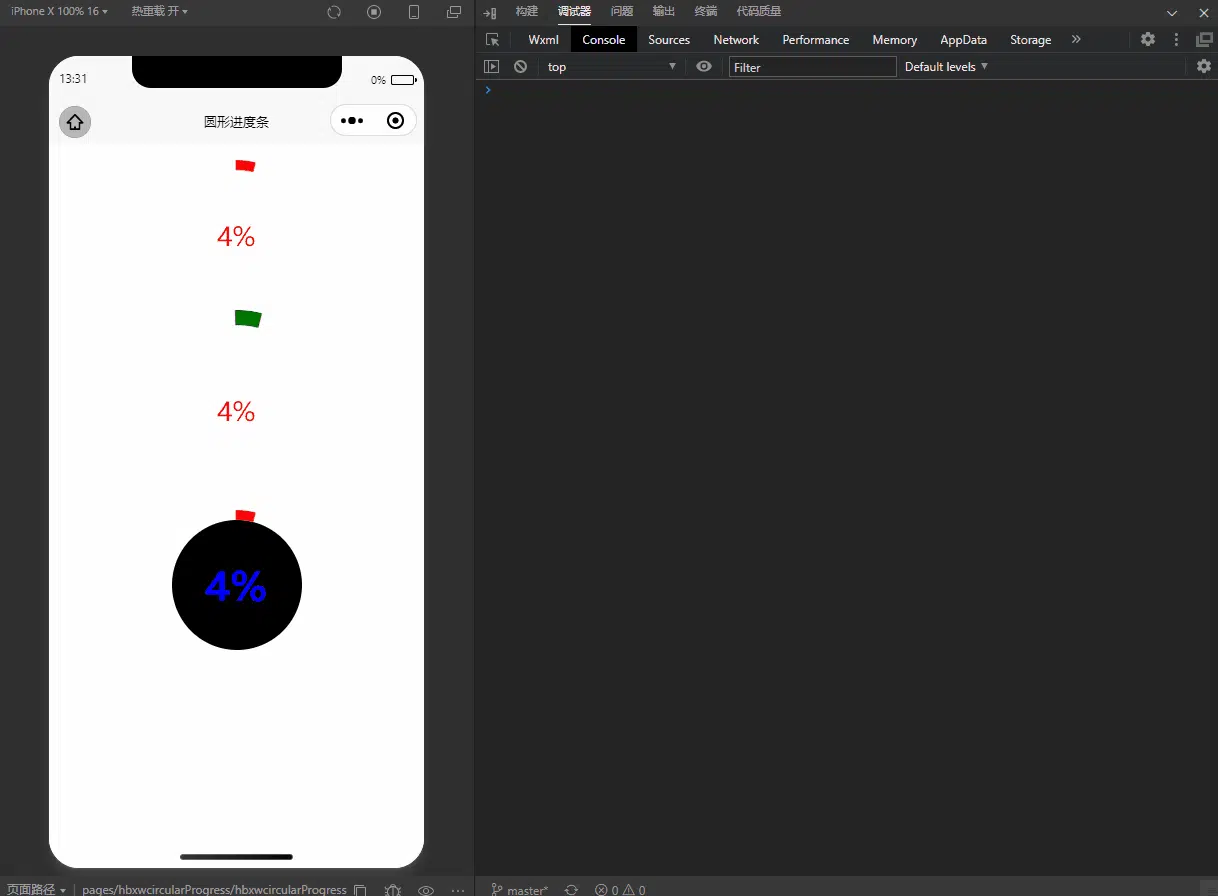
<template>
    <view class="test-container">
        <hbxw-circular-progress :value="progress" />
        <hbxw-circular-progress
            :value="progress"
            progressColor="green"
            progressWidth="30rpx"
            radius="200rpx"
        />
        <hbxw-circular-progress
            :value="progress"
             @click="progressClick"
            :textStyle="{fontSize: '40px',fontWeight: 'bold',color: blue,backgroundColor: '#000'}"
        />
    </view>
</template>

<script>
    export default {
        data() {
            return {
                progress: 0
            }
        },
        mounted() {
            setInterval(() => {
                if (this.progress === 100) {
                    this.progress = 0
                }
                this.progress += 1;
            }, 100)
        },
        methods: {
            progressClick(val) {
                console.log('---- progressClick ----:', val)
            }
        }
    }
</script>

<style>
.test-container{
    display: flex;
    flex-direction: column;
    align-items: center;
}
</style>
API
Props
| 属性名 | 类型 | 默认值 | 必填 | 说明 | |
|---|---|---|---|---|---|
| value | number | 0 | 是 | 进度条值0-100 | |
| radius | Number/String | 150 | 否 | 进度条长宽等于radius * 2 | |
| progressWidth | Number/String | 20 | 否 | 进度条条形宽度 | |
| progressColor | String | #ff0000 | 否 | 进度条条形颜色 | |
| textStyle | Object | {} | 否 | 进度条中间字体样式设置 |
Events
| 事件名 | 说明 | 返回值 |
|---|---|---|
| click | 进度条件点击触发事件 | 当前进度条值 |

 下载 9393
 赞赏 2
赞赏 2

 下载 12251509
 赞赏 1922


 赞赏
赞赏
 京公网安备:11010802035340号