


 收藏人数:
收藏人数:
 购买(
购买( 试用
试用
 使用 HBuilderX 导入示例项目
 赞赏(0)
赞赏(0)
更新记录
1.0.0(2023-12-06)
2023.12.04提交初测版本。
平台兼容性
| Android | Android CPU类型 | iOS |
|---|---|---|
| 适用版本区间:5.0 - 11.0 | armeabi-v7a:支持,arm64-v8a:未测试,x86:支持 | × |
原生插件通用使用流程:
- 购买插件,选择该插件绑定的项目。
- 在HBuilderX里找到项目,在manifest的app原生插件配置中勾选模块,如需要填写参数则参考插件作者的文档添加。
- 根据插件作者的提供的文档开发代码,在代码中引用插件,调用插件功能。
- 打包自定义基座,选择插件,得到自定义基座,然后运行时选择自定义基座,进行log输出测试。
- 开发完毕后正式云打包
付费原生插件目前不支持离线打包。
Android 离线打包原生插件另见文档 https://nativesupport.dcloud.net.cn/NativePlugin/offline_package/android
iOS 离线打包原生插件另见文档 https://nativesupport.dcloud.net.cn/NativePlugin/offline_package/ios
注意事项:使用HBuilderX2.7.14以下版本,如果同一插件且同一appid下购买并绑定了多个包名,提交云打包界面提示包名绑定不一致时,需要在HBuilderX项目中manifest.json->“App原生插件配置”->”云端插件“列表中删除该插件重新选择
0x01注意
在购买前请先点击试用。看是否符合自己的需求或者是否在APP能正常运行,作者在夜神模拟器和红米K20完美运行。不确保所有手机都能正常运行
0x02完整使用示例
<template>
<view class="content">
<image class="logo" src="/static/logo.png"></image>
<view class="text-area">
<text class="title">{{title}}</text>
</view>
<input v-model="type"/>
<input v-model="message"/>
<input v-model="time"/>
<button @click="button">button</button>
<div style="border: 1px solid black;height: 2px;"></div>
<input v-model="modal.title">
<input v-model="modal.message">
<button @click="button2">button2</button>
</view>
</template>
<script>
export default {
data() {
return {
title: 'Hello',
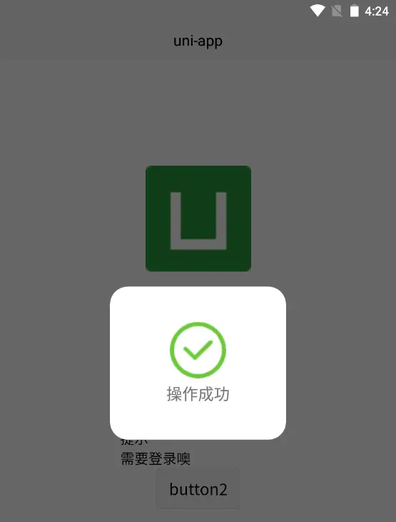
type:"success",
message:"操作成功",
time:1000,
modal:{
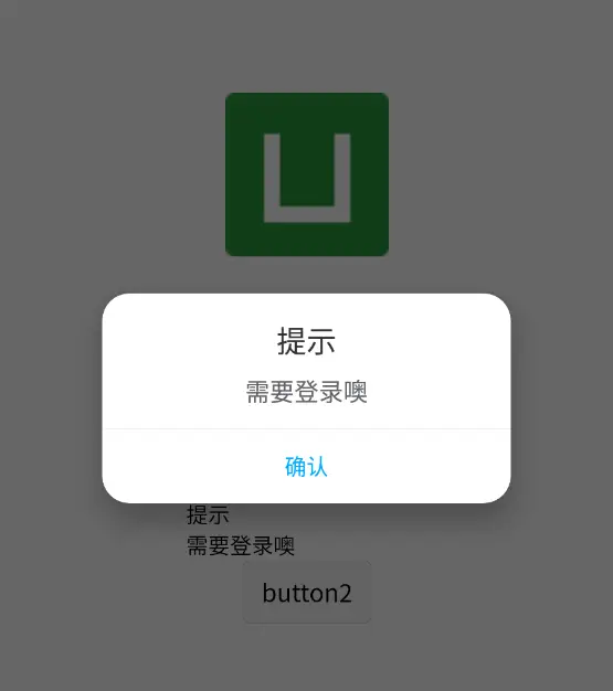
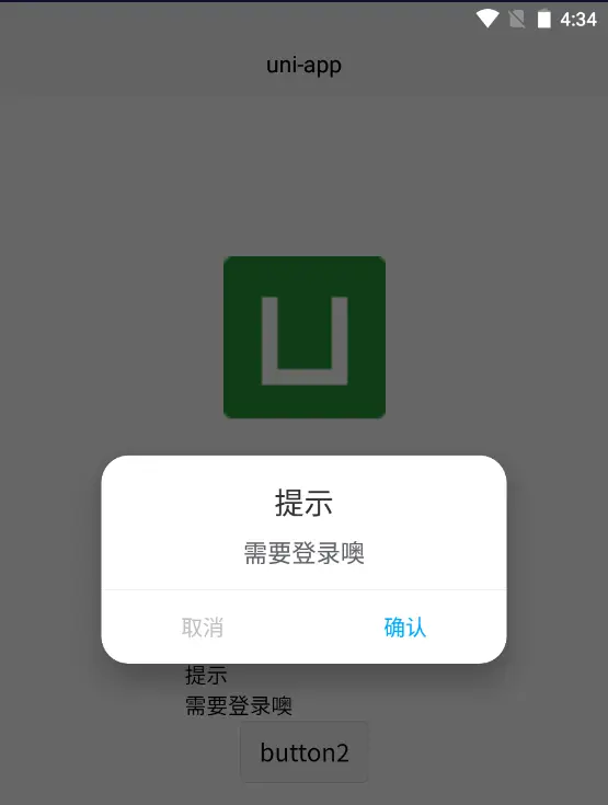
title:"提示",
message:"需要登录噢",
btn:[
{text:"取消",color:"#bfbfbf"},
{text:"确认",color:"#00aaff"}
],
back:false
}
}
},
onLoad() {
},
methods: {
button() {
const plugin=uni.requireNativePlugin('xfplugin-notice')
plugin.alert({type:this.type,message:this.message,time:this.time})
},
button2() {
const that=this
const plugin=uni.requireNativePlugin('xfplugin-notice')
console.log(that.modal)
plugin.modal(
that.modal,
(e)=>{
console.log(e)
}
)
}
}
}
</script>
<style>
.content {
display: flex;
flex-direction: column;
align-items: center;
justify-content: center;
}
.logo {
height: 200rpx;
width: 200rpx;
margin-top: 200rpx;
margin-bottom: 50rpx;
}
.text-area {
display: flex;
justify-content: center;
}
.title {
font-size: 36rpx;
color: #8f8f94;
}
</style>0x03属性
alert
type:类型【非自定义地址则必填】(内置success、error、warring、not四种状态)
message:消息(不建议使用超长字符)
time:多久消失,默认1秒
notBack:是否禁止返回键关闭,默认false
path:自定义图片链接,可以使用本地图片或者网络图片(网络图片可能由于网速原因,感觉效果不是很友好,建议本地图片地址)
注意,path需要使用
plus.io.convertLocalFileSystemURL转换地址,如const plugin=uni.requireNativePlugin('xfplugin_notice') const path=plus.io.convertLocalFileSystemURL("/static/logo.png") plugin.alert({type:this.type,message:this.message,time:this.time,path:path},res=>{console.log(res)})如果出现错误,回调函数会打印错误信息。
modal
title:标题
message:正文
btn[0]:取消按钮
btn[1]:确认按钮
btn[].text:按钮文字
btn[].color:按钮颜色,支持16进制(必须完整,不能缩写)
back:是否允许通过返回键取消
一个btn数组个数时,按钮居中显示,并且回调函数返回true,且传递的参数至少一个
modal
点击第一个返回false,点击第二个返回true,当按钮只存在一个时,返回false
0x04弹窗截图


0x05额外
alert图标处还有一个输入参数:whp
whp[提示框宽]
whp[提示框高]
whp[提示框四边padding]
0x06后续
看使用人数的多不多,是否需要适配黑暗模式,在评论区留下你的提示。如果有其他问题请留言。
 下载 1
下载 1
 赞赏 0
赞赏 0


 下载 8392


 赞赏 94
赞赏 94


 赞赏
赞赏
 京公网安备:11010802035340号