

 收藏人数:
收藏人数:
 下载插件并导入HBuilderX
 下载插件ZIP
 赞赏(0)
赞赏(0)
更新记录
1.0.2(2021-01-23)
新增梯度渐变效果; 剔除linear参数; 新增gradual参数为String类型; 默认值为空;选值linear,gradient
1.0.1(2020-12-26)
基于uviewUI修改的按钮增强插件
1.0.0(2020-12-26)
基于uviewUI修改增强的按钮插件
查看更多平台兼容性
说明
基于uView1.83修改,其他请自测;
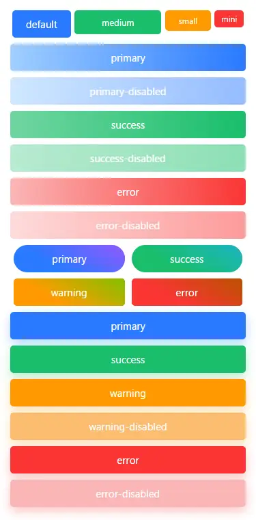
特性
- 尺寸增加small; 使用size="small";
- 按钮增加阴影,即添加shadow参数,值为Boolean, 默认false; (注:plain无效);
- 按钮增加渐变背景,即添加gradual参数,默认值为空, 可选值linear(渐变),gradient(渐变); (注:plain无效);
使用方法
请确保项目已引入uview UI > 1.8.X; 用法与官方基本一致; 可以单独引入使用,也可以直接替换文件代码:uview-ui/components/u-button
单独使用示例:
import xButton from '@/components/x-ubutton/x-ubutton.vue' //由于uview采用了easycom,改为x-
export default {
    components:{
        xButton
    }
}
<template>
    <x-button size="small">按钮</x-button>
    <x-button type="primary" gradual="linear">按钮</x-button>
    <x-button type="success" shadow>按钮</x-button>
</template>
替换代码示例:
<template>
    <u-button size="small">按钮</u-button>
    <u-button type="primary" gradual="linear">按钮</u-button>
    <u-button type="success" shadow>按钮</u-button>
</template>
鸣谢
- uview UI
- 如有侵权请联系删除
 下载 273
 赞赏 0
赞赏 0

 下载 7774509
 赞赏 921


 赞赏
赞赏
 京公网安备:11010802035340号