


 收藏人数:
收藏人数:
 下载插件并导入HBuilderX
 下载插件ZIP
 赞赏(0)
赞赏(0)
更新记录
1.0.5(2021-12-21)
隐藏提交按钮
1.0.4(2021-12-21)
增加了修改事件 可以自定义按钮 buttons
1.0.3(2021-12-08)
样式
查看更多平台兼容性
thirdlucky-data-view
DataView 数据驱动的视图
组件名:thirdlucky-data-view 代码块:
uDataView
本组件是基于table和property的封装。本组件要解决问题包括:
- 数据绑定型组件:给本组件绑定一个data,会自动渲染一组候选内容。再以往,开发者需要编写不少代码实现类似功能
注意事项 为了避免错误使用,给大家带来不好的开发体验,请在使用组件前仔细阅读下面的注意事项,可以帮你避免一些错误。
- 组件需要依赖
sass插件 ,请自行手动安装- 本组件为数据驱动,目的是快速投入使用,只可通过 style 覆盖有限样式,不支持自定义更多样式
安装方式
本组件符合easycom规范,HBuilderX 2.5.5起,只需将本组件导入项目,在页面template中即可直接使用,无需在页面中import和注册components。
如需通过npm方式使用uni-ui组件,另行文档:https://ext.dcloud.net.cn/plugin?id=55
基本用法
设置以下属性后,组件会通过数据渲染出对应的内容
- columns:表格的列标题和数据的结构
- datas:行数据
- actions: 快捷行为按钮,包括添加删除和编辑
- buttons:扩展的按钮,可自定义按钮的id,显示名称和按钮的颜色
<template>
    <view>
        <thirdlucky-data-view showButton="false" :datas="datas" :columns="columns" :tableNames="tableNames" @selected="ed" @confirm="onConfirm" @changed="d"></thirdlucky-data-view>
    </view>
</template>
export default {
data() {
return {
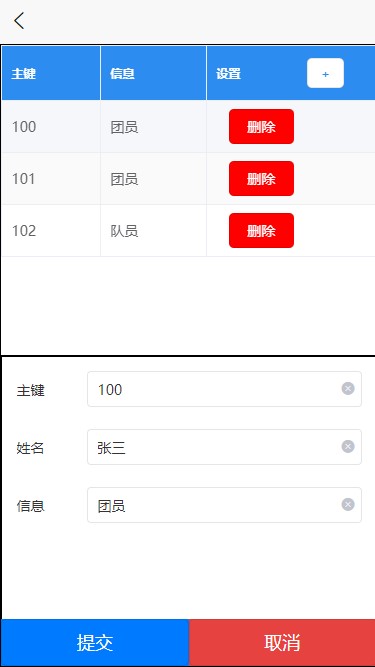
datas: [
{
id: '100',
name: '张三',
info: '团员'
},
{
id: '101',
name: '李四',
info: '团员'
},
{
id: '102',
name: '王五',
info: '队员'
}
],
buttons: [{ id: 'edit', name: '编辑', color: 'green' }],
columns: [
{
name: 'id',
info: '主键',
tips: '',
type: 'text'
},
{
name: 'name',
info: '姓名',
tips: '',
type: 'text'
},
{
name: 'info',
info: '信息',
tips: '',
type: 'text'
}
],
tableNames: ['id', 'info']
};
},
methods: {
onConfirm(action, data) {
console.log('保存', action);
},
ed(index, action, data) {
switch (action) {
case 'select':
console.log('选中', index);
break;
case 'add':
console.log('添加', index);
break;
case 'delete':
console.log('删除', index);
break;
}
},
d(name,newVal,oldVal){
console.log('修改', name,newVal);
}
}
};
API
DataTable Props
| 属性名 | 类型 | 可选值 | 默认值 | 说明 | 示例 |
|---|---|---|---|---|---|
| buttons | Array | - | [] | 选填,自选按钮 | buttons: [{ id: 'edit', name: '编辑', color: 'green' }] |
| columns | Array | [] | 必填,列头 | columns: [{name: 'name',info: 姓名',},{name: 'age',info: '年龄',},{name: 'sex',info: '性别',}] | |
| datas | Array | - | [] | 必填,行数据 | - |
| tableNames | Array | 空代表前两列 | 表格中的显示列 | ['id', 'info']表示,表格中的数据只显示,id 和 info的列 | |
| showButton | Boolean | true/false | true | 非必填 | 是否显示提交按钮 |
Localdata Options
DataTable Events
| 事件名 | 事件说明 | 返回参数 | |
|---|---|---|---|
| @selected | 行为选中事件 | index:按钮所在数据的行索引,id:按钮的id,row代表操作的行数据 | 按钮的id属性,如果是默认按钮 +表示添加,id='add',*表示编辑,id='edit',-表示删除,id='delete',选中项目,id='select',修改id='changed' |
| @confirm | 表单提交 | submit 表示提交,cancel表示取消 | |
| @changed | 列数据修改 | name 修改的列的名称,newVal 新的值,oldVal 旧的值 |
 下载 198
 赞赏 0
赞赏 0

 下载 7774089
 赞赏 921


 赞赏
赞赏
 京公网安备:11010802035340号