


 收藏人数:
收藏人数:
 下载插件并导入HBuilderX
 下载示例项目ZIP
 赞赏(0)
赞赏(0)
更新记录
1.0.0(2023-03-17) 下载此版本
第一次发布
平台兼容性
uni-app
| Vue2 | Vue3 | Chrome | Safari | app-vue | app-nvue | Android | iOS | 鸿蒙 |
|---|---|---|---|---|---|---|---|---|
| √ | - | √ | - | √ | - | - | - | - |
| 微信小程序 | 支付宝小程序 | 抖音小程序 | 百度小程序 | 快手小程序 | 京东小程序 | 鸿蒙元服务 | QQ小程序 | 飞书小程序 | 小红书小程序 | 快应用-华为 | 快应用-联盟 |
|---|---|---|---|---|---|---|---|---|---|---|---|
| - | - | - | - | - | - | - | - | - | - | - | - |
其他
| 多语言 | 暗黑模式 | 宽屏模式 |
|---|---|---|
| × | × | √ |
说明
1.封装了几个简单提示框,内含:轻提示 、加载提示、确认提示框(js中可调用)。以上均可全局挂载以失效通过js方便调用。
使用步骤
- xiaohu-msg.vue 拷贝放到pages文件下,当做一个路由页面使用。示例工程中我的路径为(pages/xiaohu-msg/index.vue).
-
在page.json 中配置如下 注意“全局确认模态框”此处配置,如下:
"pages": [ //pages数组中第一项表示应用启动页,参考:https://uniapp.dcloud.io/collocation/pages
    {
        "path": "pages/index/index",
        "style": {
            "navigationBarTitleText": "uni-app"
        }
    },
    { // 全局确认模态框
        "path": "pages/xiaohu-msg/index",
        "style": {
            "navigationStyle": "custom",
            "backgroundColor": "transparent",
            "app-plus": {
                "animationType": "fade-in",
                "background": "transparent",
                "popGesture": "none"
            }
        }
    }
],
3. 修改 xiaohu-msg.js 中 34行uni.navigateTo的跳转路径,该路径为你在page.json 中(全局确认模态框)页面的path 路径。
4. 在mani.js 中将xiaohu-msg.js 挂载到this 对象上,如下:
import msg from '@/components/xiaohu-msg/xiaohu-msg.js' Vue.prototype.$msg = msg;
5.最终使用,如下:methods: {
tip() {
// 三秒后关闭的轻提示
this.$msg.tip('轻提示内容!', 2000);
},
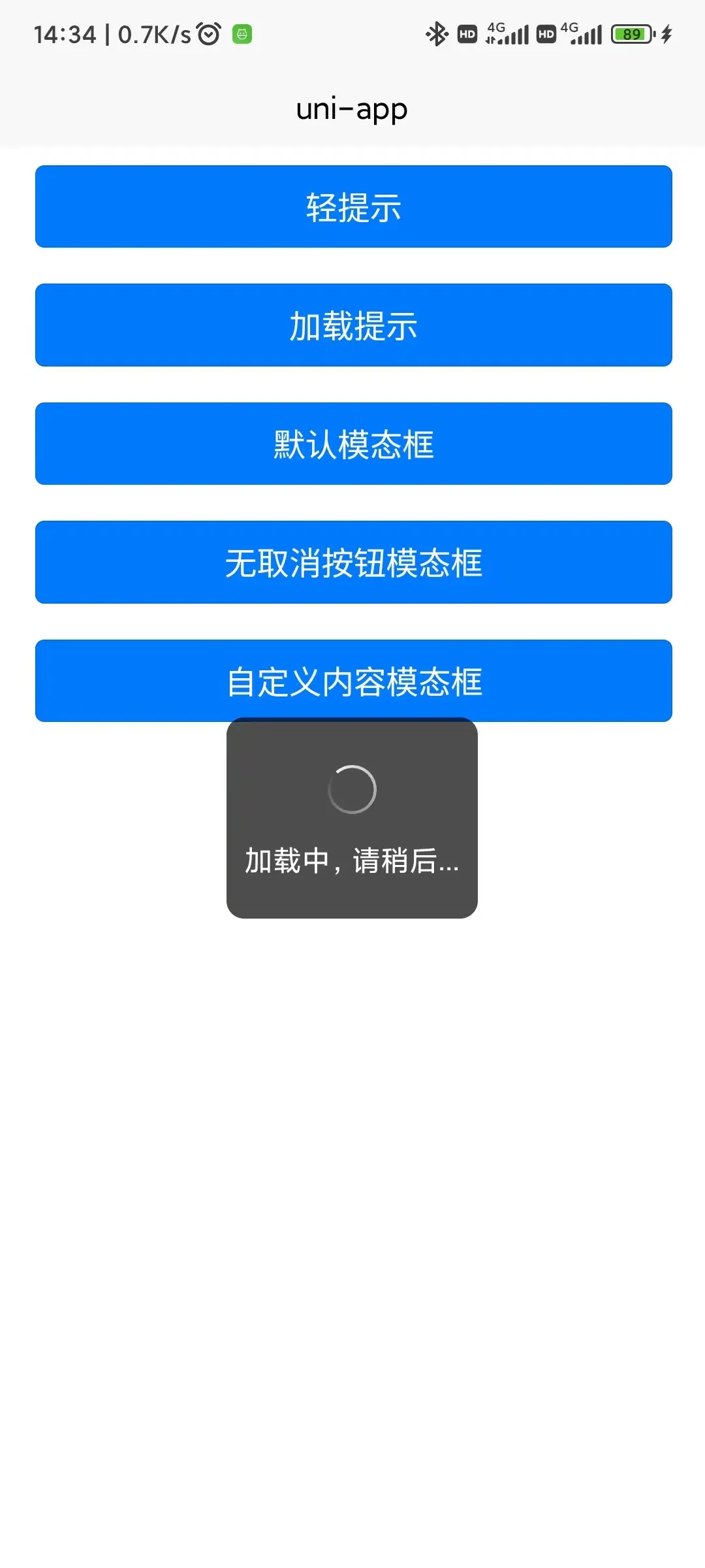
loading() {
this.$msg.showLoading('加载中,请稍后...');
setTimeout(() => {
// 关闭加载提示
this.$msg.hideLoading();
}, 2000)
},
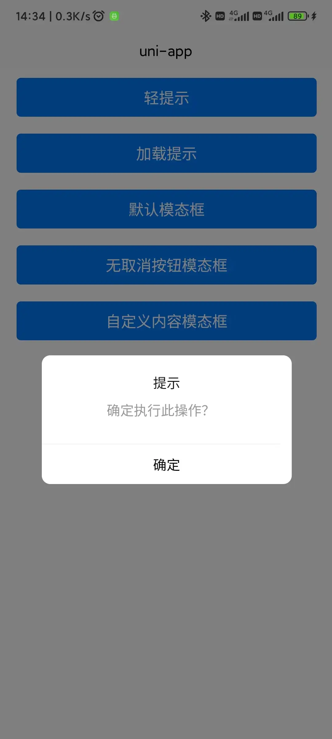
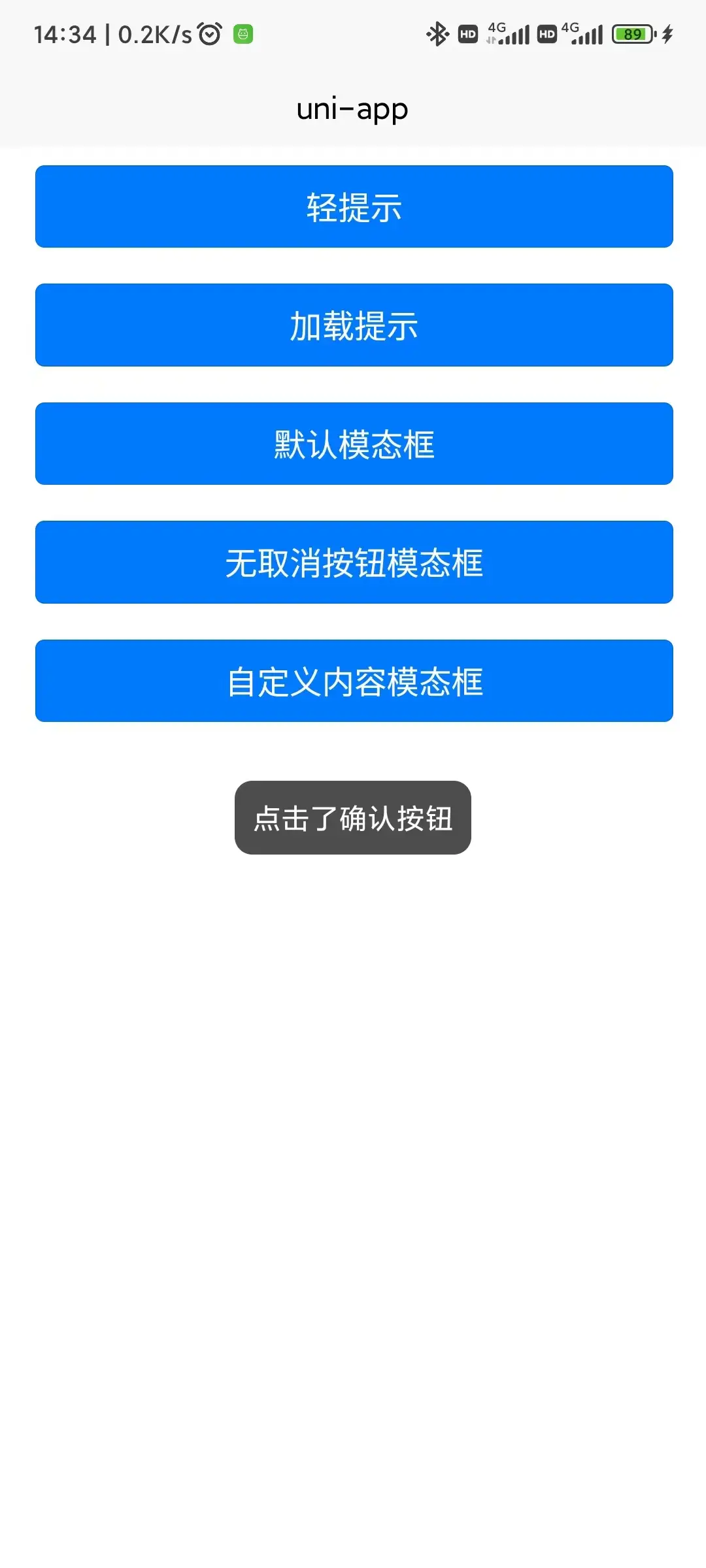
confirm(type){
if(type===1){
this.$msg.confirm({},(res)=>{
let msg = res.confirm?'点击了确认按钮':'点击了取消按钮'
this.$msg.tip(msg);
})
}
if(type===2){
this.$msg.confirm({showCancel:false},(res)=>{
let msg = res.confirm?'点击了确认按钮':'点击了取消按钮'
this.$msg.tip(msg);
})
}
if(type===3){
let optinos = {
title:'提示标题',
content:'自定义提示内容!',
showCancel:true,
cancelText:'取消按钮',// 取消按钮文本
confirmText:'确认按钮',// 确认按钮文本
}
this.$msg.confirm(optinos,(res)=>{
let msg = res.confirm?'点击了确认按钮':'点击了取消按钮'
this.$msg.tip(msg);
})
}
}
}
**注意:可下载示例项目跑起来看看就很清楚了,android 、H5 上亲自测试过的。确认提示框是基于纯vue 实现的,可根据自己的需求灵活修改样式,真正解决了uniapp 自带的uni.showModal()模态框 在app上无法修改样式的问题,**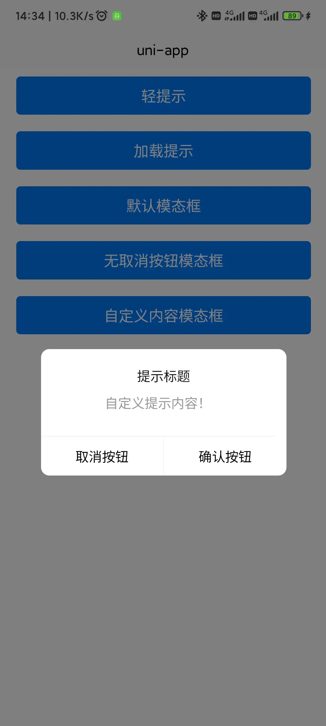
 下载 407
 赞赏 0
赞赏 0

 下载 12326973
 赞赏 1923


 赞赏
赞赏
 京公网安备:11010802035340号