

 收藏人数:
收藏人数:
 下载插件并导入HBuilderX
 下载示例项目ZIP
 赞赏(6)
赞赏(6)
更新记录
1.0.7(2023-08-28) 下载此版本
修复 textSize 属性 bug
1.0.6(2023-05-25) 下载此版本
- 添加 titleStyle 属性
- textOut 属性 变为 textPosition 属性
1.0.5(2023-05-11) 下载此版本
修复:进度值动态变化时,进度条加载卡顿的问题
查看更多平台兼容性
uni-app
| Vue2 | Vue3 | Chrome | Safari | app-vue | app-nvue | Android | iOS | 鸿蒙 |
|---|---|---|---|---|---|---|---|---|
| √ | √ | √ | √ | √ | √ | - | - | - |
| 微信小程序 | 支付宝小程序 | 抖音小程序 | 百度小程序 | 快手小程序 | 京东小程序 | 鸿蒙元服务 | QQ小程序 | 飞书小程序 | 小红书小程序 | 快应用-华为 | 快应用-联盟 |
|---|---|---|---|---|---|---|---|---|---|---|---|
| √ | √ | √ | √ | √ | √ | - | √ | √ | - | - | - |
其他
| 多语言 | 暗黑模式 | 宽屏模式 |
|---|---|---|
| × | × | √ |
lx-progress-bar
lx-progress-bar 进度条组件
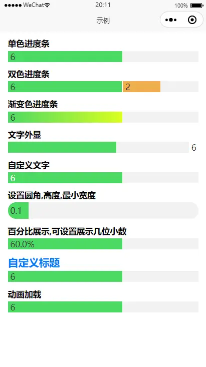
- 支持单色,双色,渐变色显示
- 文字支持外显、内显(双色进度条,文字只能内显),可设置文字大小、颜色
- 可设置底色
- 可设置圆角、进度条高度、进度条最小宽度(避免内容不能展示)
- 可选择展示百分比/数值
- 可选择是否使用动画加载
基本用法
导入方法:
- 直接使用 HBuilderX 导入插件
- 下载插件 zip ,将 lx-progress-bar 文件夹复制到项目 components 文件夹中,import+components 引入。
使用方法(demo):
    <template>
        <!-- lx-progress-bar 组件示例 -->
        <view class="container">
            <view class="container-item">
                <lx-progress-bar title="单色进度条" :total="10" :first-value="6" />
            </view>
            <view class="container-item">
                <lx-progress-bar
                    title="双色进度条"
                    :total="10"
                    :first-value="6"
                    :second-value="2"
                />
            </view>
            <view class="container-item">
                <lx-progress-bar
                    title="渐变色进度条"
                    :total="10"
                    :first-value="6"
                    content-color="linear-gradient(to right, #4cd964 , #daff20)"
                />
            </view>
            <view class="container-item">
                <lx-progress-bar
                    title="文字外显"
                    :total="10"
                    :first-value="6"
                    textPosition="outside"
                />
            </view>
            <view class="container-item">
                <lx-progress-bar
                    title="自定义文字"
                    :total="10"
                    :first-value="6"
                    text-color="#ffffff"
                    text-size="16px"
                />
            </view>
            <view class="container-item">
                <lx-progress-bar
                    title="设置圆角,高度,最小宽度"
                    :total="10"
                    :first-value="0.1"
                    bar-radius="5vw"
                    bar-height="8vw"
                    min-width="10vw"
                />
            </view>
            <view class="container-item">
                <lx-progress-bar
                    title="百分比展示,可设置展示几位小数"
                    :total="10"
                    :first-value="6"
                    percentum
                    precision="1"
                />
            </view>
            <view class="container-item">
                <lx-progress-bar
                    title="自定义标题"
                    titleStyle="font-size:5vw; color: #007aff;"
                    :total="10"
                    :first-value="6"
                />
            </view>
            <view class="container-item">
                <lx-progress-bar
                    title="动画加载"
                    :total="10"
                    :first-value="6"
                    animation
                />
            </view>
        </view>
    </template>

    <script>
    export default {};
    </script>

    <style lang="scss" scoped>
    .container {
        padding: 0 4vw;

        &-item {
            margin: 3vw 0;
        }
    }
    </style>
Attributes and Events
| 参数 | 类型 | 说明 | 是否必传 |
|---|---|---|---|
| title | String | 进度条标题 | 是 |
| titleStyle | String | 标题样式,写法见 demo(示例) | 否 |
| total | Number | 总数,用作计算分母 | 是 |
| firstValue | Number | 进度值 | 是 |
| secondValue | Number | 第二个进度值,传值后显示双色进度条 | 否 |
| backColor | String | 进度条背景色 | 否 |
| barHeight | String | 进度条高度,支持 px,rpx,vw,rem | 否 |
| barRadius | String | 进度条圆角,支持 px,rpx,vw,rem | 否 |
| contentColor | String | 进度条颜色,支持渐变 | 否 |
| contentColor2 | String | 第二条进度条颜色,支持渐变 | 否 |
| minWidth | String | 进度条最小长度,避免所占百分比过小,文字展示不全,支持 px,rpx,vw,rem | 否 |
| textSize | String | 文字大小,支持 px,rpx,vw,rem | 否 |
| textColor | String | 文字颜色 | 否 |
| textPosition | String | 文字显示位置,可选:inside/outside/none,默认 inside | 否 |
| percentum | Boolean | 展示百分比,默认为 false | 否 |
| precision | String/Number | 展示百分比时,精确到小数点后几位,默认为 2 | 否 |
| animation | Boolean | 使用动画加载,默认为 false | 否 |
 下载 765
 赞赏 6
赞赏 6

 下载 12275178
 赞赏 1922


 赞赏
赞赏


 京公网安备:11010802035340号