

 收藏人数:
收藏人数:
 下载插件并导入HBuilderX
 下载插件ZIP
 赞赏(0)
赞赏(0)
更新记录
0.0.2(2020-01-07) 下载此版本
无
平台兼容性
uni-app
| Vue2 | Vue3 | Chrome | Safari | app-vue | app-nvue | Android | iOS | 鸿蒙 |
|---|---|---|---|---|---|---|---|---|
| - | - | - | - | √ | - | - | - | - |
| 微信小程序 | 支付宝小程序 | 抖音小程序 | 百度小程序 | 快手小程序 | 京东小程序 | 鸿蒙元服务 | QQ小程序 | 飞书小程序 | 小红书小程序 | 快应用-华为 | 快应用-联盟 |
|---|---|---|---|---|---|---|---|---|---|---|---|
| - | - | - | - | - | - | - | - | - | - | - | - |
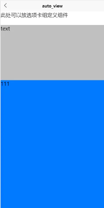
auto_view
通过css的flex盒子布局,来填充剩余空间
使用方式:
<template>
    <view style="display: flex;flex-direction: column;height: 100%;">
        <view style="height: 100rpx;">此处可以放选项卡组定义组件</view>
        <scroll-view :scroll-y="true" style="display: flex;flex:30;">
            <view style="height: 500rpx;background-color: #C0C0C0;">text</view>
            <view style="height: 500rpx;background-color: #999999;">text</view>
            <view style="height: 500rpx;background-color: #8F8F94;">text</view>
        </scroll-view>
        <swiper style="flex:70;">
            <swiper-item style="background-color: #007AFF;">
                111
            </swiper-item>
            <swiper-item style="background-color: #4CD964;">
                222
            </swiper-item>
        </swiper>
    </view>
</template>

<script>
    export default {
        data() {
            return {

            }
        },
        onLoad() {

        },
        methods: {

        }
    }
</script>

<style>
    page{
        width: 100%;
        height: 100%;
    }
</style>
简单说明:
核心就在于盒子布局中的flex-grow属性,当前的设置方式是通过将最外围的盒子给固定为屏幕的大小,从而实现了内部的元素宽高自动填充。 当实际情况下是限制在一个区域布局的时候,此方法也是适用的
 下载 347
 赞赏 0
赞赏 0

 下载 12286700
 赞赏 1922


 赞赏
赞赏
 京公网安备:11010802035340号