

 收藏人数:
收藏人数:
 下载插件并导入HBuilderX
 赞赏(5)
赞赏(5)
更新记录
1.0.4(2023-06-09) 下载此版本
优化
1.0.3(2023-06-09) 下载此版本
增加预览二维码
1.0.2(2023-06-09) 下载此版本
增加预览
查看更多平台兼容性
uni-app
| Vue2 | Vue3 | Chrome | Safari | app-vue | app-nvue | Android | iOS | 鸿蒙 |
|---|---|---|---|---|---|---|---|---|
| √ | - | √ | √ | - | - | - | - | - |
| 微信小程序 | 支付宝小程序 | 抖音小程序 | 百度小程序 | 快手小程序 | 京东小程序 | 鸿蒙元服务 | QQ小程序 | 飞书小程序 | 小红书小程序 | 快应用-华为 | 快应用-联盟 |
|---|---|---|---|---|---|---|---|---|---|---|---|
| √ | - | - | - | - | - | - | - | - | - | - | - |
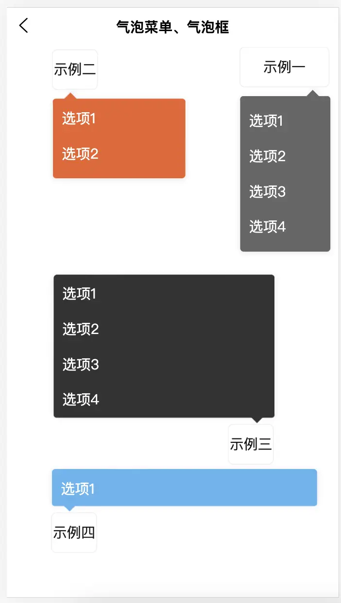
liu-bubble-menu适用于uni-app项目的气泡菜单、气泡框组件
本组件目前兼容微信小程序、H5
本组件是非常简单好用的气泡菜单、气泡框,可点击任意位置弹出,可自定义气泡框大小、颜色、内容等
--- 扫码预览、关注我们 ---
扫码关注公众号,查看更多插件信息,预览插件效果!

使用方式
<template>
    <view class="page-main">
        <liu-bubble-menu elementId="data-select1" :dataList="dataList" @change="change1" bgColor="#666666">
            <view id="data-select1" class="item1">{{name1 || '示例一'}}</view>
        </liu-bubble-menu>

        <liu-bubble-menu elementId="data-select2" :dataList="dataList" @change="change2" bgColor="#ec622a" :dWidth="300"
            :dHeight="180">
            <view id="data-select2" class="item2">{{name2 || '示例二'}}</view>
        </liu-bubble-menu>

        <liu-bubble-menu elementId="data-select3" :dataList="dataList" @change="change3" bgColor="#333333" :dWidth="500"
            :dHeight="320">
            <view id="data-select3" class="item3">{{name3 || '示例三'}}</view>
        </liu-bubble-menu>

        <liu-bubble-menu elementId="data-select4" :dataList="dataList" @change="change4" bgColor="#5cb6f1" :dWidth="600"
            :dHeight="80">
            <view id="data-select4" class="item4">{{name4 || '示例四'}}</view>
        </liu-bubble-menu>
    </view>
</template>

<script>
    export default {
        data() {
            return {
                name1: '',
                name2: '',
                name3: '',
                name4: '',
                dataList: ['选项1', '选项2', '选项3', '选项4']
            }
        },
        methods: {
            change1(e) {
                this.name1 = e
            },
            change2(e) {
                this.name2 = e
            },
            change3(e) {
                this.name3 = e
            },
            change4(e) {
                this.name4 = e
            }
        }
    }
</script>

<style scoped>
    .item1 {
        width: 200rpx;
        height: 88rpx;
        border: solid #f0f0f0 1px;
        border-radius: 12rpx;
        line-height: 88rpx;
        text-align: center;
        right: 20rpx;
        top: 88rpx;
        position: fixed;
    }

    .item2 {
        width: 100rpx;
        height: 88rpx;
        border: solid #f0f0f0 1px;
        border-radius: 12rpx;
        line-height: 88rpx;
        text-align: center;
        left: 100rpx;
        top: 0rpx;
        position: absolute;
    }

    .item3 {
        width: 100rpx;
        height: 88rpx;
        border: solid #f0f0f0 1px;
        border-radius: 12rpx;
        line-height: 88rpx;
        text-align: center;
        left: 500rpx;
        bottom: 300rpx;
        position: fixed;
    }

    .item4 {
        width: 100rpx;
        height: 88rpx;
        border: solid #f0f0f0 1px;
        border-radius: 12rpx;
        line-height: 88rpx;
        text-align: center;
        left: 100rpx;
        bottom: 100rpx;
        position: fixed;
    }
</style>
属性说明
| 名称 | 类型 | 默认值 | 描述 |
|---|---|---|---|
| elementId | String | 所点击元素id(必须传) | |
| dataList | Array | [] | 气泡框数据源 |
| hasBar | Boolean | true | 当前页面是否含有navigationBar |
| bgColor | String | #FFFFFF | 气泡框背景色 |
| radius | Number | 8 | 气泡框圆角(rpx) |
| dWidth | Number | 0 | 气泡框宽度(rpx),不传则默认取所点击元素的宽度 |
| dHeight | Number | 0 | 气泡框高度(rpx),不传则默认由内容撑开 |
| dMaxHeight | Number | 0 | 气泡框最大高度(rpx),超出则内部滚动 |
| @change | Function | 点击选项回调事件 |


 下载 6088
 赞赏 61
赞赏 61

 下载 12242490
 赞赏 1922


 赞赏
赞赏


 京公网安备:11010802035340号