

 收藏人数:
收藏人数:
 下载插件并导入HBuilderX
 赞赏(9)
赞赏(9)
更新记录
1.1.1(2026-01-05) 下载此版本
修复z-index问题
1.1.0(2024-09-14) 下载此版本
更新说明
1.0.9(2023-12-13) 下载此版本
修复bug
查看更多平台兼容性
uni-app(3.6.15)
| Vue2 | Vue3 | Chrome | Safari | app-vue | app-nvue | Android | iOS | 鸿蒙 |
|---|---|---|---|---|---|---|---|---|
| √ | √ | √ | √ | √ | √ | √ | √ | √ |
| 微信小程序 | 支付宝小程序 | 抖音小程序 | 百度小程序 | 快手小程序 | 京东小程序 | 鸿蒙元服务 | QQ小程序 | 飞书小程序 | 小红书小程序 | 快应用-华为 | 快应用-联盟 |
|---|---|---|---|---|---|---|---|---|---|---|---|
| √ | √ | √ | √ | √ | √ | √ | √ | √ | - | √ | √ |
uni-app x(4.18)
| Chrome | Safari | Android | iOS | 鸿蒙 | 微信小程序 |
|---|---|---|---|---|---|
| - | - | - | - | - | - |
next-drag-fab --悬浮拖拽按钮uni-fab的加强版(同时支持vue3 vue2语法,全平台可用)
官方uni-fab的增强版,兼并uni-fab的原有功能且比其功能更加强大,可拖拽,可配置; 遇到问题或有建议可以加入***(455948571)反馈
如果觉得组件不错,给五星鼓励鼓励咯!
如果有使用问题请***
注意:如果插件问题,请务必给一个完整的复现demo,谢谢配合; 点击链接加***聊前端开发(uniapp插件)】
使用
<template>
<view class="container">
<uni-card :is-shadow="false" is-full>
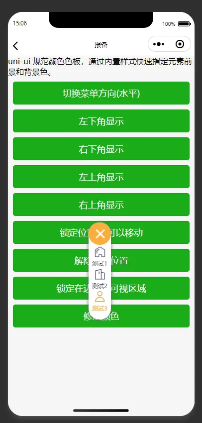
<text class="uni-h6">uni-ui 规范颜色色板,通过内置样式快速指定元素前景和背景色。</text>
</uni-card>
<uni-section title="基本功能" subTitle="点击按钮,切换 fab 不同状态" type="line">
<view class="warp">
<button class="button" type="primary" @click="switchBtn(0)">切换菜单方向({{ directionStr }})</button>
<button class="button" type="primary" @click="switchBtn('lb')">左下角显示</button>
<button class="button" type="primary" @click="switchBtn('rb')">右下角显示</button>
<button class="button" type="primary" @click="switchBtn('lt')">左上角显示</button>
<button class="button" type="primary" @click="switchBtn('rt')">右上角显示</button>
<button class="button" type="primary" @click="switchBtn('lock')">锁定位置,不可以移动</button>
<button class="button" type="primary" @click="switchBtn('unlock')">解除锁定位置</button>
<button class="button" type="primary" @click="switchBtn('dock')">锁定在边界内可视区域</button>
<button class="button" type="primary" @click="switchColor">修改颜色</button>
</view>
</uni-section>
<next-drag-fab
v-if="showNextDragFab"
ref="nextDragFabRef"
:isDock="isDock"
:isLock="isLock"
:pattern="pattern"
:content="content"
:horizontal="horizontal"
:vertical="vertical"
:direction="direction"
:defpositon="defpositon"
@trigger="trigger"
/>
</view>
</template>vue3 + ts 使用
<script lang="ts" setup>
import { ref, unref, nextTick } from 'vue'

const nextDragFabRef = ref()
const title = ref('next-drag-fab')
const directionStr = ref('垂直')
const horizontal = ref('left')
const vertical= ref('bottom')
const direction = ref('horizontal')
const defpositon = ref('rb')
const isDock = ref(false)
const isLock = ref(false)
const pattern = ref({
    color: '#3c3e49',
    backgroundColor: '#fff',
    selectedColor: '#f9ae3d',
    buttonColor: '#f9ae3d',
    iconColor: '#fff'
})
const showNextDragFab = ref(true)
const is_color_type = ref(false)
const content = ref([
            {
                text: '测试1',
                active: false,
                iconPath: 'https://www.yisuxiao.com/static/server/common/tab/tab1-0.png',
                selectedIconPath: 'https://www.yisuxiao.com/static/server/common/tab/tab1-1.png'},
            {
                text: '测试2',
                active: false,
                iconPath: 'https://www.yisuxiao.com/static/server/common/tab/tab2-0.png',
                selectedIconPath: 'https://www.yisuxiao.com/static/server/common/tab/tab2-1.png'},
            {
                text: '测试3',
                active: false,
                iconPath: 'https://www.yisuxiao.com/static/server/common/tab/tab3-0.png',
                selectedIconPath: 'https://www.yisuxiao.com/static/server/common/tab/tab3-1.png'}
        ])

function trigger(e) {
    console.log(e)
    unref(content)[e.index].active = !e.item.active
    uni.showModal({
        title: '提示',
        content: `您${unref(content)[e.index].active ? '选中了' : '取消了'}${e.item.text}`,
        success: function(res) {
            if (res.confirm) {
                console.log('用户点击确定')
            } else if (res.cancel) {
                console.log('用户点击取消')
            }
        }
    })
}

function switchBtn(val) {
    showNextDragFab.value = false
    nextTick(() => {
        if (val === 0) {
            direction.value = unref(direction) === 'horizontal' ? 'vertical' : 'horizontal'
            directionStr.value = unref(direction) === 'horizontal' ? '垂直' : '水平'
        } else if (val === 'lock') {
            isLock.value = true
        } else if (val === 'unlock') {
            isLock.value = false
        } else if (val === 'dock') {
            isDock.value = true
        } else {
            defpositon.value = val
        }
        showNextDragFab.value = true
    })
}
function switchColor() {
    is_color_type.value = !unref(is_color_type)
    if (unref(is_color_type)) {
        pattern.value.iconColor = '#aaa'
        pattern.value.buttonColor = '#fff'
    } else {
        pattern.value.iconColor = '#fff'
        pattern.value.buttonColor = '#f9ae3d'
    }
}
</script>
vue2 同样支持,在这里不再写demo
预览
| 功能预览 |
|---|
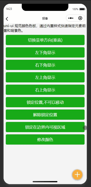 |
参数
next-drag-fab Props
可选参数属性列表
| 参数名 | 说明 | 类型 | 是否必填 | 默认值 | 可选值 |
|---|---|---|---|---|---|
| pattern | 可选样式配置项 | Object | 否 | - | - |
| horizontal | 水平对齐方式。left:左对齐,right:右对齐 | String | 否 | right | left |
| vertical | 垂直对齐方式。bottom:下对齐,top:上对齐 | String | 否 | bottom | top |
| direction | horizontal | String | 否 | vertical | horizontal |
| popMenu | 是否使用弹出菜单 | Boolean | 否 | true | false |
| content | 展开菜单内容配置项 | Array | 否 | [] | - |
| defpositon | 初始化的位置 lt 左上 lb 左下 rt 右上 rb右下 | String | 否 | rb | lt,lb,rt |
| edge | 边界大小(单位是px) | Number | 否 | 10 | - |
| fontSize | 弹出菜单文字大小(单位是px) | Number | 否 | 12 | - |
| size | fab的大小 (单位是px) | Number | 否 | 40 | - |
| isLock | 是否锁定 | Boolean | 否 | false | true |
| isDock | 显示在边界内 | Boolean | 否 | true | false |
| zIndex | 层级 | Number | 否 | 999 | - |
pattern配置项:
可选参数属性列表
| 参数名 | 说明 | 类型 | 是否必填 | 默认值 | 可选值 |
|---|---|---|---|---|---|
| color | 文字默认颜色 | String | 否 | #3c3e49 | - |
| selectedColor | 文字选中时的颜色 | String | 否 | #f9ae3d | - |
| backgroundColor | 背景色 | String | 否 | #ffffff | - |
| buttonColor | 按钮背景色 | String | 否 | #f9ae3d | - |
| icon | 自定义图标,图标来自 uni-icons | String | 否 | plusempty | - |
content配置项:
可选参数属性列表
| 参数名 | 说明 | 类型 | 是否必填 | 默认值 | 可选值 |
|---|---|---|---|---|---|
| iconPath | 图片路径 | String | 否 | - | - |
| selectedIconPath | 选中后图片路径 | String | 否 | - | - |
| text | 文字 | String | 否 | - | - |
| active | 是否选中当前 | String | 否 | - | - |
本插件使用的iconfont是uni-icons可以参考如下(uni-iocns使用说明)
Event 事件
| 事件名 | 说明 | 类型 | 回调参数 |
|---|---|---|---|
| trigger | 菜单收起时返回的筛选结果 | emit | array |
| fabClick | 悬浮按钮点击事件 | emit | array |
 下载 5495
 赞赏 54
赞赏 54

 下载 12332850
 赞赏 1924


 赞赏
赞赏


 京公网安备:11010802035340号