

 收藏人数:
收藏人数:
 https://github.com/he426100/uni-app-checker
 下载插件并导入HBuilderX
 下载示例项目ZIP
 赞赏(0)
赞赏(0)
更新记录
1.0.3(2020-02-12) 下载此版本
- 适配微信小程序
1.0.2(2020-02-11) 下载此版本
修正对must选项的处理
1.0.1(2020-02-11) 下载此版本
1、去除本地iconfont文件,改为引用在线链接 2、插件的样式写到插件内(原来在App.vue) 3、增加must选项,可设置必须选中 4、修正已知错误
查看更多平台兼容性
插件使用说明
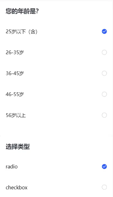
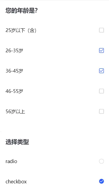
- 支持radio和checkbox,支持双向绑定,测试过App、H5、微信小程序
- 基于 vant-checker,修改以适用于uni-app,部分逻辑参考uni-collapse
- 组件中用到的iconfont图标放置在示例项目static/svg文件夹中,上传到iconfont再加入到自己项目就可以用了
- 遵守easycom规范,可直接使用
1.基本用法
<template>
    <view>
        <view class="content">
            <mrpzx-checker-box ref="questionChecker" @on-change="onChange" :type="type" v-model="question.value" :class="{'item-selected': isCheck}">
                <view class="title">{{question.title}}</view>
                <mrpzx-checker-item @checkItem="contentClick" :iconType="iconType" :checked="false" :value="vo.id" index="question" v-for="(vo, index) in question.answer" :key="index">
                    <view class="answer">{{vo.title}}</view>
                    <view class="line"></view>
                </mrpzx-checker-item>
            </mrpzx-checker-box>
        </view>
        <view class="options">
            <mrpzx-checker-box @on-change="onOptionChange" :must="true" type="radio">
                <view class="title">选择类型</view>
                <mrpzx-checker-item :checked="true" value="radio" index="options">
                    <view class="answer">radio</view>
                    <view class="line"></view>
                </mrpzx-checker-item>
                <mrpzx-checker-item :checked="false" value="checkbox" index="options">
                    <view class="answer">checkbox</view>
                    <view class="line"></view>
                </mrpzx-checker-item>
            </mrpzx-checker-box>
        </view>
    </view>
</template>

<script>
    export default {
        data() {
            return {
                type: 'radio',
                isCheck: !1,
                question: {
                    title: '您的年龄是?',
                    value: 0,
                    answer: [{
                        id: 1,
                        title: '25岁以下(含)'
                    },{
                        id: 2,
                        title: '26-35岁'
                    },{
                        id: 3,
                        title: '36-45岁'
                    },{
                        id: 4,
                        title: '46-55岁'
                    },{
                        id: 5,
                        title: '56岁以上'
                    }]
                }
            }
        },
        computed: {
            iconType () {
                return this.type == 'radio' ? 'circle' : 'box'
            }
        },
        methods: {
            contentClick (isCheck, index, value) {
                this.isCheck = isCheck
                console.log('isCheck: ' + isCheck + "\n" + 'index: ' + index + "\n" + 'value:' + value)
                console.log((isCheck ? '选中了:' : '取消选中') + value)
                console.log('question.value: ' + JSON.stringify(this.question.value))
            },
            onChange (value, isCheck) {
                console.log('changed: ' + JSON.stringify([value, isCheck]))
            },
            onOptionChange (value, isCheck) {
                if (value !== this.type) {
                    this.$refs.questionChecker.clearCheck()
                }
                this.type = value
            }
        }
    }
</script>

<style>
    .checker-box .title {
        padding: 42rpx 0 40rpx;
        font-size: 40rpx;
        font-weight: 700;
        color: #33353f;
        margin: 0 38rpx;
        max-height: 190rpx;
        line-height: 54rpx;
        -webkit-box-sizing: border-box;
        box-sizing: border-box
    }

    .checker-box .checker-item .answer {
        display: inline-block;
        padding: 48rpx 0;
        font-size: 32rpx;
        line-height: 44rpx;
        width: 92%
    }

    .checker-box .item-selected .checker-item-tag .answer {
        color: #2e5bff;
        font-weight: 700
    }
</style>
2.更多用法
请下载示例项目
3.参数说明
checker-box props
| 参数 | 说明 | 类型 | 可选值 | 默认值 |
|---|---|---|---|---|
| v-model | 选中值,type为radio时有值不代表选中 | - | - | - |
| type | 类型 | string | radio/checkbox | radio |
| must | 是否必须选中 | boolean | true/false | false |
checker-box events
| name | 说明 | 回调参数 |
|---|---|---|
| on-change | 选中状态发生变更 | 更新后选中值的value组 |
checker-item props
| 参数 | 说明 | 类型 | 可选值 | 默认值 |
|---|---|---|---|---|
| value | 值 | - | - | - |
| index | 索引/名字 | number/string | - | - |
| height | 高度 | - | - | - |
| width | 宽度 | - | - | - |
| iconType | 图标类型 | string | circle/box | circle |
| checked | 是否选中 | boolean | true/false | false |
checker-item events
| name | 说明 | 回调参数 |
|---|---|---|
| checkItem | 选中状态发生变更 | isCheck, index, value |
 下载 1012
 赞赏 0
赞赏 0

 下载 12387457
 赞赏 1928


 赞赏
赞赏
 京公网安备:11010802035340号