


 收藏人数:
收藏人数:
 下载插件并导入HBuilderX
 下载示例项目ZIP
 赞赏(1)
赞赏(1)
更新记录
1.0.0(2023-07-13) 下载此版本
首次发布,样式自己修改
1.1(2023-07-13) 下载此版本
add
1.0(2023-07-13) 下载此版本
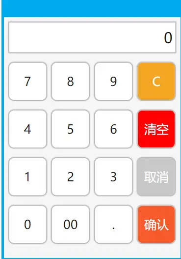
小数点后只能输入两位,其他自行更改,默认点击确认保存格式是0.00
查看更多平台兼容性
uni-app
| Vue2 | Vue3 | Chrome | Safari | app-vue | app-nvue | Android | iOS | 鸿蒙 |
|---|---|---|---|---|---|---|---|---|
| √ | √ | √ | √ | √ | √ | - | - | - |
| 微信小程序 | 支付宝小程序 | 抖音小程序 | 百度小程序 | 快手小程序 | 京东小程序 | 鸿蒙元服务 | QQ小程序 | 飞书小程序 | 小红书小程序 | 快应用-华为 | 快应用-联盟 |
|---|---|---|---|---|---|---|---|---|---|---|---|
| √ | √ | √ | √ | √ | √ | - | √ | √ | - | √ | √ |
其他
| 多语言 | 暗黑模式 | 宽屏模式 |
|---|---|---|
| × | × | √ |
number-keyboard
1.1直接下载插件并导入HBuilderx,直接使用,如果不则需要引入,步骤下面2.1
   <view v-if="show">
      <number-keyboard @confirmEvent="_confirmEvent" @closeNum="closeNum"></number-keyboard>
    </view>

    data() {
      return {
        title: 'Hello',
        show: false
      }
    },

    methods: {
      _confirmEvent(res) {
        console.log(res);
        this.title = res
        this.show = !this.show
      },
      closeNum() {
        this.show = !this.show
      }
    }
2.1步骤如下
引入组件
import numberKeyboard from "./components/numberKeyboard/numberKeyboard.vue"注册组件
   components: {
      numberKeyboard
    },
    data() {
      return {
        show: false
      }
    },
使用组件
<view v-if="show">
    <numberKeyboard @confirmEvent="_confirmEvent" @closeNum="closeNum">                </numberKeyboard>
</view>

methods: {
    //点击确认
   _confirmEvent(res) {
       console.log(res);
       this.show = !this.show
     },
     //显示和隐藏
    closeNum() {
      this.show = !this.show
  }
 }

 下载 165
 赞赏 1
赞赏 1

 下载 12288439
 赞赏 1922


 赞赏
赞赏
 京公网安备:11010802035340号