

 收藏人数:
收藏人数:
 下载插件并导入HBuilderX
 赞赏(2)
赞赏(2)
更新记录
0.1.5(2025-12-17) 下载此版本
- fix: 修复uniappx 安卓端内容为
0并且设置:show-zero="false"依然显示的问题
0.1.4(2025-12-09) 下载此版本
- fix: 修复类型问题
0.1.3(2025-11-18) 下载此版本
- feat: 更新条件编译
平台兼容性
uni-app(4.74)
| Vue2 | Vue3 | Chrome | Safari | app-vue | app-nvue | Android | iOS | 鸿蒙 |
|---|---|---|---|---|---|---|---|---|
| √ | √ | √ | √ | √ | - | 5.0 | √ | √ |
| 微信小程序 | 支付宝小程序 | 抖音小程序 | 百度小程序 | 快手小程序 | 京东小程序 | 鸿蒙元服务 | QQ小程序 | 飞书小程序 | 小红书小程序 | 快应用-华为 | 快应用-联盟 |
|---|---|---|---|---|---|---|---|---|---|---|---|
| √ | - | - | - | - | - | - | - | - | - | - | - |
uni-app x(4.75)
| Chrome | Safari | Android | iOS | 鸿蒙 | 微信小程序 |
|---|---|---|---|---|---|
| √ | √ | 5.0 | √ | √ | √ |
其他
| 多语言 | 暗黑模式 | 宽屏模式 |
|---|---|---|
| × | √ | × |
lime-badge 徽标组件
一个功能丰富的徽标组件,用于展示数字提示、红点提示等。支持自定义位置、颜色、内容等多种配置,可用于消息提醒、数量展示等多种场景。组件提供了丰富的自定义选项,可以满足各种徽标展示需求。
插件依赖:
lime-shared、lime-style
文档链接
📚 组件详细文档请访问以下站点:
安装方法
- 在uni-app插件市场中搜索并导入
lime-badge - 导入后可能需要重新编译项目
- 在页面中使用
l-badge组件
代码演示
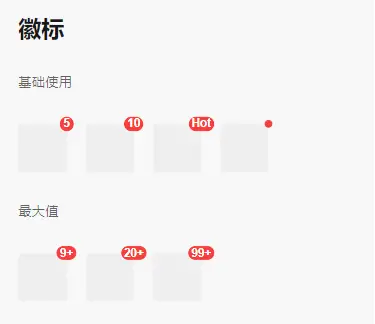
基础用法
最简单的徽标组件用法,只需要设置内容即可。
<l-badge content="5">
  <view class="box"></view>
</l-badge>
红点徽标
不需要显示具体数字,只显示一个小红点。
<l-badge dot>
  <view class="box"></view>
</l-badge>
最大值
当数值超过最大值时,会显示为最大值+。
<l-badge content="99" :max="99">
  <view class="box"></view>
</l-badge>
自定义颜色
设置徽标的背景颜色。
<l-badge content="5" color="#1989fa">
  <view class="box"></view>
</l-badge>
自定义位置
徽标支持四个不同的位置:左上角、右上角、左下角、右下角。
<l-badge content="5" position="top-left">
  <view class="box"></view>
</l-badge>

<l-badge content="5" position="top-right">
  <view class="box"></view>
</l-badge>

<l-badge content="5" position="bottom-left">
  <view class="box"></view>
</l-badge>

<l-badge content="5" position="bottom-right">
  <view class="box"></view>
</l-badge>
自定义偏移
通过offset属性设置徽标的偏移量,数组的两项分别代表水平和垂直方向的偏移量。
<l-badge content="5" :offset="[10, 10]">
  <view class="box"></view>
</l-badge>
独立展示
徽标可以不依附于其他元素,单独展示。
<l-badge content="5" />显示零值
默认情况下,当content为0时不会显示徽标,设置show-zero属性可以强制显示零值。
<l-badge content="0" show-zero>
  <view class="box"></view>
</l-badge>
快速预览
导入插件后,可以直接使用以下标签查看演示效果:
<!-- 代码位于 uni_modules/lime-badge/components/lime-badge -->
<lime-badge />
插件标签说明
| 标签名 | 说明 |
|---|---|
l-badge |
组件标签 |
lime-badge |
演示标签 |
Vue2使用说明
main.js中添加以下代码:
// vue2项目中使用
import Vue from 'vue'
import VueCompositionAPI from '@vue/composition-api'
Vue.use(VueCompositionAPI)详细配置请参考官方文档:Vue Composition API
API文档
Props 属性说明
| 属性名 | 说明 | 类型 | 默认值 |
|---|---|---|---|
| content | 徽标内容 | number | string | - |
| dot | 是否显示为小红点 | boolean | false |
| max | 最大值,超过最大值会显示 {max}+ | number | - |
| color | 徽标背景颜色 | string | - |
| offset | 设置徽标的偏移量,数组的两项分别代表水平和垂直方向的偏移量 | [number | string, number | string] | - |
| showZero | 当content为0时,是否显示徽标 | boolean | false |
| position | 徽标位置,可选值为 top-left、top-right、bottom-left、bottom-right | string | 'top-right' |
Slots 插槽
| 名称 | 说明 |
|---|---|
| default | 徽标包裹的子元素 |
| content | 自定义徽标内容 |
主题定制
组件提供了以下CSS变量,可用于自定义样式:
| 变量名称 | 默认值 | 描述 |
|---|---|---|
--l-badge-size |
16px |
徽标大小 |
--l-badge-color |
white |
徽标文字颜色 |
--l-badge-padding |
0 3px |
徽标内边距 |
--l-badge-font-size |
12px |
徽标字体大小 |
--l-badge-font-weight |
bold |
徽标字体粗细 |
--l-badge-border-width |
1px |
徽标边框宽度 |
--l-badge-border-color |
white |
徽标边框颜色 |
--l-badge-bg-color |
$error-color |
徽标背景色 |
--l-badge-dot-color |
$error-color |
小红点颜色 |
--l-badge-dot-size |
8px |
小红点大小 |
--l-badge-font |
-apple-system-font, helvetica neue, arial, sans-serif |
徽标字体 |
--l-badge-border-radius |
999px |
徽标圆角大小 |
支持与赞赏
如果你觉得本插件解决了你的问题,可以考虑支持作者:
| 支付宝赞助 | 微信赞助 |
|---|---|
 |
 |
 下载 72689
 赞赏 579

 下载 12311944
 赞赏 1923


 赞赏
赞赏

 京公网安备:11010802035340号