

 收藏人数:
收藏人数:
 下载插件并导入HBuilderX
 赞赏(0)
赞赏(0)
更新记录
1.0.7(2023-11-02) 下载此版本
优化说明文档
1.0.6(2023-11-02) 下载此版本
修改使用说明文档
1.0.5(2023-10-25) 下载此版本
优化
查看更多平台兼容性
uni-app
| Vue2 | Vue3 | Chrome | Safari | app-vue | app-nvue | Android | iOS | 鸿蒙 |
|---|---|---|---|---|---|---|---|---|
| √ | √ | √ | √ | √ | √ | - | - | - |
| 微信小程序 | 支付宝小程序 | 抖音小程序 | 百度小程序 | 快手小程序 | 京东小程序 | 鸿蒙元服务 | QQ小程序 | 飞书小程序 | 小红书小程序 | 快应用-华为 | 快应用-联盟 |
|---|---|---|---|---|---|---|---|---|---|---|---|
| √ | √ | √ | √ | √ | √ | - | √ | √ | - | √ | √ |
其他
| 多语言 | 暗黑模式 | 宽屏模式 |
|---|---|---|
| × | × | √ |
piaoyi-data-select 选择框
使用方法:
<template>
<view style="padding: 20rpx;">
<piaoyi-data-select :inputValue.sync="inputValue" ref="piaoyiSelect" :clearable="clearable" :filterable="filterable" :placeholder="placeholder" :localdata="options"></piaoyi-data-select>
<view class="title" style="margin-top: 400rpx;">
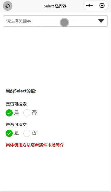
当前Select的值: {{inputValue}}
</view>
<view class="title" style="margin-top: 20rpx;">
是否可搜索
</view>
<radio-group @change="radioChange" class="radioGroup">
<label class="radioGroup-item" v-for="(item, index) in filteritems" :key="item.value">
<view>
<radio :value="item.value" :checked="index === current" />
</view>
<view>{{item.name}}</view>
</label>
</radio-group>
<view class="title" style="margin-top: 20rpx;">
是否可清空
</view>
<radio-group @change="clearradioChange" class="radioGroup">
<label class="radioGroup-item" v-for="(item, index) in clearitems" :key="item.value">
<view>
<radio :value="item.value" :checked="index === current2" />
</view>
<view>{{item.name}}</view>
</label>
</radio-group>
<view class="title" style="margin-top: 20rpx;color: red;">
具体使用方法请看插件市场简介
</view>
</view>
</template>
<script>
import piaoyiDataSelect from '@/uni_modules/piaoyi-data-select/components/piaoyi-data-select/piaoyi-data-select.vue'
export default {
data() {
return {
clearable: true,
filterable: true,
inputValue: '',
filteritems: [{
value: '是',
name: '是'
},
{
value: '否',
name: '否'
}],
clearitems: [{
value: '是',
name: '是',
checked: true
},
{
value: '否',
name: '否',
checked: false
}],
current: 0,
current2: 0,
options: [{
text: '选项1',
value: '选项1'
}, {
text: '选项2',
value: '选项2'
}, {
text: '选项3',
value: '选项3'
}, {
text: '选项4',
value: '选项4'
}],
placeholder: '请选择关键字'
};
},
components: {
piaoyiDataSelect
},
methods: {
radioChange(e) {
if (e.detail.value == '是') {
this.filterable = true
} else {
this.filterable = false
}
},
clearradioChange(e) {
if (e.detail.value == '是') {
this.clearable = true
} else {
this.clearable = false
}
},
}
}
</script>
<style lang="scss" scoped>
.title {
padding: 20rpx;
font-size: 28rpx;
line-height: 28rpx;
font-weight: 700;
color: #333;
}
.radioGroup {
display: flex;
padding: 0 18rpx;
}
.radioGroup-item {
display: flex;
margin-right: 30rpx;
uni-radio {
transform: scale(0.8);
}
}
</style>
Prop
| 参数名称 | 描述 | 默认值 |
|---|---|---|
| inputValue | 实现数据绑定的key值,注意加上sync | |
| localdata | 下拉选项数据 | |
| filterable | 是否可编辑 | false |
| clearable | 是否可清空 | true |
| placeholder | 提示文本 | 请选择关键字 |


 下载 11552
 赞赏 98
赞赏 98

 下载 12350565
 赞赏 1926


 赞赏
赞赏
 京公网安备:11010802035340号