

 收藏人数:
收藏人数:
 下载插件并导入HBuilderX
 下载示例项目ZIP
 赞赏(0)
赞赏(0)
更新记录
1.1(2020-03-26) 下载此版本
-
完善swiper相关属性
1.0(2020-03-18) 下载此版本
build
平台兼容性
注意:ios未测试
QQ交流群: 750104037 点我加入
快速导航
支持度:
-
Vue页面: 微信小程序、H5、APP(iOS未测试)
-
Nvue页面(uni-app): APP(iOS未测试)
示例项目目录结构
|-- QS-Gradient-Swiper
    |-- App.vue
    |-- main.js
    |-- manifest.json
    |-- pages.json
    |-- README.md
    |-- components
    |   |-- QS-Gradient-Swiper  //组件文件夹
    |       |-- QS-Gradient-Swiper-nvue.vue //核心组件nvue版
    |       |-- QS-Gradient-Swiper-vue.vue  //核心组件vue版
    |       |-- components
    |           |-- QS-Gradient-Swiper-Item.vue //子组件 实现swiper内部内容展示
    |-- pages
    |   |-- index
    |   |   |-- index.vue
    |   |-- nvue
    |   |   |-- nvue.nvue
    |   |-- vue
    |       |-- vue.vue
    |-- static
        |-- logo.png
Attributes
props: {
    height: {   //swiper高度, 单位px
        type: [String, Number],
        default: 200
    },
    backgroundHeightScale: {    //背景色块占组件高度比例
        type: [String, Number],
        default: 0.8
    },
    backgroundColorName: {  //指定背景颜色的变量名称
        type: String,
        default: 'backgroundColor'
    },
    borderBottomRadius: {   //背景色块的圆角值, (建议为0, 因为设置了也不好看, 试过把圆弧放大看起来平缓些,但是这样做在组件过高时影响性能, 因为只不过是把背景色块变大, 如果有好的方案请告知我
        type: [String, Number],
        default: 0
    },
    circular: { //同官方组件swiper的circular值, 首尾相连
        type: [String, Boolean],
        default: false
    },
    defCurrent: {   //默认项
        type: [String, Number],
        default: 0
    },
    previousMargin: {   //同官方组件swiper的previous-margin值
        type: String,
        default: '0px'
    },
    nextMargin: {   //同官方组件swiper的next-margin值
        type: String,
        default: '0px'
    },
    indicatorDots: {    //同官方组件swiper的indicator-dots值
        type: [String, Boolean],
        default: false
    },
    indicatorColor: {   //同官方组件swiper的indicator-color值
        type: String,
        default: 'rgba(0, 0, 0, .3)'
    },
    indicatorActiveColor: { //同官方组件swiper的indicator-active-color值
        type: String,
        default: '#000000'
    },
    autoplay: { //同官方组件swiper的autoplay值
        type: [String, Boolean],
        default: false
    },
    interval: { //同官方组件swiper的interval值
        type: [String, Number],
        default: 5000
    },
    duration: { //同官方组件swiper的duration值
        type: [String, Number],
        default: 500
    }
}
Methods
| 方法名 | 说明 | 参数 |
|---|---|---|
| setData | 设置swiper数组循环数据 | 详见data属性详解 |
data参数详解
-
注: data由组件ref实例调用setData方法设置
|data Array<Object>
|--------backgroundColor: 需过渡的背景颜色(必须是#xxxxxx格式)
|--------...(自定义数据)
组件运行原理
-
设置data数据(使用ref调用setData方法传入)
-
遍历数组,获取各项过渡颜色
-
计算各项过渡颜色之间的color值
-
根据手指移动赋值对应距离的颜色
如何使用
-
swiper-item的内部布局由子组件实现, 所以需要将子组件(默认为:组件文件夹/components/QS-Gradient-Swiper-Item.vue)中的布局修改为符合自己需求的样式
-
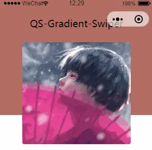
一般用于首页的轮播图, 所以在页面的onReady生命周期函数中使用ref调用setData方法, 传入一个数组, 例如: [ { backgroundColor: '#f1505c', img: '...' }, ... ]
 下载 17821
 赞赏 28
赞赏 28

 下载 12425046
 赞赏 1934


 赞赏
赞赏
 京公网安备:11010802035340号