

 收藏人数:
收藏人数:
 https://github.com/HuLuoQian/QS-tabs
 下载插件并导入HBuilderX
 下载示例项目ZIP
 赞赏(2)
赞赏(2)
更新记录
1.4(2019-11-28) 下载此版本
width属性改为minWidth tab宽度优化为不固定, 优化代码, 新增space、activeBold、lineColor属性, 详见 1.4属性更新
1.3(2019-11-19) 下载此版本
优化line3示例, 隐藏滑动条,若滑动条还在就去看注意里的2
1.2(2019-11-08) 下载此版本
修复IOS line2、line3 不生效问题
查看更多平台兼容性
可拖进示例项目运行
QQ交流群: 750104037 点我加入
推荐使用性能更好更稳定的 QS-tabs-wxs-list 高性能极致体验
作者想说
如果该插件有什么问题还请大家说出来哦,还有如果有什么建议的话也可以提下呐 ~ 如果觉得好用,可以回来给个五星好评么\~\~(❁´◡`❁)*✲゚* 蟹蟹\~拜托啦\~
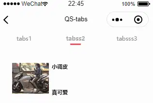
组件简介
实用、好看的tabs选项卡组件
注意
1.小程序的模拟器可能不会显示线条动画,但是真机是好的,以真机为准
2.如果不想要滚动条, 将下面的样式放入app.vue中:
::-webkit-scrollbar {
        display: none;
        width: 0 !important;
        height: 0 !important;
        -webkit-appearance: none;
        background: transparent;
    }
3.line3模式注意:
- 使用line3模式时, 请不要在swiper的change事件中改变current,应该在swiper的animationfinish中改变current
- 使用line3模式时, 请不要使swiper和QS-tabs绑定同一个current,在QS-tabs的change事件中不要改变QS-tabs所绑定的current,应该改变swiper的current,并且在swiper的change事件中改变swiper和QS-tabs的current
兼容性
line1或无线条动画: 全端, 字节跳动小程序未测试
line2: 百度小程序不支持, 字节跳动小程序未测试
line3: 百度小程序、支付宝小程序(swiper的@transitoin不能获取dx)不支持, 字节跳动小程序未测试
更新说明
| 版本 | 说明 |
|---|---|
| v1.4 | width属性改为minWidth tab宽度优化为不固定, 优化代码, 新增space、activeBold、lineColor属性, 详见 1.4属性更新 |
| v1.3 | 优化line3示例, 隐藏滑动条,若滑动条还在就去看注意里的2 |
| v1.2 | 修复IOS line2、line3 不生效问题 |
| v1.1 | animationMode 新增 line3 模式, 并新增 swiperWidth属性 |
大纲
1.属性说明
注:目前QS-tabs的单位为rpx
| 属性 | 是否必填 | 值类型 | 默认值 | 说明 |
|---|---|---|---|---|
| tabs | 是 | Array\<Object|String> | 需循环的标签列表, 详见 1.0.1 | |
| current | 是 | Number | 0 | 当前所在滑块的 index |
| @change | Function | QS-tabs中的item被点击时的回调 | ||
| height | Number | 80 | QS-tabs的高度和行高 | |
| Number | 250 | 单个tab的最小宽度 | ||
| fontSize | Number | 30 | 字体大小 | |
| activeColor | Color | #33cc33 | 选中项的主题颜色 | |
| defaultColor | Color | #888 | 未选中项的主题颜色 | |
| animationMode | String | 动画类型, 详见 1.0.2 | ||
| animationLineWidth | Number | 20 | 动画线条的宽度, 单位: % |
|
| line2Style | Style | line2线条的样式 | ||
| autoCenter | Boolean | true | 是否自动滚动至中心目标 | |
| autoCenterMode | String | component | 滚动至中心目标类型, 详见 1.0.3 | |
| activeStyle | Style | line1模式选中项的样式 | ||
| defaultStyle | Style | line1模式未选中项的样式 | ||
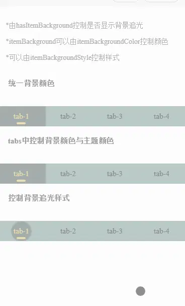
| backgroundColor | Color | 统一背景颜色 | ||
| hasItemBackground | Boolean | 是否开启背景追光 | ||
| itemBackgroundColor | Color | 统一追光背景颜色 | ||
| itemBackgroundStyle | Style | 追光样式 | ||
| zIndex | Number | css的z-index属性值 | ||
| v1.1新增 | ||||
| swiperWidth | Number | 当animationMode为line3时可传联动swiper的宽度, 单位rpx | ||
| v1.4新增 | ||||
| space | String|Number | 40 | tab间距, 单位rpx | |
| activeBold | Boolean | true | 当前tab字体是否加粗 | |
| lineColor | Color | line颜色, 若不设置则跟随主题颜色 |
1.0.1 tabs -> 1.属性说明
| 属性 | 是否必填 | 值类型 | 默认值 | 说明 |
|---|---|---|---|---|
| name | 是 | String | 显示的tab标签名称 | |
| activeColor | Color | 选中此项时,过渡的主题颜色 | ||
| defaultColor | Color | 未选中此项时,过渡的主题颜色 | ||
| backgroundColor | Color | 选中此项时,过渡的背景颜色 | ||
| itemBackgroundColor | Color | 选中此项时,过渡的背景追光颜色 |
1.0.2 animationMode -> 1.属性说明
| 值 | 说明 |
|---|---|
| line1 | 动画1,详见示例项目(默认) |
| line2 | 动画2,详见示例项目 |
| line3 | 动画3,详见示例项目, 若启用此项则需绑定swiper的transition事件与animationfinish事件,详见示例项目 |
| none | 无 |
1.0.3 autoCenterMode -> 1.属性说明
| 值 | 说明 |
|---|---|
| components | 以组件中心为滚动目标(默认) |
| window | 以屏幕中心为滚动目标 |
2. ref调用
| 方法 | 传入参数类型 | 说明 |
|---|---|---|
| getQuery | Function | 获取QS-tabs的布局信息, 从传入的方法中接收一个参数 |
| setDx | dx | line3模式需调用此方法传入swiper的@transition返回的dx |
| setFinishCurrent | current | line3模式需调用此方法传入swiper的@animationfinish返回的current |
 下载 17821
 赞赏 28
赞赏 28

 下载 12266363
 赞赏 1922


 赞赏
赞赏

 京公网安备:11010802035340号