更新记录
0.1.6(2023-10-31)
下载此版本
优化首次加载tabs时底部bar的展示速度
平台兼容性
uni-app
| Vue2 |
Vue3 |
Chrome |
Safari |
app-vue |
app-nvue |
Android |
iOS |
鸿蒙 |
| √ |
√ |
√ |
√ |
√ |
√ |
- |
- |
- |
| 微信小程序 |
支付宝小程序 |
抖音小程序 |
百度小程序 |
快手小程序 |
京东小程序 |
鸿蒙元服务 |
QQ小程序 |
飞书小程序 |
小红书小程序 |
快应用-华为 |
快应用-联盟 |
| √ |
√ |
√ |
√ |
√ |
√ |
- |
√ |
√ |
- |
√ |
√ |
其他
z-tabs


z-tabs文档
基本使用
<template>
    <z-tabs :list="list"></z-tabs>
</template>

<script>
    export default {
        data() {
            return {
                list: []
            }
        },
        onLoad() {
            const list = [];
            for(let i = 0;i < 10;i++) {
                // list内item支持字符串或对象,下方这个是字符串
                list.push('tab标题');

                // 如果要展示徽标数,则list中item的数据结构应为:
                list.push({
                    name: 'tab标题',
                    badge: {
                        // 设置徽标数为6
                        count: 6
                    }
                });
            }
            this.list = list;
        }
    }
</script>
props
| 参数 |
说明 |
类型 |
默认值 |
可选值 |
| list |
数据源数组,支持形如['tab1','tab2']的格式或[{name:'tab1',value:1}]的格式 |
Array |
[] |
- |
| current |
当前选中的index |
Number|String |
0 |
- |
| scroll-count |
list数组长度超过scrollCount时滚动显示(不自动铺满全屏) |
Number|String |
5 |
- |
| tab-width |
自定义每个tab的宽度,默认为0,即代表根据内容自动撑开,单位为rpx |
Number|String |
0 |
0 |
| bar-width |
滑块宽度,单位rpx |
Number|String |
45 |
- |
| bar-height |
滑块高度,单位rpx |
Number|String |
8 |
- |
| bar-style |
滑块样式,其中的width和height将被bar-width和bar-height覆盖 |
Object |
{} |
- |
| bar-animate-mode |
【v0.1.5起支持】切换tab时滑块动画模式,与swiper联动时有效,点击切换tab时无效,必须调用setDx。默认为line,即切换tab时滑块宽度保持不变,线性运动。可选值为worm,即为类似毛毛虫蠕动效果 |
String |
line |
worm |
| name-key |
list中item的name(标题)的key |
String |
name |
- |
| value-key |
list中item的value的key |
String |
value |
- |
| active-color |
激活状态tab的颜色 |
String |
#007AFF |
- |
| inactive-color |
未激活状态tab的颜色 |
String |
#888888 |
- |
| active-style |
激活状态tab的样式 |
Object |
{} |
- |
| inactive-style |
未激活状态tab的样式 |
Object |
{} |
- |
| badge-max-count |
徽标数最大数字限制,超过这个数字将变成badge-max-count+ |
Number|String |
99 |
- |
| badge-style |
徽标样式,例如可自定义背景色,字体等等 |
Object |
{} |
- |
| bg-color |
z-tabs背景色 |
String |
white |
- |
| tabs-style |
z-tabs样式 |
Object |
{} |
- |
| init-trigger-change |
初始化时是否自动触发change事件 |
Boolean |
true |
false |
events
| 事件名 |
说明 |
回调参数 |
| @change |
tabs改变(点击)时触发 |
参数1:index(当前切换到的index);
参数2:value(当前切换到的value) |
methods
| 方法名 |
说明 |
参数 |
| setDx |
【v0.1.4起支持】根据swiper的@transition实时更新底部dot位置 |
swiper的@transition中的e.detail.dx |
| unlockDx |
【v0.1.4起支持】在swiper的@animationfinish中通知z-tabs结束多setDx的锁定,若在父组件中调用了setDx,则必须调用unlockDx |
- |
slots
| 名称 |
说明 |
| left |
tabs左侧插槽 |
| right |
tabs右侧插槽 |
支持全局配置
- 在
/z-tabs/components/z-tabs/config/index.js文件中进行配置
export default {
    'active-color': 'red'
}
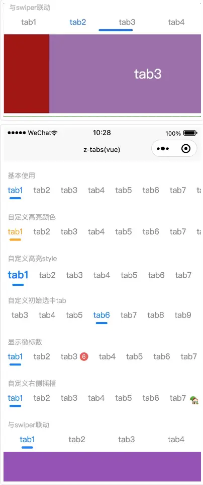
【v0.1.4起支持】底部dot与swiper联动演示
<template>
  <z-tabs ref="tabs" :list="tabList" :current="current" @change="tabsChange" />
  <swiper :current="current" @transition="swiperTransition" @animationfinish="swiperAnimationfinish">
    <swiper-item class="swiper-item" v-for="(item, index) in tabList" :key="index">
      xxx
    </swiper-item>
  </swiper>
<template>
<script>
    export default {
        data() {
            return {
                tabList: ['测试1','测试2','测试3','测试4'],
                current: 0, // tabs组件的current值,表示当前活动的tab选项
            };
        },
        methods: {
            //tabs通知swiper切换
            tabsChange(index) {
                this.current = index;
            },
            //swiper滑动中
            swiperTransition(e) {
                this.$refs.tabs.setDx(e.detail.dx);
            },
            //swiper滑动结束
            swiperAnimationfinish(e) {
                this.current = e.detail.current;
                this.$refs.tabs.unlockDx();
            }
        }
    }
</script>
样例
<template>
    <view class="content">
        <!-- 基本使用 -->
        <view class="group">
            <text class="group-title">
                基本使用
            </text>
            <z-tabs :list="list"></z-tabs>
        </view>

        <!-- 自定义高亮颜色 -->
        <view class="group">
            <text class="group-title">
                自定义高亮颜色
            </text>
            <z-tabs :list="list" active-color="orange"></z-tabs>
        </view>

        <!-- 自定义高亮style -->
        <view class="group">
            <text class="group-title">
                自定义高亮style
            </text>
            <z-tabs :list="list" :active-style="{'font-size':'40rpx','font-weight':'bold'}"></z-tabs>
        </view>

        <!-- 自定义初始选中tab -->
        <view class="group">
            <text class="group-title">
                自定义初始选中tab
            </text>
            <z-tabs :list="list" :current="5"></z-tabs>
        </view>

        <!-- 显示徽标数 -->
        <view class="group">
            <text class="group-title">
                显示徽标数
            </text>
            <z-tabs :list="badgeList"></z-tabs>
        </view>

        <!-- 自定义右侧插槽 -->
        <view class="group">
            <text class="group-title">
                自定义右侧插槽
            </text>
            <z-tabs :list="list">
                <template v-slot:right>
                    <view style="margin: 0 10rpx;">🏡</view>
                </template>
            </z-tabs>
        </view>

        <!-- 二次点击触发事件 -->
        <view class="group">
            <text class="group-title">
                二次点击触发事件
            </text>
            <z-tabs :list="list" @secondClick="secondClick"></z-tabs>
        </view>

        <!-- 与swiper联动 -->
        <view class="group">
            <text class="group-title">
                与swiper联动
            </text>
            <!-- 可通过设置bar-animate-mode="worm"开启毛毛虫模式-->
            <z-tabs ref="tabs" :current="swiperCurrent" :list="swiperList" @change="tabsChange"></z-tabs>
            <swiper class="swiper" :current="swiperCurrent" @transition="swiperTransition" @animationfinish="swiperAnimationfinish">
                <swiper-item v-for="(item, index) in swiperList" :key="index">
                    <view class="swiper-item-view" :style="{backgroundColor: item.color}">
                        {{item.name}}
                    </view>
                </swiper-item>
            </swiper>
        </view>

        <!-- #ifdef APP-PLUS -->
        <view class="to-nvue-btn" @click="gotoNvue">
            查看nvue-demo
        </view>
        <!-- #endif -->
        <!-- #ifndef APP-PLUS -->
        <view class="notice">
            —— 将demo运行至APP平台可查看nvue中的运行效果 ——
        </view>
        <!-- #endif -->
    </view>
</template>

<script>
    export default {
        data() {
            return {
                list: [],
                badgeList: [],
                swiperList: [],
                swiperCurrent: 0
            }
        },
        onLoad() {
            //普通情况数组
            const list = [];
            for(let i = 0;i < 10;i++) {
                list.push('tab' + (i + 1));
            }
            this.list = list;

            //自定义徽标数数组
            const badgeList = [];
            for(let i = 0;i < 10;i++) {
                if(i !== 2){
                    badgeList.push({
                        name: 'tab' + (i + 1),
                    });
                }else {
                    badgeList.push({
                        name: 'tab' + (i + 1),
                        badge: {
                            count: 6
                        }
                    });
                }
            }
            this.badgeList = badgeList;

            //与swiper联动数组
            const swiperList = [];
            for(let i = 0;i < 4;i++) {
                swiperList.push({
                    name: 'tab' + (i + 1),
                    color: this._getRandomColor()
                });
            }
            this.swiperList = swiperList;
        },
        methods: {
            gotoNvue(){
                uni.navigateTo({
                    url: '/pages/index-nvue/index-nvue'
                })
            },

            //tabs通知swiper切换
            tabsChange(index) {
                this.swiperCurrent = index;
            },
            //swiper滑动中
            swiperTransition(e) {
                this.$refs.tabs.setDx(e.detail.dx);
            },
            //swiper滑动结束
            swiperAnimationfinish(e) {
                this.swiperCurrent = e.detail.current;
                this.$refs.tabs.unlockDx();
            },

            // 生成随机颜色
            _getRandomColor() {
                const rgb = [];
                for (let i = 0; i < 3; ++i) {
                    let color = Math.floor(Math.random() * 256).toString(16)
                    color = color.length == 1 ? '0' + color : color
                    rgb.push(color)
                }
                return '#' + rgb.join('');
            },

            //二次点击触发事件
            secondClick(index,item){
                uni.showToast({
                    title: `tab${index+1},二次点击确认`,
                    icon: 'none'
                })
            }
        }
    }
</script>

<style>
    .content{
        padding-bottom: 20rpx;
    }
    .group{
        margin-top: 30rpx;
    }
    .group-title{
        padding-left: 20rpx;
        font-size: 26rpx;
        color: #aaaaaa;
    }
    .swiper{
        height: 300rpx;
    }
    .swiper-item-view{
        background-color: #007AFF;
        height: 300rpx;
        display: flex;
        justify-content: center;
        align-items: center;
        color: white;
        font-size: 50rpx;
    }
    .to-nvue-btn{
        background-color: #007AFF;
        height: 80rpx;
        color: white;
        text-align: center;
        line-height: 80rpx;
        width: calc(100% - 40rpx);
        margin-left: 20rpx;
        margin-top: 20rpx;
        border-radius: 10rpx;
    }
    .notice{
        text-align: center;
        color: #aaaaaa;
        font-size: 24rpx;
        margin-top: 30rpx;
    }
</style>


 收藏人数:
收藏人数:
 https://github.com/SmileZXLee/uni-z-tabs
 下载插件并导入HBuilderX
 赞赏(0)
赞赏(0)
 下载 319
 赞赏 0
赞赏 0

 下载 12424209
 赞赏 1934


 赞赏
赞赏
 京公网安备:11010802035340号