

 收藏人数:
收藏人数:
 下载插件并导入HBuilderX
 赞赏(0)
赞赏(0)
更新记录
1.0.0(2023-12-11) 下载此版本
初始化
平台兼容性
uni-app x
| Chrome | Safari | Android | iOS | 鸿蒙 | 微信小程序 |
|---|---|---|---|---|---|
| - | - | 5.0 | 12 | - | - |
ux-popup 弹窗组件
基础弹窗组件,可在此组件基础上实现自己的业务弹窗,技术支持***:484768861
组件参数
| 参数名 | 类型 | 默认值 | 备注 |
|---|---|---|---|
| pos | string | center | 弹窗弹出方向 |
| isMask | boolean | true | 是否有弹窗遮罩 |
| isMaskClick | boolean | true | 是否点击遮罩关闭弹窗 |
| maskBgColor | string | rgba(0, 0, 0, .4) | 遮罩背景颜色 |
组件方法
| 方法名 | 返回值 | 参数 | 备注 |
|---|---|---|---|
| open | void | 打开弹窗 | |
| close | void | 关闭弹窗 |
组件事件
| 事件名 | 参数 | 备注 |
|---|---|---|
| @mask-click | 点击遮罩 |
使用方式
以uni_modules的方式。将此组件拉下来,在需要使用的地方,可以直接使用
当前pages/index/components/home.uvue
// template
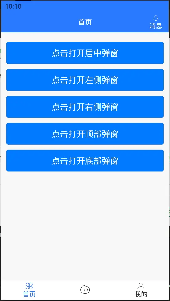
<button class="mt10" type="primary" @tap="open('center')">点击打开居中弹窗</button>
<button class="mt10" type="primary" @tap="open('left')">点击打开左侧弹窗</button>
<button class="mt10" type="primary" @tap="open('right')">点击打开右侧弹窗</button>
<button class="mt10" type="primary" @tap="open('top')">点击打开顶部弹窗</button>
<button class="mt10" type="primary" @tap="open('bottom')">点击打开底部弹窗</button>
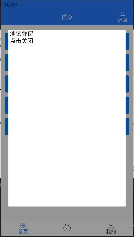
<ux-popup ref="uxPopup" :pos="pos">
<view :class="[`pos-${pos}`]">
测试弹窗
<view @tap="close">
点击关闭
</view>
</view>
</ux-popup>
// script
// 获取组件实例
const popup = this.$refs['uxPopup'] as UxPopupComponentPublicInstance
// 打开弹窗
popup.open()
// 关闭弹窗
popup.close()注意:自定义组件调用方式参考 easycom组件调用方法或设置属性
 下载 528
 赞赏 1
赞赏 1

 下载 12332925
 赞赏 1924


 赞赏
赞赏
 京公网安备:11010802035340号