

 收藏人数:
收藏人数:
 下载插件并导入HBuilderX
 赞赏(0)
赞赏(0)
更新记录
1.0.0(2024-01-08) 下载此版本
新发布
平台兼容性
uni-app
| Vue2 | Vue3 | Chrome | Safari | app-vue | app-nvue | Android | iOS | 鸿蒙 |
|---|---|---|---|---|---|---|---|---|
| √ | √ | √ | √ | √ | √ | - | - | - |
| 微信小程序 | 支付宝小程序 | 抖音小程序 | 百度小程序 | 快手小程序 | 京东小程序 | 鸿蒙元服务 | QQ小程序 | 飞书小程序 | 小红书小程序 | 快应用-华为 | 快应用-联盟 |
|---|---|---|---|---|---|---|---|---|---|---|---|
| √ | √ | √ | √ | √ | √ | - | √ | √ | - | √ | √ |
其他
| 多语言 | 暗黑模式 | 宽屏模式 |
|---|---|---|
| × | × | √ |
Mods-Button 组件
一、组件概述
该组件为一个按钮组件,根据不同的状态显示不同的样式和文本内容。
二、属性 (Props)
- type (String ,默认值:
primary) - 按钮类型,可选值为 'primary', 'loading', 'error', 'success'。 - title (Object ,默认值:
{ primary: '点击提交', loading: '提交中 ~', error: '提交失败', success: '提交成功', }) - 按钮的文本内容 - disable (Boolean ,默认值:
false) - 是否禁用按钮。 - primary (String ,默认值:
primary) - 主要按钮类型。 - loading (String ,默认值:
loading) - 加载中按钮类型。 - error (String ,默认值:
error) - 错误按钮类型。 - success (String ,默认值:
success) - 成功按钮类型。 - delay (Number ,默认值:
800) - 点击事件的延迟时间,单位毫秒。 - size (String ,默认值:
default) - 按钮大小,可选值为 'default', 'mini', 'medium'。 - useThrottle (Boolean ,默认值:
false) - 是否开启节流功能。 - openwork (String ,默认值:
default) - 是否开启镂空样式。 - colorData (Object ,默认值:
{ primary: 'rgb(25,137,250)', loading: 'rgb(25,137,250)', error: 'rgb(238,10,36)', success: 'rgb(7,193,93)', }) - 按钮颜色数据
三、事件 (Events)
- click - 按钮被点击时。
四、使用方法
在需要使用按钮的页面或组件中,引入 Mods-Button 组件,并传入相应的属性。
<template>
  <Mods-Button
    type="primary"
    title="点击提交"
    :disable="false"
    :delay="800"
    size="default"
    :useThrottle="false"
    :openwork="false"
    :colorData="{
      primary: 'rgb(25,137,250)',
      loading: 'rgb(25,137,250)',
      error: 'rgb(238,10,36)',
      success: 'rgb(7,193,93)',
    }"
    @click="handleClick"
  />
</template>

<script>
import ModsButton from "@/components/Mods-Button/libs.js";

export default {
  name: "MyComponent",
  components: {
    ModsButton,
  },
  methods: {
    handleClick() {
      // 处理点击事件
    },
  },
};
</script>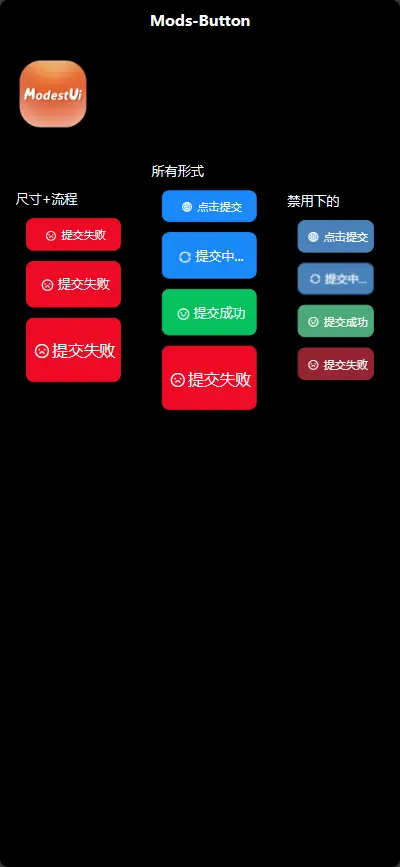
 下载 173
 赞赏 0
赞赏 0

 下载 12371902
 赞赏 1927


 赞赏
赞赏
 京公网安备:11010802035340号