更新记录
1.0.0(2024-03-13)
下载此版本
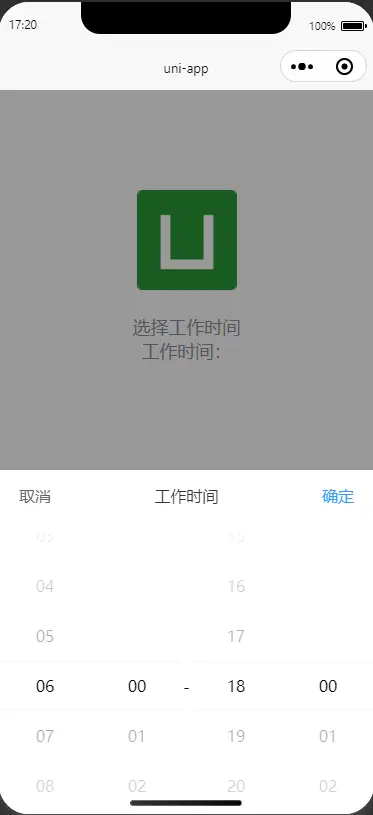
1.0.0--本插件结合了uni-popup 弹出层封装的工作时间选择器
平台兼容性
uni-app
| Vue2 |
Vue3 |
Chrome |
Safari |
app-vue |
app-nvue |
Android |
iOS |
鸿蒙 |
| √ |
- |
√ |
√ |
√ |
- |
- |
- |
- |
| 微信小程序 |
支付宝小程序 |
抖音小程序 |
百度小程序 |
快手小程序 |
京东小程序 |
鸿蒙元服务 |
QQ小程序 |
飞书小程序 |
小红书小程序 |
快应用-华为 |
快应用-联盟 |
| √ |
√ |
√ |
√ |
- |
- |
- |
- |
- |
- |
- |
- |
其他
使用组件
<Working-hours ref="TimePickerPopupRef" :value="value" @confirm="confirm"></Working-hours>
export default {
    data() {
        return {
          birthday: ['06', '00', '18', '00'],
            time:''
        }
    },
    onReady() {
        this.open();
    },
    methods: {
        confirm(data) {
            this.time=`上午${data[0]}:${data[1]}-下午${data[2]}:${data[3]}`
        },
        open() {
            this.$refs.TimePickerPopupRef.open();
        }
    }
}
参数
// 当前选中的值
value: {
    type: Array,
    default: () => (['09', '00', '18', '00'])
},
// 标题
title: {
    type: String,
    default: '工作时间'
},
// 取消按钮文字
cancelText: {
    type: String,
    default: '取消'
},
// 取消按钮颜色
canceColor: {
    type: String,
    default: '#666666'
},
// 确定按钮文字
confirmText: {
    type: String,
    default: '确定'
},
// 确定按钮颜色
confirmColor: {
    type: String,
    default: '#369AFE'
},
// 分割符
segmentation: {
    type: String,
    default: '-'
},
// 设置选择器中间选中框的类名 注意页面或组件的style中写了scoped时,需要在类名前写/deep/
indicatorClass: {
    type: String,
    default: 'picker-view__indicator'
},
// 设置选择器中间选中框的样式
indicatorStyle: {
    type: String,
    default: ''
},
本插件结合了uni-popup 弹出层使用
注意:必须引入ni-popup 弹出层组件


 收藏人数:
收藏人数:
 下载插件并导入HBuilderX
 下载示例项目ZIP
 赞赏(2)
赞赏(2)

 下载 2682
 赞赏 59
赞赏 59

 下载 12386353
 赞赏 1928


 赞赏
赞赏

 京公网安备:11010802035340号