更新记录
1.7(2020-07-08)
下载此版本
-
优化 当backgroundColor背景颜色改变时,组件内部 在Vue使用animation api, 在 Nvue使用animation模块 来改变背景颜色
-
修复 app-nvue 与 H5 borderRadius属性 简写 与 分开写冲突问题
1.6(2020-07-07)
下载此版本
1.5(2020-06-24)
下载此版本
查看更多
平台兼容性
-
QQ交流群: 750104037 点我加入
-
快速指引
-
-
-
-
-
-
-
-
注意
-
组件使用了uni官方的uni-icons,请务必保证在 项目/components/ 下有uniIcons组件文件夹
示例项目目录结构
|-- QS-Navbar
    |-- App.vue
    |-- main.js
    |-- manifest.json
    |-- pages.json
    |-- README.md
    |-- components
    |   |-- QS-nav-bar  //组件文件夹
    |   |   |-- QS-nav-bar.vue  //核心vue文件
    |   |-- uni-icons
    |       |-- icons.js
    |       |-- uni-icons.vue
    |-- pages
    |   |-- index
    |       |-- index.vue
    |-- static
        |-- logo.png
        |-- blackmonth-swiper
Attributes
props: {
    fixed: {    //是否悬浮在顶部
        type: [Boolean, String],
        default: true
    },
    backgroundColor: {  //背景颜色
        type: String,
        default: '#ffffff'
    },
    statusBar: {    //是否包含系统状态栏高度
        type: [Boolean, String],
        default: true
    },
    navbarItems: {  //导航栏元素序列
        type: Array,
        default() {
            return [];
        }
    },
    diffMenuButtonInfo: {   //小程序是否腾出胶囊菜单的空间
        type: [Boolean, String],
        default: true
    },
    hasPlacherholder: { //fixed为true时是否占位原高度
        type: [Boolean, String],
        default: true
    },
    zIndex: {   //css的z-index值 不知道这里设置有没有效,没有测试
        type: [Number, String],
        default: 998
    }
}
Events
| 事件名 |
说明 |
形参 |
| click |
元素点击事件 |
(item<Object>, index) |
Methods
| 方法名 |
说明 |
传入参数 |
| getQuery |
获取该组件的布局信息 |
|
navbarItems参数详解
|navbarItems Array<Object>
    [
        {
            type: '', //元素类型, 取值: 'text'、'image'、'icon'、'search','colImageText', 有需求可以自己加,

            //text、search、colImageText
            text: '', //type为text或search时的文本内容

            //image、colImageText
            src: '', //type为image、colImageText时的图片路径
            mode: 'aspectFill', //type为image、colImageText时image组件的mode参数值

            //icon
            icon: '', //type为icon时的icon图标名称
            iconSize: 26,  //type为icon时的icon图标大小, 单位px
            iconColor: '#000000',  //type为icon时的icon图标颜色

            //公共属性
            width: 0, //type: any, 元素的宽度, 总长度100, 自行分配宽度
            backgroundColor: '', //type: any, 元素的背景颜色
            borderRadius: '', //type: any, 元素的圆角值
            border: '', //type: any, 元素的边框
            layout: '', //type: any, 元素的布局, 可取值: 'left'、'center'、'right'

            itemBorderRadius: '8rpx', //type: image、text、colImageText, 元素内组件的圆角值
            imageBorderRadius: '4px', //type: colImageText, 元素内图片的圆角值
            itemBackgroundColor: '', //type: image、text、colImageText, 元素内组件的背景颜色
            itemWidth: '100%', //type: image、text、colImageText, 元素内组件的宽度
            itemHeight: '100%', //type: image、text、colImageText, 元素内组件的高度

            fontSize: '100%', //type: text、colImageText, 元素内组件的字体大小
            color: '#000', //type: text、colImageText, 元素内组件的文本颜色
            textAlign: '100%', //type: text, 元素内组件的文本布局方式
            weight: '0', //type: text、colImageText, 元素内组件的粗细程度

            //点击事件控制
            doEvent: '', //点击元素时 可以设置对应事件, 目前内置的有'back'(返回页面)、'navigateTo'(跳转页面), 若不传则emit事件(click)至父级
            targetPath: '', //doEvent为navigateTo时跳转页面的路径
        }
    ]
提示
-
如果觉得 页面上每次都需要在data中设置一个navbarItems 麻烦的话可以对于一些简单的页面(只包含back按钮和页面标题)写一个公共的方法来返回navbaritems,只要传入页面标题即可返回navbarItems
示例代码
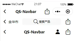
<template>
    <view>
        <QSNavbar :navbarItems="navbarItems_1" @click="click"></QSNavbar>
        <QSNavbar :navbarItems="navbarItems_2" fixed="false" statusBar="false" diffMenuButtonInfo="false" @click="click"></QSNavbar>
        <QSNavbar :navbarItems="navbarItems_3" fixed="false" statusBar="false" diffMenuButtonInfo="false" @click="click"></QSNavbar>
    </view>
</template>
import QSNavbar from '@/components/QS-Navbar/QS-Navbar.vue';
export default {
    components: { QSNavbar },
    data() {
        return {
            navbarItems_1: [
                {
                    type: 'icon',
                    icon: 'back',
                    width: 15,
                    doEvent: 'back',
                    layout: 'left'
                },
                {
                    type: 'text',
                    text: 'QS-Navbar',
                    width: 70,
                    weight: 'bold'
                },
                {
                    type: 'icon',
                    icon: 'upload',
                    width: 15,
                    layout: 'right'
                }
            ],
            navbarItems_2: [
                {
                    type: 'icon',
                    icon: 'back',
                    width: 10,
                    doEvent: 'back',
                    layout: 'left'
                },
                {
                    type: 'text',
                    text: '金华市',
                    width: 20,
                    fontSize: '14px',
                    textAlign: 'left'
                },
                {
                    type: 'search',
                    backgroundColor: '#f8f8f8',
                    borderRadius: '10rpx',
                    text: '搜索产品',
                    width: 55,
                    weight: 'bold'
                },
                {
                    type: 'icon',
                    icon: 'upload',
                    width: 15,
                    layout: 'right'
                }
            ],
            navbarItems_3: [
                {
                    type: 'icon',
                    icon: 'back',
                    width: 26,
                    doEvent: 'back',
                    layout: 'left'
                },
                {
                    type: 'text',
                    text: 'QS-Navbar',
                    width: 48,
                    weight: 'bold'
                },
                {
                    type: 'icon',
                    icon: 'person-filled',
                    width: 13
                },
                {
                    type: 'icon',
                    icon: 'upload',
                    width: 13,
                    layout: 'right'
                }
            ]
        }
    },
    methods: {
        click(e, index) {
            uni.showToast({
                title: `点击了第${index}项`,
                position: 'center',
                icon: 'none'
            })
        }
    }
}


 收藏人数:
收藏人数:
 下载插件并导入HBuilderX
 下载示例项目ZIP
 赞赏(0)
赞赏(0)
 下载 17821
 赞赏 28
赞赏 28

 下载 12312426
 赞赏 1923


 赞赏
赞赏
 京公网安备:11010802035340号