

 收藏人数:
收藏人数:
 购买源码授权版(
 试用
试用
 赞赏(0)
赞赏(0)
更新记录
1.0.0(2025-04-10)
- 【新增】对话框,菜单对话框,提示,通知/消息通知,菜单,底部对话框,底部菜单
- 【新增】初始化第一版本
平台兼容性
uni-app
| Vue2 | Vue3 | Chrome | Safari | app-vue | app-nvue | Android | iOS | 鸿蒙 |
|---|---|---|---|---|---|---|---|---|
| √ | √ | - | - | - | - | 5.0 | × | × |
| 微信小程序 | 支付宝小程序 | 抖音小程序 | 百度小程序 | 快手小程序 | 京东小程序 | 鸿蒙元服务 | QQ小程序 | 飞书小程序 | 小红书小程序 | 快应用-华为 | 快应用-联盟 |
|---|---|---|---|---|---|---|---|---|---|---|---|
| × | × | × | × | × | × | - | × | × | - | × | × |
uni-app x
| Chrome | Safari | Android | iOS | 鸿蒙 | 微信小程序 |
|---|---|---|---|---|---|
| - | - | 5.0 | × | × | × |
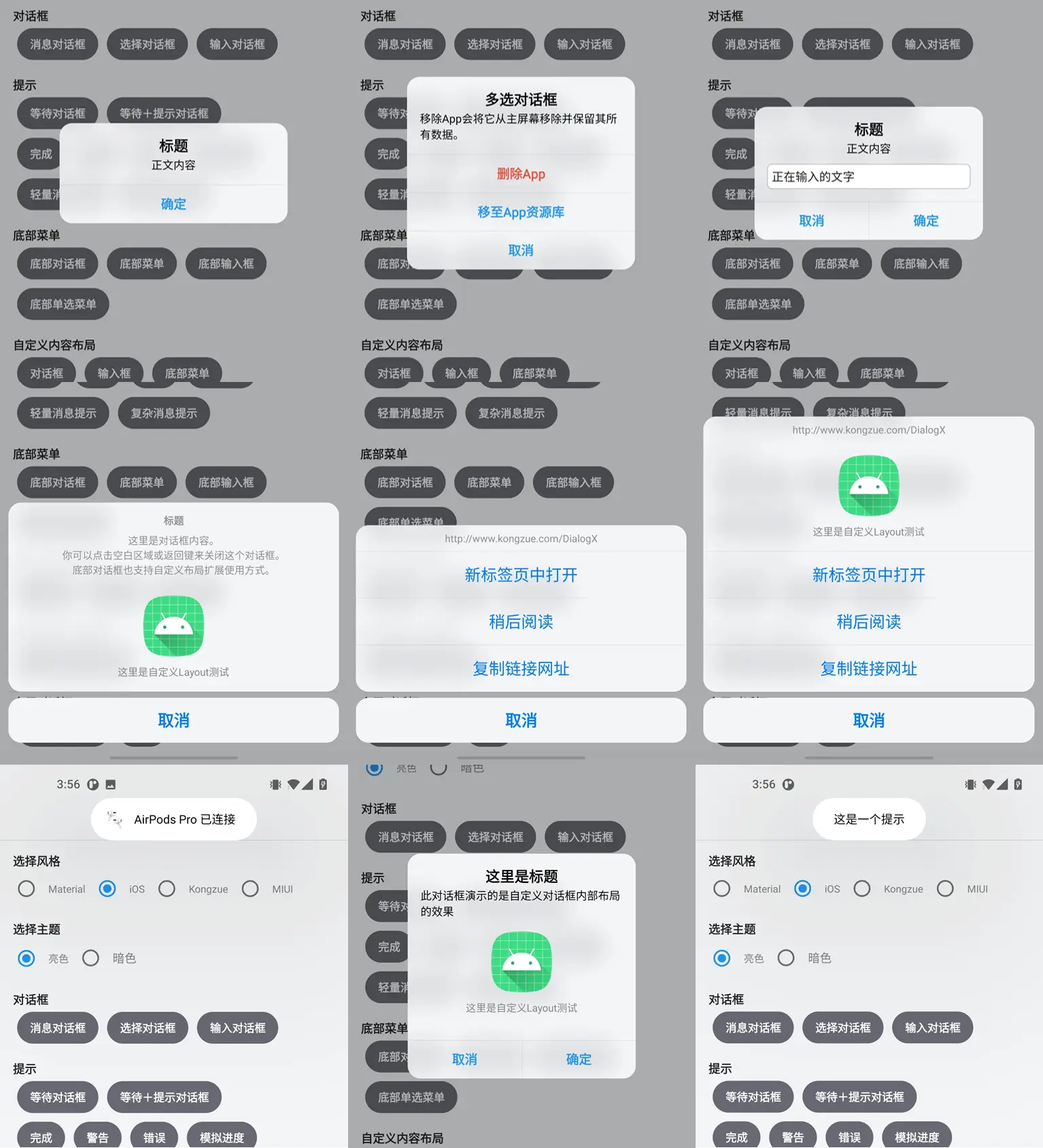
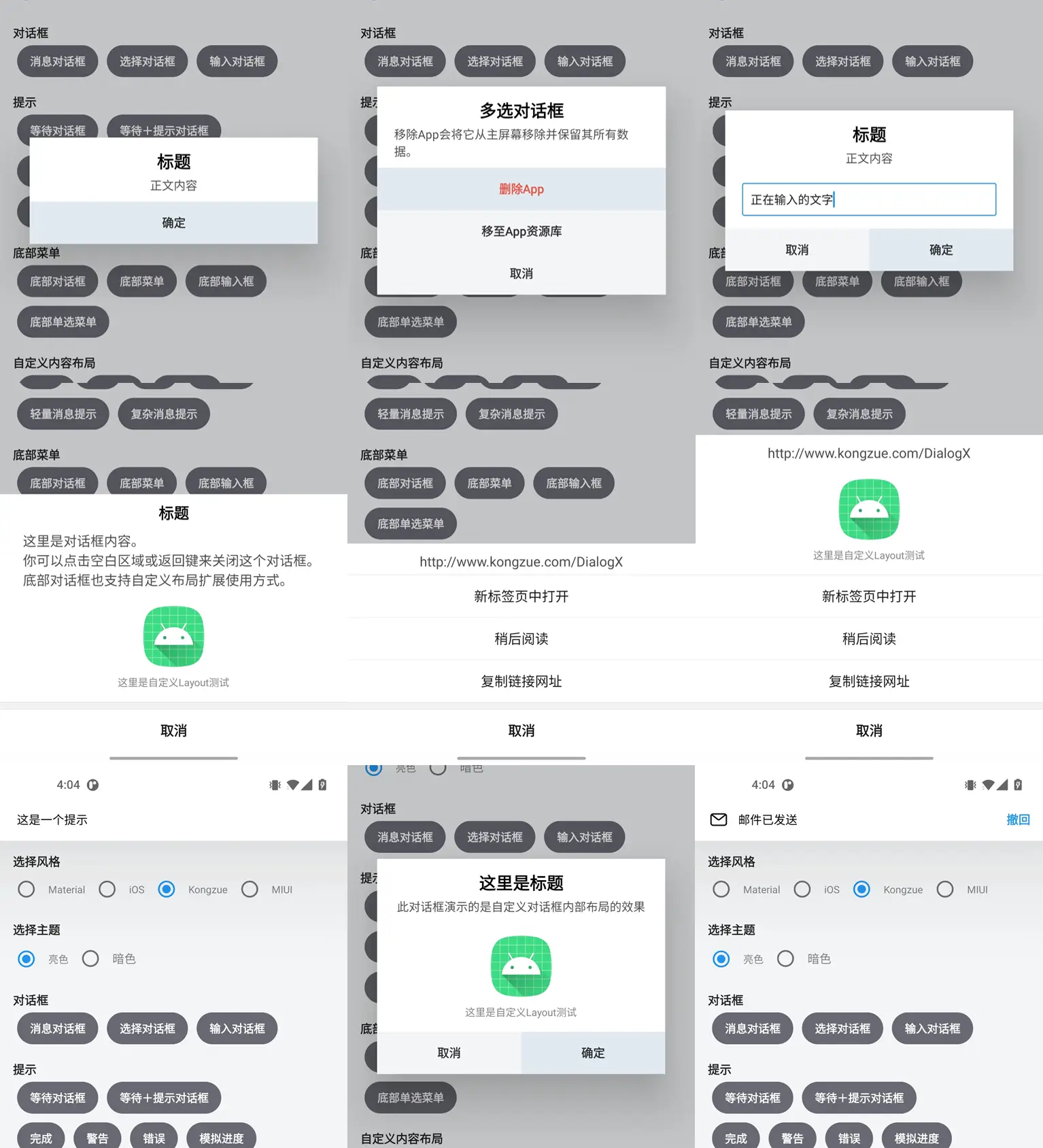
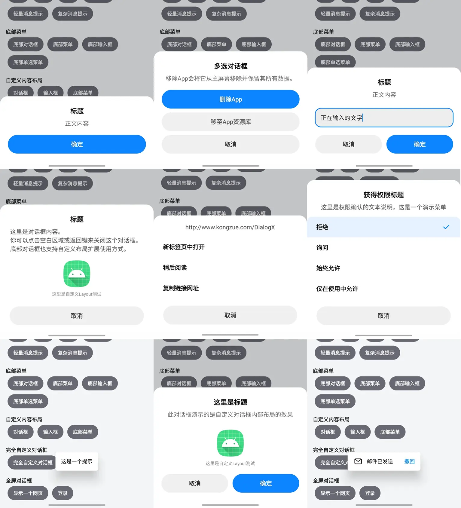
弹窗支持多种主题(支持 uni-app 和 uni-app x)
支持多种主题,更适应各种场景:
-
Material
-
iOS
-
MIUI
-
Kongzue
-
UVUE使用示例
<template>
    <view class="box">
        <button class="btn" @click="handleShowMessageDialog">显示对话框</button>
        <button class="btn" @click="handleShowMessageMenu">显示菜单对话框</button>
        <button class="btn" @click="handleShowPopTip">显示提示</button>
        <button class="btn" @click="handleShowPopNotification">显示通知</button>
        <button class="btn" @click="handleShowPopMenu">显示菜单</button>
        <button class="btn" @click="handleShowBottomDialog">显示底部对话框</button>
        <button class="btn" @click="handleShowBottomMenu">显示底部菜单</button>
    </view>
</template>

<script setup>
import {
    XDialogS,
    X_DIALOG_CONFIG,
    X_POPNOTIFICATION_OPTIONS,
    X_POPNOTIFICATION_RESULT,
    X_POPTIP_OPTIONS,
    X_POPTIP_RESULT,
    X_MESSAGEDIALOG_OPTIONS,
    X_MESSAGEDIALOG_RESULT,
    X_POPMENU_OPTIONS,
    X_POPMENU_RESULT,
    X_BOTTOMDIALOG_OPTIONS,
    X_BOTTOMDIALOG_RESULT,
    X_BOTTOMMENU_OPTIONS
} from "@/uni_modules/x-dialog-s"
let xDialogS = new XDialogS()

onReady(() => {
    xDialogS.config({
        DEBUGMODE:true,
        globalStyle:"ios"
    } as X_DIALOG_CONFIG)
})

const handleShowMessageDialog = () => {
    xDialogS.showMessageDialog({
        title: "提示",
        content: "你在干嘛呢",
        btnOkText: "确认",
        btnCancelText: "取消",
        success: (result:X_MESSAGEDIALOG_RESULT) => {
            console.log(result)
        },
        fail: (result:X_MESSAGEDIALOG_RESULT) => {
            console.log(result)
        },
    } as X_MESSAGEDIALOG_OPTIONS)
}

const handleShowPopTip = () => {
    xDialogS.showPopTip({
        content: "你好 uni-app x"
    } as X_POPTIP_OPTIONS)
}
const handleShowPopNotification = () => {
    xDialogS.showPopNotification({
        icon: "/static/logo.png",
        title: "GV给你发消息了",
        content: "你在干嘛呀",
        btnText: "回复",
        success: (result:X_POPNOTIFICATION_RESULT) => {
            console.log(result)
        },
        fail: (result:X_POPNOTIFICATION_RESULT) => {
            console.log(result)
        }
    } as X_POPNOTIFICATION_OPTIONS)
}

const handleShowPopMenu = () => {
    xDialogS.showPopMenu({
        menus: ["你好","测试1","测试2","测试3"],
        pressedIndex: 2,
        success: (result:X_POPMENU_RESULT) => {
            console.log(result)
        },
        fail: (result:X_POPMENU_RESULT) => {
            console.log(result)
        }
    } as X_POPMENU_OPTIONS)
}

const handleShowBottomDialog = () => {
    xDialogS.showBottomDialog({
        content: "你好啊",
        btnOkText: "确认",
        btnCancelText: "取消",
        success: (result:X_BOTTOMDIALOG_RESULT) => {
            console.log(result)
        },
        fail: (result:X_BOTTOMDIALOG_RESULT) => {
            console.log(result)
        }
    } as X_BOTTOMDIALOG_OPTIONS)
}

const handleShowBottomMenu = () => {
    xDialogS.showBottomMenu({
        menus: ["测试1","测试1","测试1","测试1"]
    } as X_BOTTOMMENU_OPTIONS)
}
</script>

<style>
    .box{
        padding: 15px;
    }
    .btn{
        margin-bottom: 15px;
        background-color: blue;
        color: #ffffff;
    }
</style>- VUE使用示例
<template>
    <view class="box">
        <button class="btn" @click="handleShowMessageDialog">显示对话框</button>
    </view>
</template>

<script setup>
import { XDialogS } from "@/uni_modules/x-dialog-s"
let xDialogS = new XDialogS()

onReady(() => {
    xDialogS.config({
        DEBUGMODE:true,
        globalStyle:"ios"
    })
})

const handleShowMessageDialog = () => {
    xDialogS.showMessageDialog({
        title: "提示",
        content: "你在干嘛呢",
        btnOkText: "确认",
        btnCancelText: "取消",
        success: (result) => {
            console.log(result)
        },
        fail: (result) => {
            console.log(result)
        },
    })
}
</script>

<style>
    .box{
        padding: 15px;
    }
    .btn{
        margin-bottom: 15px;
        background-color: blue;
        color: #ffffff;
    }
</style>- 暴露的
interface.uts
/**
 * @param {String} 主题样式
 */
export type X_GLOBAL_STYLE = "material" | "ios" | "kongzue" | "miui";
/**
 * @param {String} 主题模式
 */
export type X_GLOBAL_THEME = "light" | "dark" | "auto"

/**
 * 设置全局配置
 * @param {Boolean} DEBUGMODE 开启调试模式,在部分情况下会使用 Log 输出日志信息
 * @param {X_GLOBAL_STYLE} globalStyle 设置主题样式
 * @param {X_GLOBAL_THEME} globalTheme 设置亮色/暗色(在启动下一个对话框时生效)
 * @param {Number} dialogMaxWidth 设置对话框最大宽度(单位为像素)
 * @param {Boolean} autoShowInputKeyboard 设置 InputDialog 自动弹出键盘
 * @param {Boolean} onlyOnePopTip 限制 PopTip 一次只显示一个实例(关闭后可以同时弹出多个 PopTip)
 * @param {String} buttonTextInfo 设置对话框默认按钮文本字体样式
 * @param {String} okButtonTextInfo 设置对话框默认确定按钮文字样式
 * @param {String} titleTextInfo 设置对话框默认标题文字样式
 * @param {String} messageTextInfo 设置对话框默认内容文字样式
 * @param {String} tipTextInfo 设置默认 WaitDialog 和 TipDialog 文字样式
 * @param {String} inputInfo 设置默认输入框文字样式
 * @param {String} menuTitleInfo 设置默认底部菜单、对话框的标题文字样式
 * @param {String} menuTextInfo 设置默认底部菜单文本样式
 * @param {String} backgroundColor 设置默认对话框背景颜色(值为ColorInt,为-1不生效)
 * @param {Boolean} cancelable 设置默认对话框默认是否可以点击外围遮罩区域或返回键关闭,此开关不影响提示框(TipDialog)以及等待框(TipDialog)
 * @param {Boolean} cancelableTipDialog 设置默认提示框及等待框(WaitDialog、TipDialog)默认是否可以关闭
 * @param {String} cancelButtonText 设置默认取消按钮文本文字,影响 BottomDialog
 * @param {String} popTextInfo 设置默认 PopTip 文本样式
 */
export type X_DIALOG_CONFIG = {
    DEBUGMODE?: boolean;
    globalStyle?: X_GLOBAL_STYLE;
    globalTheme?: X_GLOBAL_THEME;
    dialogMaxWidth?: number;
    autoShowInputKeyboard?: boolean;
    onlyOnePopTip?: boolean;
    buttonTextInfo?: string;
    okButtonTextInfo?: string;
    titleTextInfo?: string;
    messageTextInfo?: string;
    tipTextInfo?: string;
    inputInfo?: string;
    menuTitleInfo?: string;
    menuTextInfo?: string;
    backgroundColor?: string;
    cancelable?: boolean;
    cancelableTipDialog?: boolean;
    cancelButtonText?: string;
    popTextInfo?: string;
}

/**
 * 对话框回调
 */
export type X_MESSAGEDIALOG_RESULT = {
    ok: boolean;
    msg: string;
}
/**
 * 对话框配置
 * @param {String} title 标题
 * @param {String} content 内容
 * @param {String} btnOkText 确认按钮文字(不设置则不显示)
 * @param {String} btnCancelText 取消按钮文字(不设置则不显示)
 * @param {String} buttonOrientation 按钮方向(默认横向)
 * @param {String} bgColor 背景颜色
 */
export type X_MESSAGEDIALOG_OPTIONS = {
    title?: string;
    content?: string;
    btnOkText?: string;
    btnCancelText?: string;
    buttonOrientation?: string;
    bgColor?: string;
    success?: (result:X_MESSAGEDIALOG_RESULT) => void;
    fail?: (result:X_MESSAGEDIALOG_RESULT) => void;
}

/**
 * 通知回调
 */
export type X_POPNOTIFICATION_RESULT = {
    ok: boolean;
    msg: string;
}
/**
 * 通知配置
 * @param {String} icon 图片(仅支持static目录图片)
 * @param {String} title 标题
 * @param {String} content 内容
 * @param {String} btnText 按钮文字
 */
export type X_POPNOTIFICATION_OPTIONS = {
    icon?: string;
    title?: string;
    content?: string;
    btnText?: string;
    success?: (result:X_POPNOTIFICATION_RESULT) => void;
    fail?: (result:X_POPNOTIFICATION_RESULT) => void;
}

/**
 * 提示回调
 */
export type X_POPTIP_RESULT = {
    ok: boolean;
    msg: string;
}
/**
 * 提示配置
 * @param {String} content 内容
 * @param {Number} radius 圆角
 */
export type X_POPTIP_OPTIONS = {
    content?: string;
    radius?: number;
    success?: (result:X_POPTIP_RESULT) => void;
    fail?: (result:X_POPTIP_RESULT) => void;
}

/**
 * 菜单回调
 */
export type X_POPMENU_RESULT = {
    ok: boolean;
    index: string;
    msg: string;
}
/**
 * 菜单配置
 * @param {String[]} menus 菜单列表
 * @param {Number} pressedIndex 设置一个已选项
 */
export type X_POPMENU_OPTIONS = {
    menus: string[];
    pressedIndex?: number;
    width?: number;
    height?: number;
    success?: (result:X_POPMENU_RESULT) => void;
    fail?: (result:X_POPMENU_RESULT) => void;
}

/**
 * 底部对话框回调
 */
export type X_BOTTOMDIALOG_RESULT = {
    ok: boolean;
    msg: string;
}
/**
 * 底部对话框配置
 */
export type X_BOTTOMDIALOG_OPTIONS = {
    content?: string;
    btnOkText?: string;
    btnCancelText?: string;
    success?: (result:X_BOTTOMDIALOG_RESULT) => void;
    fail?: (result:X_BOTTOMDIALOG_RESULT) => void;
}

/**
 * 底部菜单回调
 */
export type X_BOTTOMMENU_RESULT = {
    ok: boolean;
    msg: string;
}
/**
 * 底部菜单配置
 * @param {String[]} 菜单列表
 */
export type X_BOTTOMMENU_OPTIONS = {
    menus: string[];
    btnOkText?: string;
    btnCancelText?: string;
    success?: (result:X_BOTTOMMENU_RESULT) => void;
    fail?: (result:X_BOTTOMMENU_RESULT) => void;
}
 下载 575
 赞赏 5
赞赏 5

 下载 12377186
 赞赏 1927


 赞赏
赞赏
 京公网安备:11010802035340号