更新记录
1.1(2020-07-20)
下载此版本
-
修复 nvue list 组件中 可能出现的bug
1.0(2020-07-17)
下载此版本
平台兼容性
-
QQ交流群: 750104037 点我加入
-
快速指引
-
-
-
-
-
-
注意
-
内部icons使用了 QS-Icons ,目前请在示例项目中获取
示例项目目录结构
|-- QS-Progress
    |-- App.vue
    |-- components.zip
    |-- main.js
    |-- manifest.json
    |-- pages.json
    |-- QS-Progress.zip
    |-- README.md
    |-- components
    |   |-- QS-Icons
    |   |   |-- icons.js
    |   |   |-- QS-Icons.vue
    |   |-- QS-Progress //组件文件夹
    |       |-- QS-Progress.vue
    |-- pages
    |   |-- index
    |       |-- index.nvue
    |       |-- index.vue
    |-- static
        |-- 1-fill.jpg
        |-- 1.jpg
        |-- logo.png
Attributes
props: {
    type: { //自定义类型,必传, 相同type的组件, 内部布局信息只是前几个获取后公用
        type: String,
        default: 'def'
    },
    iconType: { //图标类型, 目前使用QS-Icons, 图标不多,可以修改为自己的icons组件
        type: String,
        default: 'star'
    },
    iconSize: { //图标大小
        type: [String, Number],
        default: '16px'
    },
    defColor: { //进度条默认颜色
        type: String,
        default: '#999999'
    },
    activeColor: {  //进度条颜色
        type: String,
        default: '#f1505c'
    },
    stars: {    //图标个数
        type: [String, Number],
        default: 5
    },
    percent: {  //当前进度
        type: [String, Number],
        default: 0
    },
    maxPercent: {   //最大进度
        type: [String, Number],
        default: 100
    },
    useSlot: {  //使用slot插槽实现自定义进度条
        type: [String, Boolean],
        default: false
    },
    showInfo: { //显示进度值
        type: [String, Boolean],
        default: false
    },
    format: {   //进度值格式化, 会将进度值替换内部 {percent} 字符串
        type: String,
        default: '{percent}'
    }
}
Events
| 事件名 |
说明 |
返回值 |
| move |
用户手指移动事件 |
计算后的进度值 |
Methods
| 方法名 |
说明 |
传入参数 |
| getQuery |
获取该组件的布局信息 |
|
示例代码
<template>
<view class="content">
<!-- 自定义进度条 -->
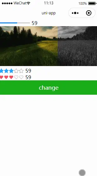
<QSProgress @move="move" showInfo type="index-1" iconType="love" :percent="percent_1" useSlot>
<view class="unfill" slot="unfill"></view>
<view class="fill" slot="fill"></view>
</QSProgress>
<!-- 自定义进度条 -->
<QSProgress @move="move" type="index-2" iconType="love" :percent="percent_1" useSlot>
<view slot="unfill">
<image style="width: 750rpx;height: 300rpx;" src="/static/1-fill.jpg" mode="aspectFill"></image>
</view>
<view slot="fill">
<image style="width: 750rpx;height: 300rpx;" src="/static/1.jpg" mode="aspectFill"></image>
</view>
</QSProgress>
<!-- 星形进度条 -->
<QSProgress @move="move" showInfo type="index-3" iconType="star" activeColor="#22a7ff" :percent="percent_1"></QSProgress>
<!-- 爱心进度条 -->
<QSProgress @move="move" showInfo type="index-4" iconType="love" activeColor="#f1505c" :percent="percent_1"></QSProgress>
<button type="primary" @tap="change">change</button>
</view>
</template>
import QSProgress from '@/components/QS-Progress/QS-Progress.vue';
function random(lower, upper) {
    return Math.floor(Math.random() * (upper - lower+1)) + lower;
}
export default {
    components: {
        QSProgress
    },
    data() {
        return {
            title: 'Hello',
            percent_1: 36,
        }
    },
    onLoad() {

    },
    methods: {
        change() {
            this.percent_1 = random(1, 100);
        },
        move(x) {
            this.percent_1 = Math.ceil(x);
        }
    }
}
.unfill{
    height: 3px;
    width: 100px;
    background-color: #cccccc;
}
.fill{
    height: 3px;
    width: 100px;
    background-color: #007AFF;
}


 收藏人数:
收藏人数:
 下载插件并导入HBuilderX
 下载示例项目ZIP
 赞赏(0)
赞赏(0)
 下载 17821
 赞赏 28
赞赏 28

 下载 12332157
 赞赏 1924


 赞赏
赞赏
 京公网安备:11010802035340号