更新记录
1.0.0(2025-05-12)
下载此版本
- 首次发布
- 实现基础的描述列表功能
- 支持自定义标签宽度、颜色和样式
- 支持行和列的布局
- 适配多端使用(H5、App、各小程序平台)
平台兼容性
uni-app
| Vue2 |
Vue3 |
Chrome |
Safari |
app-vue |
app-nvue |
Android |
iOS |
鸿蒙 |
| × |
√ |
√ |
√ |
√ |
- |
- |
- |
- |
| 微信小程序 |
支付宝小程序 |
抖音小程序 |
百度小程序 |
快手小程序 |
京东小程序 |
鸿蒙元服务 |
QQ小程序 |
飞书小程序 |
小红书小程序 |
快应用-华为 |
快应用-联盟 |
| √ |
√ |
√ |
√ |
√ |
√ |
- |
√ |
√ |
- |
√ |
√ |
其他
lb-descriptions
介绍
lb-descriptions 是一个用于展示详情列表的 uniapp 组件,基于 Vue3 开发。类似于 ElementUI 中的 Descriptions 组件,可用于展示多行键值对信息,如用户资料、商品详情等。
特性
- 简洁美观的详情展示
- 可自定义标签宽度、颜色和样式
- 支持行和列的布局
- 适配多端使用
安装方法
在 uni-app 插件市场中搜索 lb-descriptions 并导入到项目中,或者直接导入 uni_modules 目录下的 lb-descriptions 文件夹。
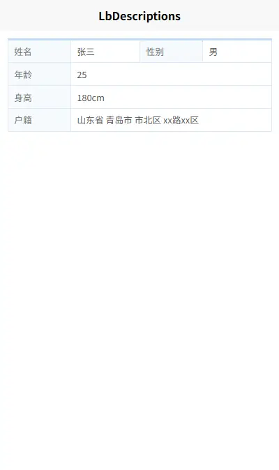
基础用法
<template>
  <lb-descriptions>
    <lb-descriptions-row>
      <lb-descriptions-item label="姓名">张三</lb-descriptions-item>
      <lb-descriptions-item label="性别">男</lb-descriptions-item>
    </lb-descriptions-row>
    <lb-descriptions-row>
      <lb-descriptions-item label="年龄">28岁</lb-descriptions-item>
      <lb-descriptions-item label="职业">工程师</lb-descriptions-item>
    </lb-descriptions-row>
  </lb-descriptions>
</template>

<script>
export default {
  // ...
}
</script>
属性说明
lb-descriptions
| 属性名 |
类型 |
默认值 |
说明 |
| styles |
String/Object |
- |
自定义样式 |
| borderColor |
String |
#DBEBFA |
边框颜色 |
| headColor |
String |
rgba(146, 196, 241, 0.6) |
头部颜色 |
| labelWidth |
String/Number |
- |
标签宽度 |
| labelFontSize |
String/Number |
24rpx |
标签字体大小 |
| labelStyle |
Object |
- |
标签样式对象 |
| valueFontSize |
String/Number |
24rpx |
内容字体大小 |
| labelColor |
String |
#777777 |
标签文字颜色 |
| valueColor |
String |
#575757 |
内容文字颜色 |
lb-descriptions-item
| 属性名 |
类型 |
默认值 |
说明 |
| label |
String |
- |
标签文本 |
插槽
lb-descriptions-item
| 插槽名 |
说明 |
| default |
内容区域的默认插槽 |
| label |
标签区域的自定义插槽 |
示例
自定义样式
<template>
  <lb-descriptions
    borderColor="#ebeef5"
    headColor="rgba(64, 158, 255, 0.6)"
    labelWidth="200rpx"
    labelColor="#333"
    valueColor="#666"
  >
    <!-- 内容省略 -->
  </lb-descriptions>
</template>
使用插槽自定义标签
<template>
  <lb-descriptions>
    <lb-descriptions-row>
      <lb-descriptions-item>
        <template #label>
          <view class="custom-label">
            <text>自定义</text>
            <text style="color: red;">标签</text>
          </view>
        </template>
        自定义标签内容
      </lb-descriptions-item>
    </lb-descriptions-row>
  </lb-descriptions>
</template>


 收藏人数:
收藏人数:
 下载插件并导入HBuilderX
 下载示例项目ZIP
 赞赏(0)
赞赏(0)
 下载 112
 赞赏 0
赞赏 0

 下载 12456982
 赞赏 1935


 赞赏
赞赏
 京公网安备:11010802035340号