更新记录
1.0.0(2025-05-12)
下载此版本
- 全新发布gp-skeleton骨架屏组件
- 支持多种预设骨架屏类型:banner、info、text、menu、list、waterfall
- 可完全自定义骨架屏配置
- 支持动画效果和淡出过渡
- 基于TypeScript开发,提供完整类型支持
- 兼容Vue2/Vue3
新特性
- 基于Vue3和TypeScript重构组件
- 添加TypeScript类型定义和接口
- 优化代码结构和组织
- 改进动画效果和性能
- 完善文档和使用示例
- 类名从x-skeleton更改为gp-skeleton,保持一致性
- 增强代码的可读性和可维护性
改进
- 使用Vue3 Composition API重写组件
- 优化TS类型系统支持
- 重构配置文件,使用类型安全的接口
- 改进代码结构,提高可维护性
- 添加完整的API文档
- 添加更多使用示例和最佳实践
平台兼容性
uni-app
| Vue2 |
Vue3 |
Chrome |
Safari |
app-vue |
app-nvue |
Android |
iOS |
鸿蒙 |
| √ |
√ |
√ |
√ |
√ |
√ |
- |
- |
- |
| 微信小程序 |
支付宝小程序 |
抖音小程序 |
百度小程序 |
快手小程序 |
京东小程序 |
鸿蒙元服务 |
QQ小程序 |
飞书小程序 |
小红书小程序 |
快应用-华为 |
快应用-联盟 |
| √ |
√ |
√ |
√ |
√ |
√ |
- |
√ |
√ |
- |
√ |
√ |
其他
gp-skeleton 骨架屏组件
简介
gp-skeleton 是一个功能强大、灵活配置的 uni-app 骨架屏组件,支持多种常见布局,如轮播图、个人信息、文本段落、菜单、列表和瀑布流等。本组件基于Vue3重写,支持TypeScript,且兼容Vue2。
特性
- 支持多种预设骨架屏类型
- 可完全自定义骨架屏配置
- 支持动画效果和淡出过渡
- 基于TypeScript开发,类型安全
- 可组合的布局系统,包括行、列和嵌套结构
安装方式
uni_modules安装
- 在uni-app插件市场页面点击右上角【使用HBuilderX导入插件】,或者【下载插件ZIP】
- 在HBuilderX中的项目管理器选择项目,右键选择
导入插件,选择下载的zip包
基本用法
模板示例
<template>
  <view class="container">
    <!-- 轮播图骨架屏 -->
    <gp-skeleton type="banner" :loading="loading">
      <swiper class="banner" indicator-dots autoplay :interval="3000" :duration="500">
        <swiper-item v-for="(item, index) in 3" :key="index">
          <view class="banner-item">
            <text>Banner {{index + 1}}</text>
          </view>
        </swiper-item>
      </swiper>
    </gp-skeleton>

    <!-- 个人信息骨架屏 -->
    <gp-skeleton type="info" :loading="loading">
      <view class="user-info">
        <view class="avatar">
          <text>头像</text>
        </view>
        <view class="info-content">
          <view class="username">用户名称</view>
          <view class="bio">这是一段个人简介,用来展示用户的基本信息</view>
          <view class="tags">
            <text class="tag">标签1</text>
            <text class="tag">标签2</text>
          </view>
        </view>
      </view>
    </gp-skeleton>

    <!-- 列表骨架屏 -->
    <gp-skeleton type="list" :loading="loading">
      <view class="list">
        <view class="list-item" v-for="(item, index) in 2" :key="index">
          <view class="list-img">图片</view>
          <view class="list-content">
            <view class="list-title">列表项标题 {{index + 1}}</view>
            <view class="list-desc">这是列表项的描述内容,提供更多信息</view>
            <view class="list-info">附加信息: {{new Date().toLocaleDateString()}}</view>
            <view class="list-price">¥99.00</view>
          </view>
        </view>
      </view>
    </gp-skeleton>
  </view>
</template>

<script lang="ts" setup>
import { ref, onMounted } from 'vue';
// 引入骨架屏组件
import gpSkeleton from '@/uni_modules/gp-skeleton/components/gp-skeleton/gp-skeleton.vue';

// 骨架屏加载状态
const loading = ref<boolean>(true);

// 组件挂载完成
onMounted(() => {
  // 模拟数据加载,3秒后显示实际内容
  setTimeout(() => {
    loading.value = false;
  }, 3000);
});
</script>
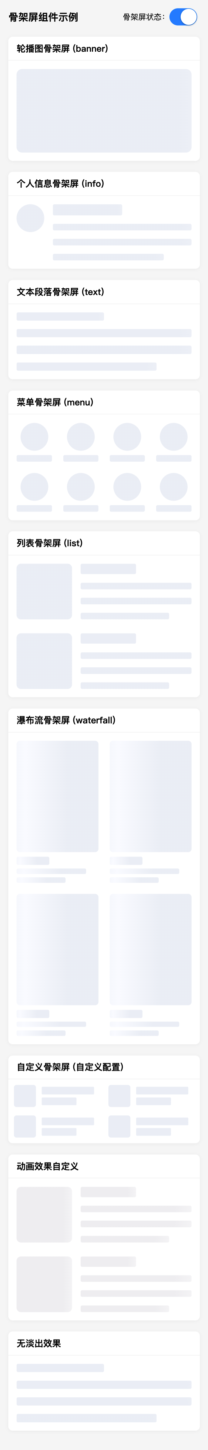
支持的骨架屏类型
banner: 轮播图骨架屏info: 个人信息骨架屏text: 文本段落骨架屏menu: 菜单骨架屏list: 列表骨架屏waterfall: 瀑布流骨架屏
预设类型默认配置
每种预设类型都有其默认配置,你可以通过 configs 属性覆盖这些配置。以下是各类型的默认配置:
banner 类型默认配置
| 配置项 |
默认值 |
| padding |
'30rpx' |
| gridRows |
1 |
| gridColumns |
1 |
| gridRowsGap |
'40rpx' |
| gridColumnsGap |
'24rpx' |
| itemDirection |
'row' |
| itemGap |
'30rpx' |
| itemAlign |
'center' |
| headShow |
true |
| headWidth |
'100%' |
| headHeight |
'300rpx' |
| headBorderRadius |
'20rpx' |
| textShow |
false |
| textRows |
3 |
| textRowsGap |
'20rpx' |
| textWidth |
'100%' |
| textHeight |
'30rpx' |
| textBorderRadius |
'6rpx' |
info 类型默认配置
| 配置项 |
默认值 |
| padding |
'30rpx' |
| gridRows |
1 |
| gridColumns |
1 |
| gridRowsGap |
'50rpx' |
| gridColumnsGap |
'24rpx' |
| itemDirection |
'row' |
| itemGap |
'30rpx' |
| itemAlign |
'flex-start' |
| headShow |
true |
| headWidth |
'100rpx' |
| headHeight |
'100rpx' |
| headBorderRadius |
'50%' |
| textShow |
true |
| textRows |
4 |
| textRowsGap |
'30rpx' |
| textWidth |
['50%', '100%', '100%', '80%'] |
| textHeight |
['40rpx', '24rpx', '24rpx', '24rpx'] |
| textBorderRadius |
'6rpx' |
text 类型默认配置
| 配置项 |
默认值 |
| padding |
'30rpx' |
| gridRows |
1 |
| gridColumns |
1 |
| gridRowsGap |
'50rpx' |
| gridColumnsGap |
'24rpx' |
| itemDirection |
'row' |
| itemGap |
'30rpx' |
| itemAlign |
'flex-start' |
| headShow |
false |
| headWidth |
'100rpx' |
| headHeight |
'100rpx' |
| headBorderRadius |
'50%' |
| textShow |
true |
| textRows |
4 |
| textRowsGap |
'30rpx' |
| textWidth |
['50%', '100%', '100%', '80%'] |
| textHeight |
'30rpx' |
| textBorderRadius |
'6rpx' |
menu 类型默认配置
| 配置项 |
默认值 |
| padding |
'30rpx' |
| gridRows |
2 |
| gridColumns |
4 |
| gridRowsGap |
'40rpx' |
| gridColumnsGap |
'40rpx' |
| itemDirection |
'column' |
| itemGap |
'16rpx' |
| itemAlign |
'center' |
| headShow |
true |
| headWidth |
'100rpx' |
| headHeight |
'100rpx' |
| headBorderRadius |
'50%' |
| textShow |
true |
| textRows |
1 |
| textRowsGap |
'0rpx' |
| textWidth |
'100%' |
| textHeight |
'24rpx' |
| textBorderRadius |
'6rpx' |
list 类型默认配置
| 配置项 |
默认值 |
| padding |
'30rpx' |
| gridRows |
2 |
| gridColumns |
1 |
| gridRowsGap |
'50rpx' |
| gridColumnsGap |
'24rpx' |
| itemDirection |
'row' |
| itemGap |
'30rpx' |
| itemAlign |
'flex-start' |
| headShow |
true |
| headWidth |
'200rpx' |
| headHeight |
'200rpx' |
| headBorderRadius |
'16rpx' |
| textShow |
true |
| textRows |
4 |
| textRowsGap |
'30rpx' |
| textWidth |
['50%', '100%', '100%', '80%'] |
| textHeight |
['38rpx', '24rpx', '24rpx', '24rpx'] |
| textBorderRadius |
'6rpx' |
waterfall 类型默认配置
| 配置项 |
默认值 |
| padding |
'30rpx' |
| gridRows |
2 |
| gridColumns |
2 |
| gridRowsGap |
'40rpx' |
| gridColumnsGap |
'24rpx' |
| itemDirection |
'column' |
| itemGap |
'16rpx' |
| itemAlign |
'center' |
| headShow |
true |
| headWidth |
'100%' |
| headHeight |
'400rpx' |
| headBorderRadius |
'12rpx' |
| textShow |
true |
| textRows |
3 |
| textRowsGap |
'12rpx' |
| textWidth |
['40%', '85%', '60%'] |
| textHeight |
['30rpx', '20rpx', '20rpx'] |
| textBorderRadius |
'6rpx' |
组件属性
| 属性名 |
类型 |
默认值 |
说明 |
| type |
String |
'' |
骨架屏类型,可选值:banner, info, text, menu, list, waterfall |
| loading |
Boolean |
true |
是否展示骨架屏,false时显示实际内容 |
| animate |
Boolean |
true |
是否开启动画效果 |
| animateTime |
Number/String |
1.8 |
动画效果持续时间,单位秒 |
| fadeOut |
Boolean |
true |
是否开启淡出动画 |
| fadeOutTime |
Number/String |
0.5 |
淡出效果持续时间,单位秒 |
| bgColor |
String |
'#EAEDF5' |
骨架的背景色 |
| highlightBgColor |
String |
'#F9FAFF' |
骨架的动画高亮背景色 |
| configs |
Object |
{} |
自定义配置,覆盖预设配置 |
高级自定义
自定义配置属性
| 配置项 |
说明 |
默认值(根据类型不同) |
| padding |
内边距 |
'30rpx' |
| gridRows |
行数 |
1-2 |
| gridColumns |
列数 |
1-5 |
| gridRowsGap |
行间隔 |
'40rpx'-'50rpx' |
| gridColumnsGap |
列间距 |
'24rpx'-'40rpx' |
| itemDirection |
排列方向 |
'row'/'column' |
| itemGap |
元素间隔 |
'16rpx'-'30rpx' |
| itemAlign |
对齐方式 |
'center'/'flex-start' |
| headShow |
是否显示头部 |
true/false |
| headWidth |
头部宽度 |
'100%'/'100rpx'/'200rpx' |
| headHeight |
头部高度 |
'100rpx'/'200rpx'/'300rpx'/'400rpx' |
| headBorderRadius |
头部圆角 |
'12rpx'/'16rpx'/'20rpx'/'50%' |
| textShow |
是否显示文本 |
true/false |
| textRows |
文本行数 |
1-4 |
| textRowsGap |
文本行间距 |
'0rpx'-'30rpx' |
| textWidth |
文本宽度 |
'100%' 或 数组 |
| textHeight |
文本高度 |
'24rpx'-'40rpx' 或 数组 |
| textBorderRadius |
文本圆角 |
'6rpx' |
自定义配置示例
<template>
  <gp-skeleton :loading="loading" :configs="customConfigs">
    <view class="custom">
      <view class="custom-item" v-for="(item, index) in 4" :key="index">
        <view class="custom-img">自定义图片 {{index + 1}}</view>
        <view class="custom-content">
          <view class="custom-title">自定义标题</view>
          <view class="custom-info">自定义信息</view>
        </view>
      </view>
    </view>
  </gp-skeleton>
</template>

<script lang="ts" setup>
import { ref } from 'vue';
import { SkeletonConfigsInterface } from '@/uni_modules/gp-skeleton/components/gp-skeleton/gp-skeleton-configs';
import gpSkeleton from '@/uni_modules/gp-skeleton/components/gp-skeleton/gp-skeleton.vue';

// 骨架屏加载状态
const loading = ref<boolean>(true);

// 自定义骨架屏配置
const customConfigs = ref<SkeletonConfigsInterface>({
  padding: '20rpx',
  gridRows: 2,
  gridColumns: 2,
  gridRowsGap: '30rpx',
  gridColumnsGap: '30rpx',
  itemDirection: 'row',
  itemGap: '20rpx',
  itemAlign: 'center',
  headShow: true,
  headWidth: '80rpx',
  headHeight: '80rpx',
  headBorderRadius: '10rpx',
  textShow: true,
  textRows: 2,
  textRowsGap: '10rpx',
  textWidth: ['90%', '60%'],
  textHeight: '28rpx',
  textBorderRadius: '4rpx'
});

// 模拟数据加载
setTimeout(() => {
  loading.value = false;
}, 3000);
</script>
组合多个骨架屏
<template>
  <view class="container">
    <!-- 头部信息 -->
    <gp-skeleton type="info" :loading="loading">
      <view class="user-info">
        <view class="avatar">
          <text>头像</text>
        </view>
        <view class="info-content">
          <view class="username">用户名称</view>
          <view class="bio">这是一段个人简介</view>
        </view>
      </view>
    </gp-skeleton>

    <!-- 菜单 -->
    <gp-skeleton type="menu" :loading="loading">
      <view class="menu">
        <view class="menu-item" v-for="(item, index) in 8" :key="index">
          <view class="menu-icon">图标</view>
          <text class="menu-text">菜单{{index + 1}}</text>
        </view>
      </view>
    </gp-skeleton>

    <!-- 列表内容 -->
    <gp-skeleton
      type="list"
      :loading="loading"
      :configs="{
        gridRows: 5,  // 更多行
        headHeight: '160rpx'  // 更小的头像
      }">
      <view class="list">
        <view class="list-item" v-for="(item, index) in 2" :key="index">
          <view class="list-img">图片</view>
          <view class="list-content">
            <view class="list-title">列表项标题 {{index + 1}}</view>
            <view class="list-desc">这是列表项的描述内容</view>
          </view>
        </view>
      </view>
    </gp-skeleton>
  </view>
</template>

<script lang="ts" setup>
import { ref } from 'vue';
import gpSkeleton from '@/uni_modules/gp-skeleton/components/gp-skeleton/gp-skeleton.vue';

// 骨架屏加载状态
const loading = ref<boolean>(true);

// 模拟数据加载
setTimeout(() => {
  loading.value = false;
}, 3000);
</script>
动画效果自定义
<template>
  <gp-skeleton
    type="list"
    :loading="loading"
    :animate="true"
    :animate-time="3"
    bg-color="#EEEDF0"
    highlight-bg-color="#FFFFFF">
    <view class="list">
      <view class="list-item">
        <view class="list-img">图片</view>
        <view class="list-content">
          <view class="list-title">自定义动画效果</view>
          <view class="list-desc">修改了动画时间、背景色等参数</view>
        </view>
      </view>
    </view>
  </gp-skeleton>
</template>

<script lang="ts" setup>
import { ref } from 'vue';
import gpSkeleton from '@/uni_modules/gp-skeleton/components/gp-skeleton/gp-skeleton.vue';

// 骨架屏加载状态
const loading = ref<boolean>(true);

// 模拟数据加载
setTimeout(() => {
  loading.value = false;
}, 3000);
</script>
无淡出效果
<template>
  <gp-skeleton type="text" :loading="loading" :fade-out="false">
    <view class="text-content">
      <view class="paragraph">禁用了淡出效果的骨架屏,加载完成后会直接显示内容,没有淡出动画。</view>
      <view class="paragraph">适合对性能要求较高的场景。</view>
    </view>
  </gp-skeleton>
</template>

<script lang="ts" setup>
import { ref } from 'vue';
import gpSkeleton from '@/uni_modules/gp-skeleton/components/gp-skeleton/gp-skeleton.vue';

// 骨架屏加载状态
const loading = ref<boolean>(true);

// 模拟数据加载
setTimeout(() => {
  loading.value = false;
}, 3000);
</script>
注意事项
textHeight 参数不支持百分比单位- 当同时使用多个骨架屏时,建议它们共享同一个
loading 状态
- 自定义配置会覆盖预设配置,只需要写入需要覆盖的属性
TS支持
如果使用TypeScript,可以导入骨架屏配置接口:
import { SkeletonConfigsInterface } from '@/uni_modules/gp-skeleton/components/gp-skeleton/gp-skeleton-configs';

// 在组件内
const customConfigs = ref<SkeletonConfigsInterface>({
  padding: '40rpx',
  gridRows: 2,
  // 其他配置...
});
完整示例
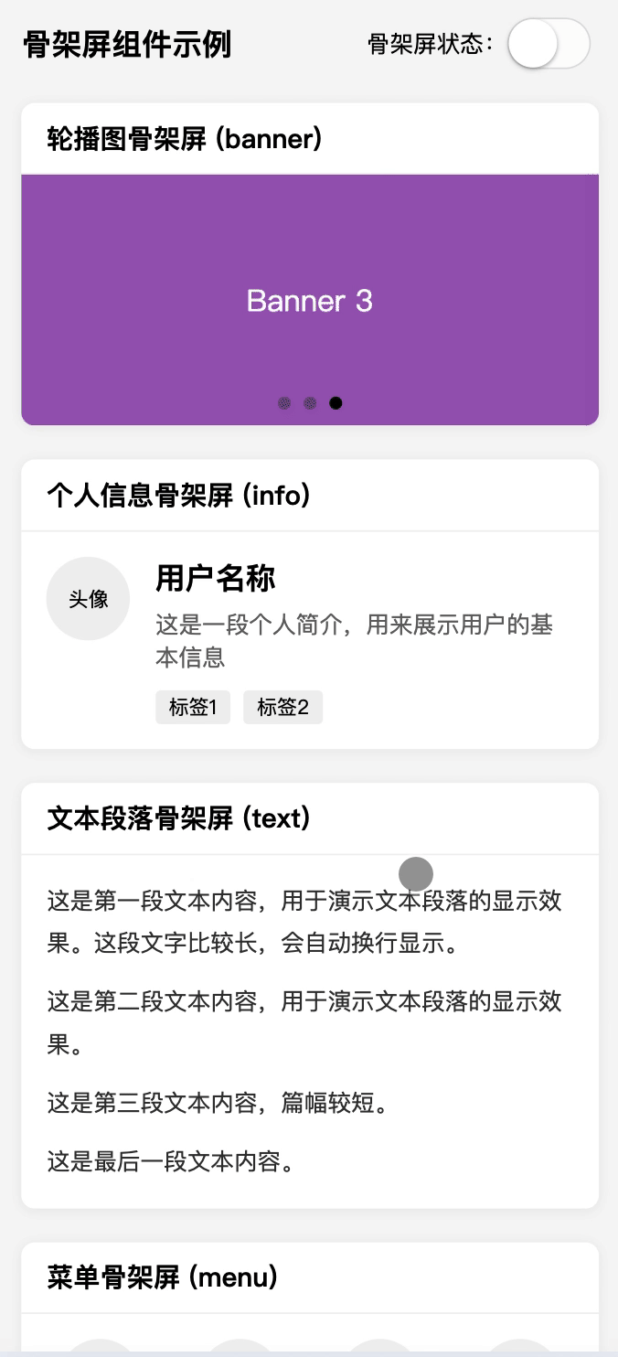
<template>
  <view class="skeleton-demo">
    <view class="header">
      <text class="title">gp-skeleton 骨架屏组件示例</text>
      <view class="control">
        <text>骨架屏状态:</text>
        <switch :checked="loading" @change="toggleLoading" />
      </view>
    </view>

    <!-- 轮播图骨架屏 -->
    <view class="section">
      <view class="section-title">轮播图骨架屏 (banner)</view>
      <gp-skeleton type="banner" :loading="loading">
        <swiper class="banner" indicator-dots autoplay :interval="3000" :duration="500">
          <swiper-item v-for="(item, index) in 3" :key="index">
            <view class="banner-item" :class="`banner-item-${index + 1}`">
              <text>Banner {{index + 1}}</text>
            </view>
          </swiper-item>
        </swiper>
      </gp-skeleton>
    </view>

    <!-- 个人信息骨架屏 -->
    <view class="section">
      <view class="section-title">个人信息骨架屏 (info)</view>
      <gp-skeleton type="info" :loading="loading">
        <view class="user-info">
          <view class="avatar">
            <text>头像</text>
          </view>
          <view class="info-content">
            <view class="username">用户名称</view>
            <view class="bio">这是一段个人简介,用来展示用户的基本信息</view>
            <view class="tags">
              <text class="tag">标签1</text>
              <text class="tag">标签2</text>
            </view>
          </view>
        </view>
      </gp-skeleton>
    </view>

    <!-- 文本段落骨架屏 -->
    <view class="section">
      <view class="section-title">文本段落骨架屏 (text)</view>
      <gp-skeleton type="text" :loading="loading">
        <view class="text-content">
          <view class="paragraph">这是第一段文本内容,用于演示文本段落的显示效果。这段文字比较长,会自动换行显示。</view>
          <view class="paragraph">这是第二段文本内容,用于演示文本段落的显示效果。</view>
          <view class="paragraph">这是第三段文本内容,篇幅较短。</view>
          <view class="paragraph">这是最后一段文本内容。</view>
        </view>
      </gp-skeleton>
    </view>

    <!-- 其他类型展示... -->

    <!-- 自定义骨架屏 -->
    <view class="section">
      <view class="section-title">自定义骨架屏 (自定义配置)</view>
      <gp-skeleton :loading="loading" :configs="customConfigs">
        <view class="custom">
          <view class="custom-item" v-for="(item, index) in 4" :key="index">
            <view class="custom-img">自定义图片 {{index + 1}}</view>
            <view class="custom-content">
              <view class="custom-title">自定义标题</view>
              <view class="custom-info">自定义信息</view>
            </view>
          </view>
        </view>
      </gp-skeleton>
    </view>
  </view>
</template>

<script lang="ts" setup>
import { ref, onMounted } from 'vue';
import { SkeletonConfigsInterface } from '@/uni_modules/gp-skeleton/components/gp-skeleton/gp-skeleton-configs';
// 引入骨架屏组件
import gpSkeleton from '@/uni_modules/gp-skeleton/components/gp-skeleton/gp-skeleton.vue';

// 骨架屏加载状态
const loading = ref<boolean>(true);

// 自定义骨架屏配置
const customConfigs = ref<SkeletonConfigsInterface>({
  padding: '20rpx',
  gridRows: 2,
  gridColumns: 2,
  gridRowsGap: '30rpx',
  gridColumnsGap: '30rpx',
  itemDirection: 'row',
  itemGap: '20rpx',
  itemAlign: 'center',
  headShow: true,
  headWidth: '80rpx',
  headHeight: '80rpx',
  headBorderRadius: '10rpx',
  textShow: true,
  textRows: 2,
  textRowsGap: '10rpx',
  textWidth: ['90%', '60%'],
  textHeight: '28rpx',
  textBorderRadius: '4rpx'
});

// 切换骨架屏状态
const toggleLoading = (e: any) => {
  loading.value = e.detail.value;
};

// 组件挂载完成
onMounted(() => {
  // 模拟数据加载,3秒后显示实际内容
  setTimeout(() => {
    loading.value = false;
  }, 3000);
});
</script>

<style lang="scss">
.skeleton-demo {
  padding: 30rpx;
  background-color: #f5f5f5;
  min-height: 100vh;

  .header {
    display: flex;
    justify-content: space-between;
    align-items: center;
    margin-bottom: 40rpx;

    .title {
      font-size: 36rpx;
      font-weight: bold;
    }

    .control {
      display: flex;
      align-items: center;
      font-size: 28rpx;
    }
  }

  .section {
    margin-bottom: 40rpx;
    background-color: #fff;
    border-radius: 16rpx;
    overflow: hidden;
    box-shadow: 0 2rpx 12rpx rgba(0, 0, 0, 0.05);

    .section-title {
      font-size: 32rpx;
      font-weight: bold;
      padding: 20rpx 30rpx;
      border-bottom: 1px solid #f0f0f0;
    }
  }

  // Banner样式
  .banner {
    height: 300rpx;

    .banner-item {
      display: flex;
      justify-content: center;
      align-items: center;
      width: 100%;
      height: 100%;
      font-size: 36rpx;
      color: #fff;

      &-1 {
        background-color: #3498db;
      }

      &-2 {
        background-color: #2ecc71;
      }

      &-3 {
        background-color: #9b59b6;
      }
    }
  }

  // 更多样式...
}
</style>


 收藏人数:
收藏人数:
 下载插件并导入HBuilderX
 下载示例项目ZIP
 赞赏(0)
赞赏(0)


 下载 247
 赞赏 0
赞赏 0

 下载 12288383
 赞赏 1922


 赞赏
赞赏
 京公网安备:11010802035340号