


 收藏人数:
收藏人数:
 下载插件并导入HBuilderX
 下载插件ZIP
 赞赏(0)
赞赏(0)
更新记录
1.0.0(2025-10-24) 下载此版本
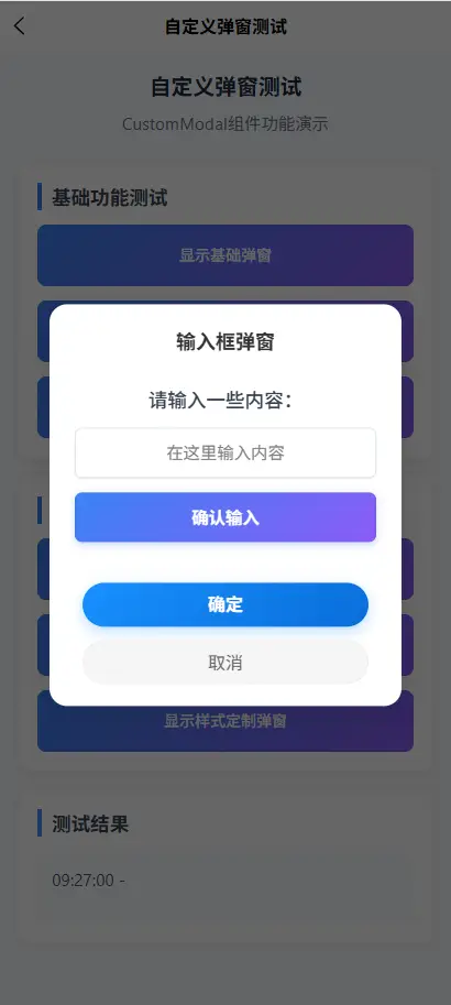
自定义弹窗,支持基础,自动一内容,全屏弹窗,及样式定制
平台兼容性
其他
| 多语言 | 暗黑模式 | 宽屏模式 |
|---|---|---|
| × | × | √ |
CustomModal 组件文档
概述
CustomModal 是一个基于 Vue 3 + TypeScript + Uni-app 的自定义弹窗组件,提供丰富的配置选项和动画效果,适用于移动端应用场景。
功能特性
- ✅ 响应式设计 - 适配不同屏幕尺寸
- ✅ 动画效果 - 遮罩淡入和弹窗缩放动画
- ✅ 自定义内容 - 支持插槽和文本内容
- ✅ 灵活配置 - 丰富的属性配置选项
- ✅ 类型安全 - 完整的 TypeScript 支持
- ✅ 无障碍访问 - 支持键盘操作和屏幕阅读器
安装与使用
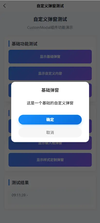
基本用法
<template>
<CustomModal
v-model:visible="modalVisible"
title="提示"
content="这是一个自定义弹窗"
@confirm="handleConfirm"
@cancel="handleCancel"
/>
</template>
<script setup lang="ts">
import { ref } from 'vue';
import CustomModal from '@/components/CustomModal.vue';
const modalVisible = ref(false);
const handleConfirm = () => {
console.log('用户点击了确认');
modalVisible.value = false;
};
const handleCancel = () => {
console.log('用户点击了取消');
modalVisible.value = false;
};
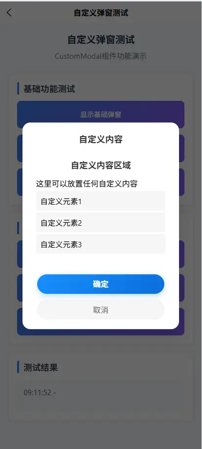
</script>使用插槽自定义内容
<CustomModal v-model:visible="modalVisible" title="自定义内容">
  <template #content>
    <view class="custom-content">
      <text>这是自定义的内容区域</text>
      <button @click="handleButtonClick">自定义按钮</button>
    </view>
  </template>
</CustomModal>
程序化控制
<script setup lang="ts">
import { ref } from 'vue';
import CustomModal from '@/components/CustomModal.vue';

const modalRef = ref<InstanceType<typeof CustomModal>>();

// 显示弹窗
const showModal = () => {
  modalRef.value?.show();
};

// 隐藏弹窗
const hideModal = () => {
  modalRef.value?.hide();
};
</script>

<template>
  <CustomModal ref="modalRef" title="程序化控制" />
</template>
API 文档
Props 属性
| 属性名 | 类型 | 默认值 | 说明 |
|---|---|---|---|
visible |
boolean |
false |
控制弹窗显示/隐藏 |
title |
string |
'' |
弹窗标题 |
content |
string |
'' |
弹窗内容文本 |
showCancel |
boolean |
true |
是否显示取消按钮 |
cancelText |
string |
'取消' |
取消按钮文本 |
confirmText |
string |
'确定' |
确认按钮文本 |
zIndex |
number |
9999 |
弹窗层级 |
maskClosable |
boolean |
true |
是否允许点击遮罩关闭 |
isUpdateModal |
boolean |
false |
是否为更新提示样式(显示火箭图标) |
Events 事件
| 事件名 | 参数 | 说明 |
|---|---|---|
confirm |
- | 确认按钮点击事件 |
cancel |
- | 取消按钮点击事件 |
close |
- | 弹窗关闭事件 |
Methods 方法
| 方法名 | 参数 | 说明 |
|---|---|---|
show() |
- | 显示弹窗 |
hide() |
- | 隐藏弹窗 |
Slots 插槽
| 插槽名 | 作用域 | 说明 |
|---|---|---|
default |
- | 默认插槽,用于自定义内容 |
content |
- | 内容区域插槽,替代默认文本内容 |
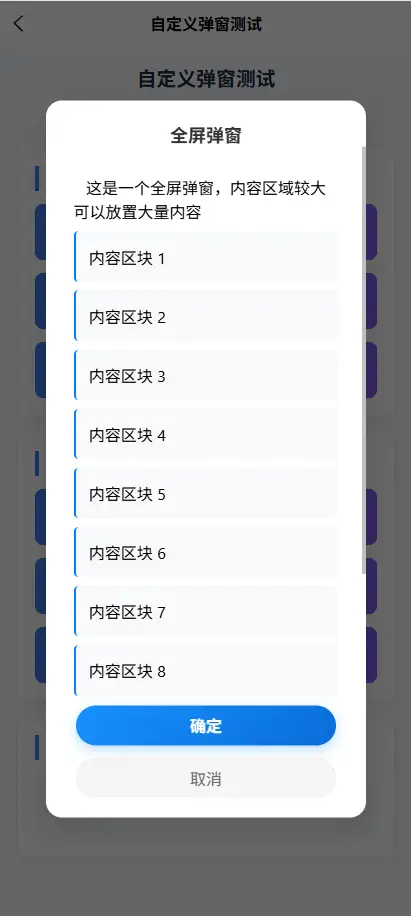
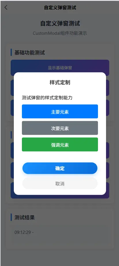
样式定制
CSS 类名
组件提供以下 CSS 类名用于样式定制:
.custom-modal-wrapper- 弹窗容器.custom-modal-mask- 遮罩层.custom-modal-container- 弹窗主体容器.custom-modal-content- 弹窗内容区域.custom-modal-header- 头部区域.custom-modal-title- 标题样式.custom-modal-body- 内容区域.custom-modal-text- 文本内容样式.custom-modal-footer-vertical- 底部按钮区域.custom-modal-button- 按钮基础样式.custom-modal-confirm- 确认按钮样式.custom-modal-cancel- 取消按钮样式
自定义样式示例
// 自定义主题色
.custom-modal-confirm {
  background: linear-gradient(135deg, #ff6b6b, #ee5a24) !important;
}

// 自定义尺寸
.custom-modal-container {
  width: 90% !important;
  max-width: 400px !important;
}

// 自定义动画
@keyframes customFadeIn {
  from {
    opacity: 0;
    transform: translate(-50%, -60%) scale(0.9);
  }
  to {
    opacity: 1;
    transform: translate(-50%, -50%) scale(1);
  }
}
高级用法
更新提示样式
当设置 isUpdateModal 为 true 时,弹窗会显示火箭图标和浮动动画:
<CustomModal
  v-model:visible="updateModalVisible"
  title="发现新版本"
  content="有新版本可用,是否立即更新?"
  :isUpdateModal="true"
  confirmText="立即更新"
  cancelText="稍后再说"
/>
禁用遮罩关闭
<CustomModal
  v-model:visible="importantModalVisible"
  title="重要提示"
  content="此操作不可逆,请谨慎操作"
  :maskClosable="false"
  :showCancel="false"
  confirmText="我明白了"
/>
动态内容
<CustomModal v-model:visible="dynamicModalVisible" :title="dynamicTitle">
  <template #content>
    <view v-if="loading">
      <text>加载中...</text>
    </view>
    <view v-else>
      <text>{{ dynamicContent }}</text>
    </view>
  </template>
</CustomModal>
最佳实践
1. 弹窗管理
建议使用统一的弹窗管理策略:
// 弹窗类型定义
type ModalType = 'confirm' | 'alert' | 'prompt' | 'custom';

// 弹窗配置接口
interface ModalConfig {
  type: ModalType;
  title: string;
  content?: string;
  confirmText?: string;
  cancelText?: string;
  onConfirm?: () => void;
  onCancel?: () => void;
}
2. 性能优化
- 使用
v-if而非v-show控制弹窗显示 - 避免在弹窗内放置大量复杂组件
- 使用
keep-alive缓存频繁使用的弹窗
3. 无障碍访问
组件已内置以下无障碍特性:
- 支持键盘 ESC 键关闭
- 适当的 ARIA 属性
- 焦点管理
- 屏幕阅读器支持
常见问题
Q: 弹窗内容过长怎么办?
A: 内容区域支持滚动,最大高度为 60vh,可通过 CSS 自定义:
.custom-modal-body {
  max-height: 70vh !important;
}
Q: 如何修改弹窗动画?
A: 覆盖默认的 CSS 动画:
.custom-modal-container {
  animation: yourCustomAnimation 0.3s ease-in-out 0.1s forwards !important;
}
Q: 弹窗在特定场景下显示异常?
A: 检查以下可能的原因:
- 父容器有
overflow: hidden样式 - 层级 (
z-index) 冲突 - 异步加载导致的显示时机问题
版本历史
- v1.0.0 (2024-10-24)
- 初始版本发布
- 基础弹窗功能
- TypeScript 支持
- 动画效果
技术支持
如有问题或建议,请联系开发团队或提交 Issue。
文档最后更新:2024-10-24
 下载 62
下载 62
 赞赏 0
赞赏 0

 下载 12227337
 赞赏 1918


 赞赏
赞赏
 京公网安备:11010802035340号