

 收藏人数:
收藏人数:
 下载插件并导入HBuilderX
 赞赏(0)
赞赏(0)
更新记录
0.0.1(2021-01-27) 下载此版本
初始版本
平台兼容性
插件安装
将组件放在自己的组件库里导入即可
导入:
import imgUpload from '@/components/liky-alert/liky-alert.vue';
属性
| 属性名 | 类型 | 介绍 | 默认值 |
|---|---|---|---|
| v-model | Boolean | 是否显示提示框 | false |
| title | String | 提示框标题 | 提示 |
| content | String | 提示框内容 | |
| buttons | Array | 提示框按钮 | 已经设置默认值 |
| maskClose | Boolean | 点击提示框外部区域是否关闭提示框 | true |
buttons设置
| 属性名 | 类型 | 介绍 |
|---|---|---|
| text | String | 按钮名称 |
| color | String | 按钮颜色 |
事件
| 事件称名 | 说明 | 返回参数 |
|---|---|---|
| confirm | 按钮点击触发事件 | 按钮下标 |
示范代码
<template>
<modalAlert v-model="showModal" :title="mTitle" :content="mContent" :buttons="mBtns" @confirm="confirm" />
</template>
<script>
import modalAlert from '@/components/liky-alert/liky-alert.vue';
export default {
components: {
modalAlert
},
data() {
return {
showModal: false,
mTitle: '提示',
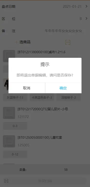
mContent: '即将退出单据编辑,请问是否保存?',
mBtns: [
{ text:'取消'},
{ text:'保存并退出', color:'#19be6b' },
{ text:'直接退出', color:'#2db7f5' }
]
}
},
methods: {
confirm: function(index) {
this.showModal = false;
console.log(index)
},
}
}
</script>

 下载 113
 赞赏 0
赞赏 0

 下载 12347584
 赞赏 1925


 赞赏
赞赏
 京公网安备:11010802035340号