

 收藏人数:
收藏人数:
 https://github.com/liub1934/uni-lb-tabbar
 https://www.npmjs.com/package/uni-lb-tabbar
 下载插件并导入HBuilderX
 下载示例项目ZIP
 赞赏(1)
赞赏(1)
更新记录
v1.0.3(2021-03-30) 下载此版本
- 优化nvue dot info 显示
- 优化nvue图标凸起
- 新增nvue demo
v1.0.2(2021-03-08) 下载此版本
- 新增nvue支持
- 新增uni.switchtab切换Demo
v1.0.1(2021-02-21) 下载此版本
- 修复手动修改active部分页面不切换的问题
- demo更新
平台兼容性


由于项目中经常需要用到自定义的 Tabbar,原生的 Tabbar 可自定义性有局限性,将之前写的组件加以整理,弄出一个通用的组件。
Github:点击前往
插件市场:点击前往
H5 Demo:点击预览
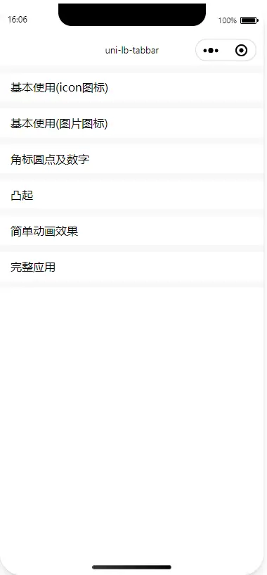
提供了相关示例 Demo,可以自己在插件市场导入示例项目,或者直接查看 Demo相关代码
如果问题最好去 github 反馈,插件市场评论区留下五星好评即可, 点我去反馈
最好提供一下使用的什么端,数据结构及大概的代码,我好复现找问题,不要直接提怎么xxx报错了等没意义的问题,神仙也不知道你为啥报错了。
兼容性
App + nvue + H5 + 各平台小程序(头条小程序暂不支持)
引入插件
推荐使用 easycom 引入
导入插件后再pages.json加上如下配置:
"easycom": {
  "autoscan": true,
  "custom": {
    "lb-tabbar-item": "@/components/lb-tabbar/lb-tabbar-item.vue"
  }
}
npm 安装引入
npm install uni-lb-tabbar安装完插件后再pages.json加上如下配置:
"easycom": {
  "autoscan": true,
  "custom": {
    "lb-tabbar": "uni-lb-tabbar/components/lb-tabbar/lb-tabbar",
    "lb-tabbar-item": "uni-lb-tabbar/components/lb-tabbar/lb-tabbar-item"
  }
}
Props 参数
Tabbar Props
| 参数 | 说明 | 类型 | 可选值 | 默认值 |
|---|---|---|---|---|
| v-model/value | 选中标签的 name | String/Number | - | - |
| height | Tabbar 高度 | String | - | 50px |
| icon-size | 图标大小 | String | - | 22px |
| text-size | 文字大小 | String | - | 12px |
text-top v1.0.3新增 |
文字的 margin-top | String | - | 5px |
v1.0.3弃用 文字高度同text-size |
String | - | 18px | |
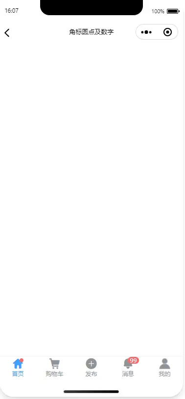
| dot-color | 小红点颜色 | String | - | #F56C6C |
| fixed | 是否固定在底部 | Boolean | true/false | true |
| placeholder | 是否生成等高的占位块 | Boolean | true/false | true |
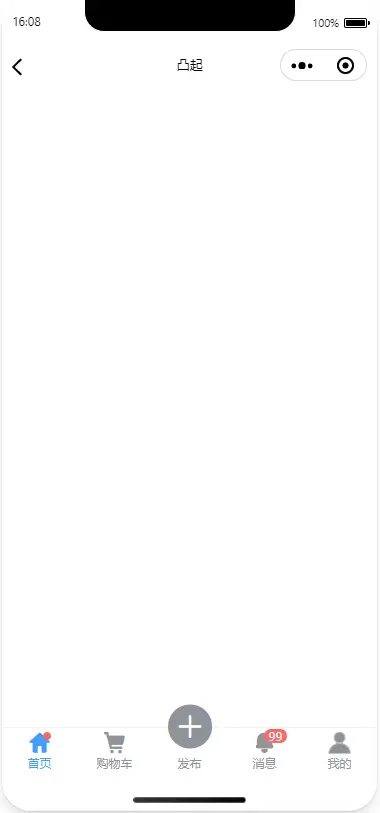
| animate | 图标动画(引用了部分 Animate.css 库的动画效果,nvue 不支持) | String | zoomIn/bounce/rubberBand/bounceIn/fadeIn | - |
| close-animate-on-raisede | 是否关闭凸起图标动画 | Boolean | true/false | true |
| border | 是否展示边框 | Boolean | true/false | true |
| border-color | 边框颜色 | String | - | #DCDFE6 |
| bg-color | 背景色,默认是白色背景 | String | - | #FFF |
| inactive-color | 未选中标签的颜色 | String | - | #909399 |
| active-color | 选中标签的颜色 | String | - | #409EFF |
| active-text-color | 可单独定义未选中标签文字的颜色,不填则同inactive-color |
String | - | - |
| active-text-color | 可单独定义选中标签文字的颜色,不填则同active-color |
String | - | - |
| safe-area-inset-bottom | 苹果 X 等机型底部安全区 | Boolean | true/false | true |
| hide-tabbar | 是否隐藏原生的 tabbar | Boolean | true/false | true |
| raisede-scale | 凸起放大倍数,默认 2 倍 | Number | - | 2 |
TabbarItem Props
| 参数 | 说明 | 类型 | 可选值 | 默认值 |
|---|---|---|---|---|
| name | 标签的 name 名称 | String/Number | - | - |
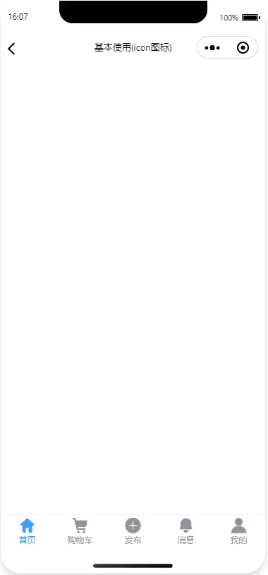
| text | 标签底部文字,仅 nvue 支持,其他使用 默认 slot 形式 | String/Number | - | - |
| icon | icon 图标,可为图片地址,如果是 icon 图标不需要带前缀,如icon- |
String | - | - |
| icon-prefix | icon 图标前缀 | String | - | - |
| dot | 是否显示小红点 | Boolean | true/false | - |
| info | 图标右上角信息 | String/Number | - | - |
| raisede | 图标是否凸出 | Boolean | true/false | - |
Tabbar Event
| 事件名 | 说明 | 参数 |
|---|---|---|
| change | 切换标签时触发 | 当前选中TabbarItem的props |
| click | 点击标签时触发 | 当前点击标签TabbarItem的props |
Tabbar Methods
| 方法名 | 说明 |
|---|---|
| getTabbarHeight | 需要在onReady中调用,返回 Tabbar 的实际高度,包括安全区的高度 |
 下载 20666
 赞赏 3
赞赏 3

 下载 12298117
 赞赏 1922


 赞赏
赞赏
 京公网安备:11010802035340号