


 收藏人数:
收藏人数:
 下载插件并导入HBuilderX
 赞赏(0)
赞赏(0)
更新记录
1.0.0(2021-05-10) 下载此版本
发布组件
平台兼容性
z-modal 弹框使用说明
使用方法:
-
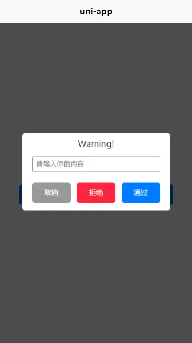
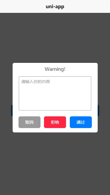
基本用法
<template>
    <view>
        <z-modal :show="modalControl" :btnGroup="btnGroup" :contentType="1" :contentText="contentText" :titleText="titleText" @cancle="cancle" @sure="sure" @reject="reject" ></z-modal>
    </view>
</template>

<script>
    import zModal from '@/components/z-modal/z-modal.vue'
    export default {
        data() {
            return {
                modalControl:false,
                btnGroup: [{
                    text: '取消',
                    color: '#FFFFFF',
                    bgColor: '#999999',
                    width: '150rpx',
                    height: '80rpx',
                    shape: 'fillet',
                    eventName: 'cancle'
                }, {
                    text: '拒绝',
                    color: '#FFFFFF',
                    bgColor: '#ff2542',
                    width: '150rpx',
                    height: '80rpx',
                    shape: 'fillet',
                    eventName: 'reject'
                }, {
                    text: '通过',
                    color: '#FFFFFF',
                    bgColor: '#007AFF',
                    width: '150rpx',
                    height: '80rpx',
                    shape: 'fillet',
                    eventName: 'sure'
                }],
                titleText:'modal title',
                contentText:'There are moments in life when you miss someone so much that you just want to pick them from your dreams and hug them for real!'
            }
        },
        components: {
            zModal
        },
        methods:{
            cancle(e){

            },
            sure(e){

            },
            reject(e){

            },
        }
    }
</script>
使用说明
平台差异说明
| H5 | 微信小程序 | 其他 |
|---|---|---|
| √ | √ | 未知 |
OBJECT 参数说明:
| 参数名 | 类型 | 必填 | 说明 | 默认值 | 可选值 |
|---|---|---|---|---|---|
| show | Boolean | false | 控制modal的显示隐藏 | false | false/true |
| contentType | Number,String | false | 文本类型 1-展示文字 2-input 3-textarea | 1 | 1,2,3 |
| maxLength | Number | false | contentType为2或3时的字数限制 | 20 | |
| modalWidth | String | false | modal整体宽度 rpx | 580rpx | |
| titleSize | String | false | title区域文字大小 | 32rpx | |
| contentSize | String | false | content区域文字大小 | 28rpx | |
| bottomFontSize | String | false | 底部(按钮)区域的字号 | 28rpx | |
| titlePadding | Sting | false | title(标题) 区域的padding | '20rpx 0' | |
| contentPadding | Sting | false | content(内容) 区域的padding | '10rpx 40rpx' | |
| bottomPadding | String | false | 底部(按钮)区域的padding | '30rpx 40rpx' | |
| titleColor | String | false | 标题文字颜色 | '#333333' | |
| contentColor | String | false | 内容文字颜色 | '#333333' | |
| placeholderColor | String | false | placeholderColor-提示文字的颜色 | '#999' | |
| inputBorderColor | String | false | 输入框的边框颜色 | '#999' | |
| titleText | String | false | 标题内容 | titleText | |
| contentText | String | false | 文本内容 | contentText | |
| placeholderText | String | false | input或textarea的placeholder | 请输入你的内容 | |
| btnGroup | Array | false | 自定义按钮组,详细说明请看下文 | 请在详情查看 | |
| check | Boolean | false | 是否需要文本校验 | false | |
| checkItem | Array | false | 内置校验项,详细说明请看下文 | [ ] | isRequired,isNumber,isChinese,isEnglish,isEmail,isIdNum |
| selfCheckItem | Object | false | 自定义校验项,详细说明请看下文 | { } |
显示
将show属性置为true,就会显示modal弹框
btnGroup-自定义底部按钮组
默认值:
[{
    text: '取消',
    color: '#FFFFFF',
    bgColor: '#999999',
    width: '220rpx',
    height: '80rpx',
    shape: 'circle',
    eventName: 'cancle'
}, {
    text: '确定',
    color: '#FFFFFF',
    bgColor: '#007AFF',
    width: '220rpx',
    height: '80rpx',
    shape: 'circle',
    eventName: 'sure'
}]
按钮组参数说明
| 参数名 | 类型 | 必填 | 说明 | 可选值 |
|---|---|---|---|---|
| text | String | true | 按钮文字 | |
| color | String | true | 按钮文字颜色 | |
| bgColor | String | true | 按钮背景颜色 | |
| width | String | true | 按钮宽度 | |
| height | String | true | 按钮高度 | |
| shape | String | true | 按钮形状 | circle,straight,fillet |
| eventName | String | true | 按钮事件 |
shape
- circle 圆角按钮
- straight 平角按钮
- fillet 12rpx的圆角按钮
eventName
按钮事件,你将可以在组件上使用 @[你规定的eventName] 去接受这个按钮的点击事件。 点击事件默认吐出两个参数,如果input 或 textarea 上有值,将会在此返回
- inputText
- textareaText
文本校验
可在此配置帮助您在 contentType 为 2 或 3 时进行文本校验
check
check置为true则开启文本校验
checkItem
z-modal内置了一些正则来帮助校验
- isRequired 是否必填
- isNumber 是否为纯数字
- isChinese 是否为纯中文
- isEnglish 是否为纯英文
- isEmail 是否为邮箱格式
- isIdNum 是否为身份证格式
checkItem是个数组,可以这样使用:
checkItem = ['isRequired','isEmail']selfCheckItem
如果需要其他校验,就需要使用selfCheckItem,例如:
selfCheckItem:{
    'isIncludeNumber':'[0-9]',
    'isIncludeChinese':'[\u4e00-\u9fa5]'
}
key 是校验的名称,value 是正则的字符串,比如正则是/[0-9]/,那么就写 '[0-9]'
如果没有通过校验,则会通过 error 事件把校验的 key 吐出,比如是 isRequired 没有通过,那么你将在 error 事件的参数收到 isRequired

 下载 3305
 赞赏 0
赞赏 0

 下载 12287307
 赞赏 1922


 赞赏
赞赏
 京公网安备:11010802035340号