

 收藏人数:
收藏人数:
 下载插件并导入HBuilderX
 下载插件ZIP
 赞赏(2)
赞赏(2)
更新记录
1.0.9(2023-06-01) 下载此版本
左侧会自动下拉更多内容
1.0.8(2021-09-27) 下载此版本
1.0.8修复 在微信小程序中 点击右侧二级分类 数据错误的问题
1.0.7(2021-06-28) 下载此版本
修复左侧一级分类过多时出现的问题
查看更多平台兼容性
uni-app
| Vue2 | Vue3 | Chrome | Safari | app-vue | app-nvue | Android | iOS | 鸿蒙 |
|---|---|---|---|---|---|---|---|---|
| √ | √ | √ | √ | √ | √ | - | - | - |
| 微信小程序 | 支付宝小程序 | 抖音小程序 | 百度小程序 | 快手小程序 | 京东小程序 | 鸿蒙元服务 | QQ小程序 | 飞书小程序 | 小红书小程序 | 快应用-华为 | 快应用-联盟 |
|---|---|---|---|---|---|---|---|---|---|---|---|
| √ | √ | √ | √ | - | - | - | √ | - | - | √ | √ |
其他
| 多语言 | 暗黑模式 | 宽屏模式 |
|---|---|---|
| × | × | √ |
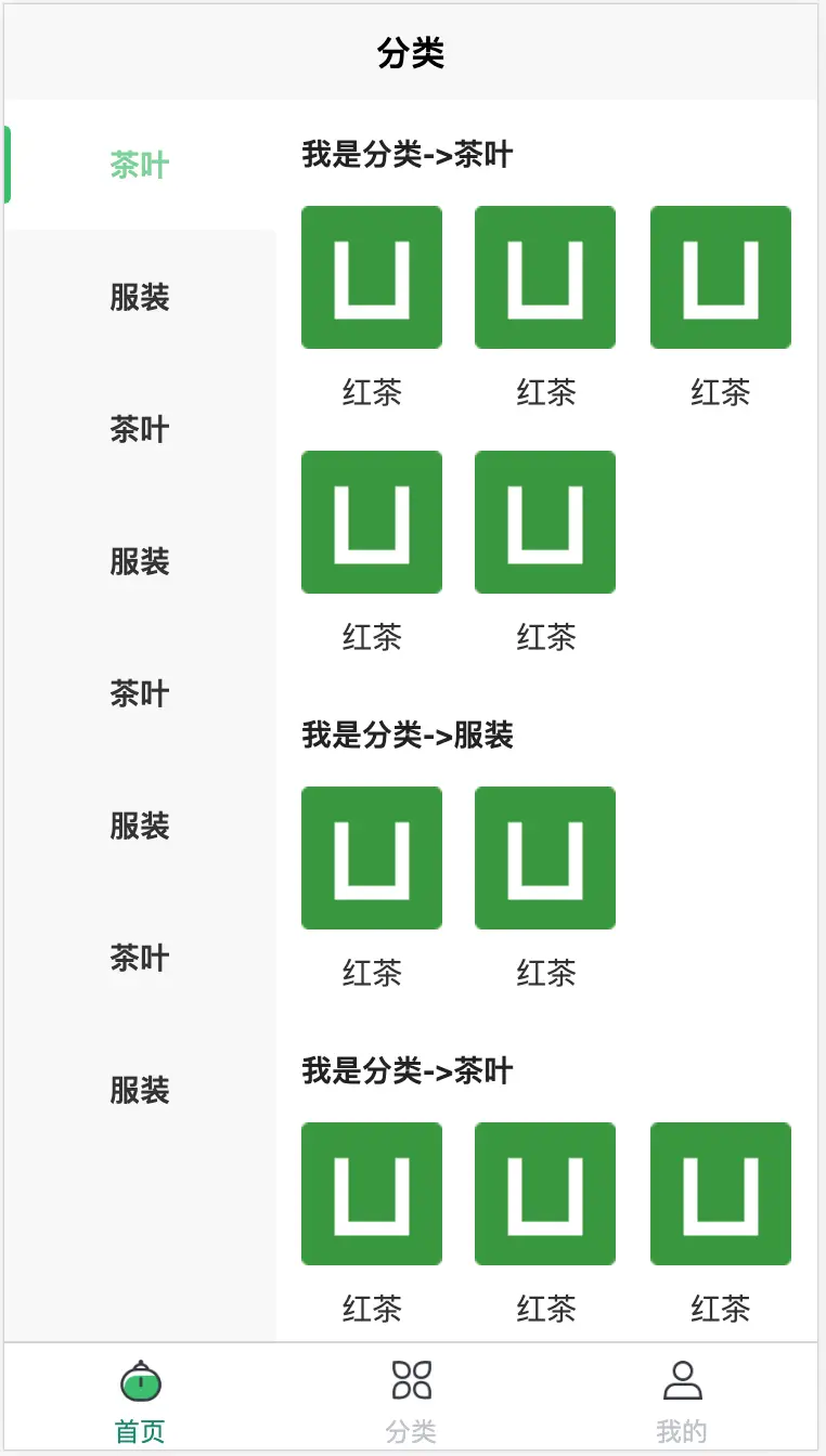
ss-classSide
在 pages.json 引入页面地址即可
{
            "path" : "uni_modules/ss-classSide/pages/ss-classSide/ss-classSide",
            "style" :
            {
                "navigationBarTitleText": "分类",
                "enablePullDownRefresh": false
            }

        }
左侧一级分类高度为 60rpx 可根据需求自定设置
.left_view {
    background-color: #f8f8f8;
    position: relative;
    // 蒙版
    .seletItem {
        height: 120rpx;
        position: absolute;
        top: 0rpx;
        left: 0rpx;
        z-index: 10;
        right: 0rpx;
        background-color: rgba(255, 255, 255, 0.3);
        transition: top 0.2s linear;
        display: flex;
        align-items: center;

        &::before {
            content: '';
            width: 6rpx;
            height: 60%;
            background-color: #24c06a;
            left: 0rpx;
            border-radius: 0px 100rpx 100rpx 0px;
        }
    }
    .left_item {
        display: flex;
        justify-content: center;
        align-items: center;
        height: 60px;
        margin-bottom: 2rpx;
        position: relative;
        font-weight: bold;
        font-size: 28rpx;
    }

    .left_item_s {
        background-color: #ffffff;
        color: #24c06a;
        font-weight: bold;
        position: relative;

    }
}
右侧默认为3列 可根据需求自定设置列与间距
.right_item_view {
            display: grid;
            grid-template-columns: repeat(3, 1fr);//需要几列 自行设置
            grid-template-rows: auto;
            grid-gap: 8px 15px;//间距
            .item {
                display: flex;
                flex-flow: column nowrap;
                align-items: center;
                text {
                    color: #333;
                    line-height: 40px;
                }
            }
        }
子分类图片宽度与高度
    subItemW:parseInt((uni.getSystemInfoSync().screenWidth * (2/3) - (15 * 2)-24)/3),

    2/3:右侧图所占屏幕的比例
    15 * 2:右侧子分类列与列之间的检测 因为为 3列 所有间隙为 2个
    24:右侧图内边距
    3:三列
 下载 1733
 赞赏 2
赞赏 2

 下载 12359920
 赞赏 1926


 赞赏
赞赏
 京公网安备:11010802035340号