

 收藏人数:
收藏人数:
 下载插件并导入HBuilderX
 下载插件ZIP
 赞赏(0)
赞赏(0)
更新记录
1.0.1(2021-05-18) 下载此版本
增加几个界面
1.0.0(2021-05-17) 下载此版本
需要的就拿走吧
平台兼容性
uni-app
| Vue2 | Vue3 | Chrome | Safari | app-vue | app-nvue | Android | iOS | 鸿蒙 |
|---|---|---|---|---|---|---|---|---|
| - | - | √ | √ | √ | - | - | - | - |
| 微信小程序 | 支付宝小程序 | 抖音小程序 | 百度小程序 | 快手小程序 | 京东小程序 | 鸿蒙元服务 | QQ小程序 | 飞书小程序 | 小红书小程序 | 快应用-华为 | 快应用-联盟 |
|---|---|---|---|---|---|---|---|---|---|---|---|
| √ | √ | √ | √ | - | - | - | √ | - | - | - | - |
ss-shoppage
主要是自用
导入本插件侯 右键 安装插件第三方依赖
在app.vue 引入样式
@import '@/uni_modules/ss-superModules/ss-superModules/superStyle/selfCss.css';
@import '@/uni_modules/ss-superModules/ss-superModules/superStyle/superCss.css';
在main.js 引入js
import superConfig from '@/uni_modules/ss-superModules/ss-superModules/superConfig.js'
Vue.use(superConfig)
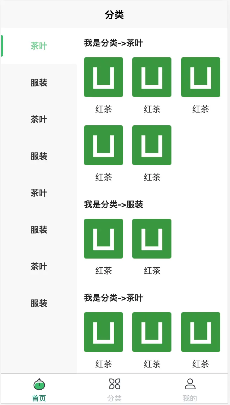
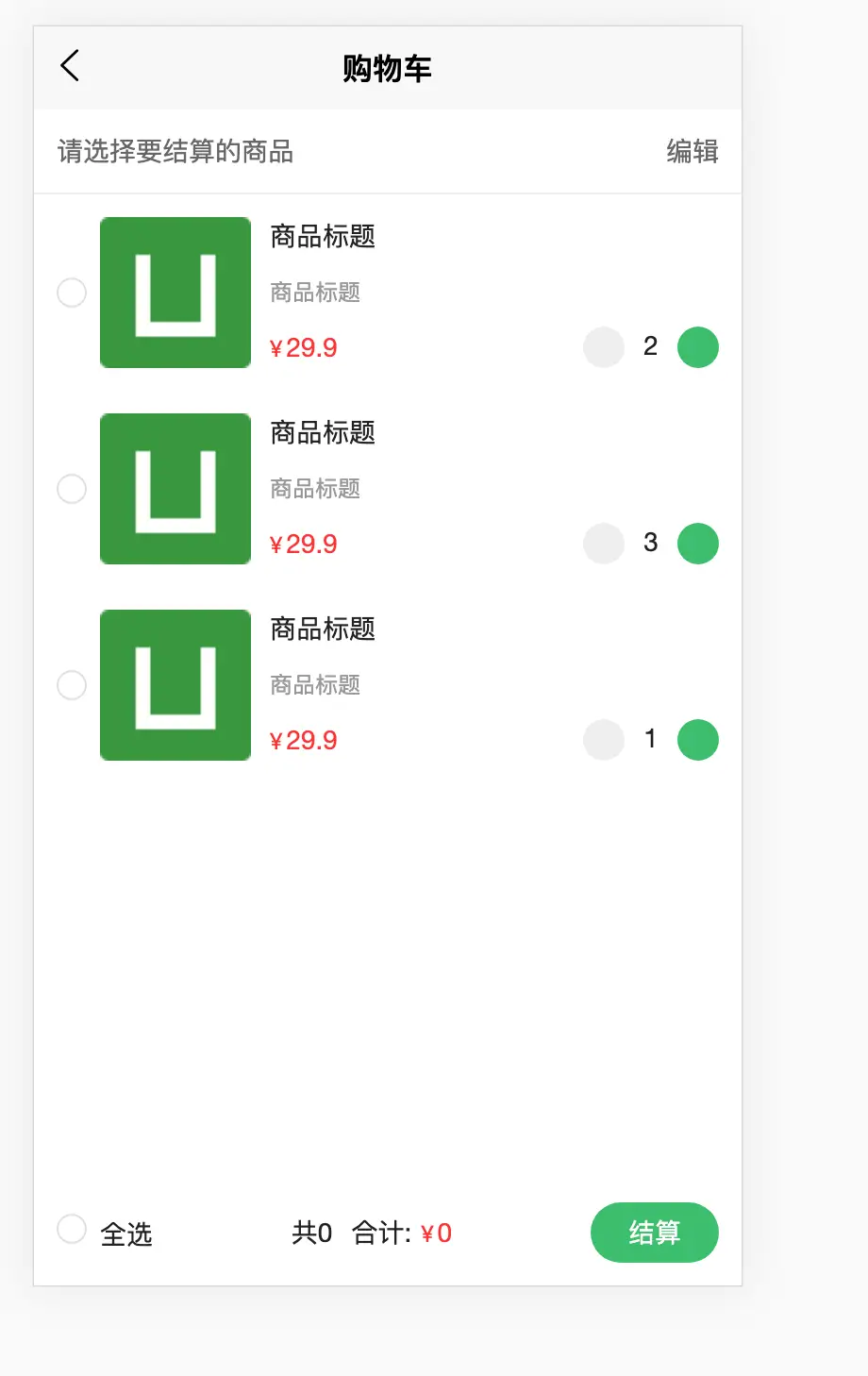
在 pages.json 引入页面地址即可 (二级分类 购物车) 其他界面都是半成品 需要自行对接数据
{
            "path" : "uni_modules/ss-shoppage/pages/ss-classSide/ss-classSide",
            "style" :
            {
                "navigationBarTitleText": "分类",
                "enablePullDownRefresh": false
            }

        }
左侧一级分类高度为 120rpx 可根据需求自定设置
.left_view {
    background-color: #f8f8f8;
    position: relative;
    // 蒙版
    .seletItem {
        height: 120rpx;
        position: absolute;
        top: 0rpx;
        left: 0rpx;
        z-index: 10;
        right: 0rpx;
        background-color: rgba(255, 255, 255, 0.3);
        transition: top 0.2s linear;
        display: flex;
        align-items: center;

        &::before {
            content: '';
            width: 6rpx;
            height: 60%;
            background-color: #24c06a;
            left: 0rpx;
            border-radius: 0px 100rpx 100rpx 0px;
        }
    }
    .left_item {
        display: flex;
        justify-content: center;
        align-items: center;
        height: 120rpx;
        margin-bottom: 2rpx;
        position: relative;
        font-weight: bold;
        font-size: 28rpx;
    }

    .left_item_s {
        background-color: #ffffff;
        color: #24c06a;
        font-weight: bold;
        position: relative;

    }
}
右侧默认为3列 可根据需求自定设置列与间距
.right_item_view {
            display: grid;
            grid-template-columns: repeat(3, 1fr);//需要几列 自行设置
            grid-template-rows: auto;
            grid-gap: 15rpx 30rpx;//间距
            .item {
                display: flex;
                flex-flow: column nowrap;
                align-items: center;
                text {
                    color: #333;
                    line-height: 80rpx;
                }
            }
        }
 下载 1733
 赞赏 2
赞赏 2

 下载 12435122
 赞赏 1934


 赞赏
赞赏
 京公网安备:11010802035340号