

 收藏人数:
收藏人数:
 https://github.com/GPBOB/ListCheckBox/tree/master
 下载插件并导入HBuilderX
 赞赏(0)
赞赏(0)
更新记录
1.2.3(2021-08-19) 下载此版本
添加重置选项方法
1.2.2(2021-08-17) 下载此版本
添加隐藏按钮属性
1.2.1(2021-08-17) 下载此版本
优化代码,添加小程序兼容,完善说明文档
查看更多平台兼容性
uni-app
| Vue2 | Vue3 | Chrome | Safari | app-vue | app-nvue | Android | iOS | 鸿蒙 |
|---|---|---|---|---|---|---|---|---|
| √ | - | √ | √ | √ | - | - | - | - |
| 微信小程序 | 支付宝小程序 | 抖音小程序 | 百度小程序 | 快手小程序 | 京东小程序 | 鸿蒙元服务 | QQ小程序 | 飞书小程序 | 小红书小程序 | 快应用-华为 | 快应用-联盟 |
|---|---|---|---|---|---|---|---|---|---|---|---|
| √ | - | - | - | - | - | - | - | - | - | - | - |
其他
| 多语言 | 暗黑模式 | 宽屏模式 |
|---|---|---|
| × | × | √ |
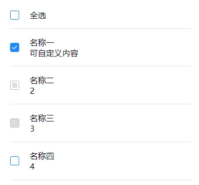
ListCheckBox
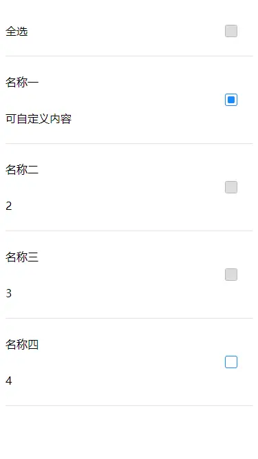
效果图


使用说明
| 参数 | 类型 | 默认值 | 必填 | 说明 |
|---|---|---|---|---|
| defaultColor | string | #1989fa(蓝色) | 否 | 默认主题色 |
| linkBorder | boolean | true | 否 | 复选框边界和配置色统一 |
| type | string | pane | 否 | 选择按钮类型 pane-方框,circle-圆形,custom-自定义(小程序不支持自定义) |
| selectAll | boolean | false | 否 | 是否全选 |
| isAll | boolean | true | 否 | 是否显示全选按钮 |
| disabledAll | boolean | false | 否 | 禁止全选 |
| data | array | [] | 是 | 数据 |
| allText | string | 全选 | 否 | 全选文本 |
| padding | number | 10 | 否 | 列表上下padding |
| size | number | 16 | 否 | 按钮大小 |
| activeSize | number | 10 | 否 | 按钮选中大小 |
| position | string | left | 否 | 按钮位置 (left,right) |
| hiddenButton | boolean | false | 否 | 隐藏选择按钮 |
方法
| 方法名 | 返回值 |
|---|---|
| select | 选中的数据 |
| $refs.xx.selectAllData | 全选数据 |
| $refs.xx.reset | 重置选项 |
如要自定义全选功能,获取全选的数据可使用$refs操作 调用selectAllData方法 上述select方法将会返回选中数据
selectAll(){
    this.$refs.listcheckbox.selectAllData()
}
data数据说明:
data数据格式为:
[
    {
        name:'张三',
        value:1,
        selected:true,
        disabled:true,
    },
    {
        name:'里斯',
        value:2
    },
]
其中selected默认为false,disabled默认为false,可设置。 其余数据可自定义设置
自定义内容
微信小程序不支持按钮自定义
 <template v-slot:checkSlot="item">
    <view class="test">
        <text>{{item.data.name}}</text>
        <text>{{item.data.value}}</text>
    </view>
 </template>
按钮自定义
//点击按钮自定义
<template v-slot:customBtn>
    <image style="width: 30rpx;height: 30rpx;" src="../../static/select.png" mode=""></image>
</template>
//禁用按钮自定义
<template v-slot:customDisabledBtn>
    <image style="width: 30rpx;height: 30rpx;" src="../../static/disabledSel.png" mode=""></image>
</template>
使用方法(例子)
<template>
    <view class="content">
        <ListCheckBox :disabledAll="true" :data="data" @select="selectData">
            <template v-slot:checkSlot="item">
                <view class="test">
                    <text>{{item.data.name}}</text>
                    <text>{{item.data.value}}</text>
                </view>
            </template>
            <template v-slot:customBtn>
                <image style="width: 30rpx;height: 30rpx;" src="../../static/select.png" mode=""></image>
            </template>
            <template v-slot:customDisabledBtn>
                <image style="width: 30rpx;height: 30rpx;" src="../../static/disabledSel.png" mode=""></image>
            </template>
        </ListCheckBox>
    </view>
</template>

<script>
    import ListCheckBox from '@/components/peng-ListCheckBox/ListCheckBox.vue'
    export default {
        data() {
            return {
                data: [{
                        name: '名称一',
                        value: '可自定义内容',
                        selected: true
                    },
                    {
                        name: '名称二',
                        value: 2,
                        disabled: true,
                        selected: true
                    },
                    {
                        name: '名称三',
                        value: 3,
                        disabled: true,
                    },
                    {
                        name: '名称四',
                        value: 4
                    }
                ]
            }
        },
        components: {
            ListCheckBox
        },
        onLoad() {

        },
        methods: {
            selectData(data) {
                console.log(data)
            }
        }
    }
</script>

<style>
    .content {
        padding: 40rpx;

    }

    .test {
        display: flex;
        flex-direction: column;
    }
</style>
type为custom时,自定义选择效果:
选中自定义按钮
//添加插槽名为customBtn
<template v-slot:customBtn>
    <image style="width: 15px;height: 15px;" src="../../static/select.png" mode=""></image>
</template>
禁止选中自定义按钮
//添加插槽名为customBtn
<template v-slot:customDisabledBtn>
    <image style="width: 15px;height: 15px;" src="../../static/disabledSel.png" mode=""><image>
</template>
github
https://github.com/GPBOB/ListCheckBox/tree/vue2.0
 下载 305
 赞赏 0
赞赏 0

 下载 12240296
 赞赏 1921


 赞赏
赞赏
 京公网安备:11010802035340号