

 收藏人数:
收藏人数:
 下载插件并导入HBuilderX
 赞赏(3)
赞赏(3)
更新记录
0.1.7(2025-12-26) 下载此版本
- fix: 修复uniapp vue2不显示问题
0.1.6(2025-09-16) 下载此版本
- feat: 增加
scrollPosition属性,用于告诉插件是否在滚动 - chore: 更新文档
0.1.5(2025-09-16) 下载此版本
feat: 增加scrollPosition属性,用于告诉插件是否在滚动
平台兼容性
uni-app(4.54)
| Vue2 | Vue3 | Chrome | Safari | app-vue | app-nvue | Android | iOS | 鸿蒙 |
|---|---|---|---|---|---|---|---|---|
| √ | √ | √ | √ | √ | √ | 5.0 | √ | √ |
| 微信小程序 | 支付宝小程序 | 抖音小程序 | 百度小程序 | 快手小程序 | 京东小程序 | 鸿蒙元服务 | QQ小程序 | 飞书小程序 | 小红书小程序 | 快应用-华为 | 快应用-联盟 |
|---|---|---|---|---|---|---|---|---|---|---|---|
| √ | - | - | - | - | - | - | - | - | - | - | - |
uni-app x(4.61)
| Chrome | Safari | Android | iOS | 鸿蒙 | 微信小程序 |
|---|---|---|---|---|---|
| √ | √ | 5.0 | √ | √ | √ |
lime-popover 气泡弹出框组件
一个功能丰富的气泡弹出框组件,用于在元素周围显示提示信息、菜单或其他内容。支持多种弹出位置、主题样式、箭头显示等配置,可用于提示说明、操作菜单、详细信息展示等多种场景。组件提供了丰富的自定义选项,可以满足各种气泡弹出框需求。
插件依赖:
lime-shared、lime-style
文档链接
📚 组件详细文档请访问以下站点:
安装方法
- 在uni-app插件市场中搜索并导入
lime-popover - 导入后可能需要重新编译项目
- 在页面中使用
l-popover组件
代码演示
基础用法
最简单的气泡弹出框组件用法,点击触发元素显示气泡内容。
<l-popover content="这是一个简单的气泡提示">
  <button>点击显示气泡</button>
</l-popover>
不同弹出位置
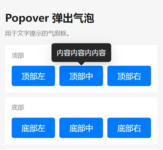
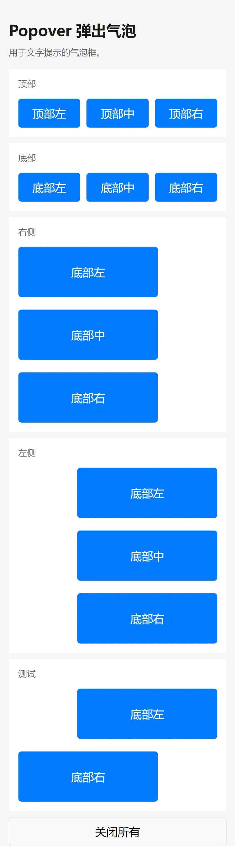
气泡支持多种弹出位置,可以根据需要设置。通过 placement 属性来控制气泡的弹出位置。可选项:top/left/right/bottom/top-left/top-right/bottom-left/bottom-right/left-top/left-bottom/right-top/right-bottom
<l-popover content="顶部显示" placement="top">
  <button>顶部</button>
</l-popover>

<l-popover content="底部显示" placement="bottom">
  <button>底部</button>
</l-popover>

<l-popover content="左侧显示" placement="left">
  <button>左侧</button>
</l-popover>

<l-popover content="右侧显示" placement="right">
  <button>右侧</button>
</l-popover>
不同主题
气泡支持亮色和暗色两种主题。
<l-popover content="亮色主题" theme="light">
  <button>亮色主题</button>
</l-popover>

<l-popover content="暗色主题" theme="dark">
  <button>暗色主题</button>
</l-popover>
自定义颜色
设置气泡的自定义颜色。
<l-popover content="自定义颜色" color="#ff5500">
  <button>自定义颜色</button>
</l-popover>
隐藏箭头
可以选择不显示气泡的箭头。
<l-popover content="无箭头气泡" :show-arrow="false">
  <button>无箭头</button>
</l-popover>
禁用状态
设置气泡为禁用状态,点击触发元素不会显示气泡。
<l-popover content="禁用状态" :disabled="true">
  <button>禁用状态</button>
</l-popover>
控制显示状态
通过visible属性控制气泡的显示和隐藏。
<template>
  <l-popover content="受控显示状态" :visible="visible">
    <button @click="toggleVisible">{{ visible ? '隐藏' : '显示' }}气泡</button>
  </l-popover>
</template>
const visible = ref(false)
const toggleVisible = () => {
visible.value = !visible.value
}自定义内容
使用插槽自定义气泡内容。
<l-popover>
  <template #content>
    <view class="custom-content">
      <text>自定义内容</text>
      <button size="mini" type="primary">操作按钮</button>
    </view>
  </template>
  <button>自定义内容</button>
</l-popover>
点击外部关闭
设置是否在点击气泡外部时自动关闭气泡。
<l-popover content="点击外部不会关闭" :close-on-click-outside="false">
  <button>点击外部不关闭</button>
</l-popover>
手动关闭
由于小程序无法监听点击自己以外的地方(WEB和APP无此问题),故使用了mask层,会导致点击其它按钮时会先点击mask层,造成要点击2下才点中的感觉。所以组件也提供了一个主动关闭的函数。在页面的根元素上绑定点击事件。
<view class="page" @click="closeAll">
    <l-popover :closeOnClickOutside="false"  theme="dark" content="内容" placement="bottom">
        <button type="primary">底部</button>
    </l-popover>
</view>
import { closeOutside } from '@/uni_modules/lime-popover'
const closeAll = () => {
closeOutside()
}快速预览
导入插件后,可以直接使用以下标签查看演示效果:
<!-- 代码位于 uni_modules/lime-popover/components/lime-popover -->
<lime-popover />
插件标签说明
| 标签名 | 说明 |
|---|---|
l-popover |
组件标签 |
lime-popover |
演示标签 |
Vue2使用说明
main.js中添加以下代码:
// vue2项目中使用
import Vue from 'vue'
import VueCompositionAPI from '@vue/composition-api'
Vue.use(VueCompositionAPI)详细配置请参考官方文档:Vue Composition API
API文档
Props 属性说明
| 属性名 | 说明 | 类型 | 默认值 |
|---|---|---|---|
| content | 气泡内容 | string | - |
| placement | 气泡弹出位置,可选值为 top、top-left、top-right、bottom、bottom-left、bottom-right、left、left-top、left-bottom、right、right-top、right-bottom |
string | top |
| theme | 气泡主题,预设值:light、dark 或自定义颜色值(十六进制、RGB、颜色名称等) |
string | light |
| showArrow | 是否显示箭头 | boolean | true |
| visible | 是否显示气泡,设置为 null 时为非受控模式 |
boolean | null |
| closeOnClickOutside | 是否在点击外部时关闭气泡 | boolean | true |
| color | 自定义文本气泡颜色 | string | - |
| disabled | 是否禁用气泡 | boolean | false |
| scrollPosition | 页面或scroll-view的滚动值,用于告诉插件是否在滚动 | number | - |
Slots 插槽
| 名称 | 说明 |
|---|---|
| default | 触发气泡显示的元素 |
| content | 自定义气泡内容 |
主题定制
组件提供了以下CSS变量,可用于自定义样式:
| 变量名称 | 默认值 | 描述 |
|---|---|---|
--l-popover-border-radius |
6px |
气泡圆角大小 |
--l-popover-font-size |
24px |
气泡内容文字大小 |
--l-popover-padding |
12px |
气泡内边距 |
--l-popover-line-height |
24px |
气泡内容行高 |
--l-popover-arrow-size |
8px |
气泡箭头大小 |
--l-popover-margin |
8px |
气泡内容外边距 |
--l-popover-color |
$text-color-1 (亮色主题) / #fff (暗色主题) |
气泡文字颜色 |
--l-popover-bg-color |
$bg-color-container (亮色主题) / $bg-color-spotlight (暗色主题) |
气泡背景颜色 |
支持与赞赏
如果你觉得本插件解决了你的问题,可以考虑支持作者:
| 支付宝赞助 | 微信赞助 |
|---|---|
 |
 |
 下载 72707
 赞赏 579

 下载 12321758
 赞赏 1923


 赞赏
赞赏

 京公网安备:11010802035340号