

 收藏人数:
收藏人数:
 下载插件并导入HBuilderX
 赞赏(1)
赞赏(1)
更新记录
0.1.0(2025-12-28) 下载此版本
- fix: 修复划动后无法关闭问题
0.0.9(2025-09-29) 下载此版本
- fix: 修复uniappx ios 返回是报错
0.0.8(2025-09-11) 下载此版本
- feat: 增加closeOnClickOutside,点击外部关闭
平台兼容性
uni-app(4.74)
| Vue2 | Vue3 | Chrome | Safari | app-vue | app-nvue | Android | iOS | 鸿蒙 |
|---|---|---|---|---|---|---|---|---|
| √ | √ | √ | √ | √ | - | 5.0 | √ | √ |
| 微信小程序 | 支付宝小程序 | 抖音小程序 | 百度小程序 | 快手小程序 | 京东小程序 | 鸿蒙元服务 | QQ小程序 | 飞书小程序 | 小红书小程序 | 快应用-华为 | 快应用-联盟 |
|---|---|---|---|---|---|---|---|---|---|---|---|
| √ | - | - | - | - | - | - | - | - | - | - | - |
uni-app x(4.74)
| Chrome | Safari | Android | iOS | 鸿蒙 | 微信小程序 |
|---|---|---|---|---|---|
| √ | √ | 5.0 | √ | √ | √ |
其他
| 多语言 | 暗黑模式 | 宽屏模式 |
|---|---|---|
| × | √ | × |
lime-swipe-cell 滑动单元格
一个功能丰富的滑动单元格组件,可以通过左右滑动来展示操作按钮。支持自定义左右滑动区域内容、异步关闭、默认打开等多种配置,适用于列表项的编辑、删除、收藏等操作场景。组件提供了丰富的自定义选项,可以满足各种复杂的交互需求。
插件依赖:
lime-shared、lime-style
文档链接
📚 组件详细文档请访问以下站点:
安装方法
- 在uni-app插件市场中搜索并导入
lime-swipe-cell - 导入后可能需要重新编译项目
- 在页面中使用
l-swipe-cell组件
代码演示
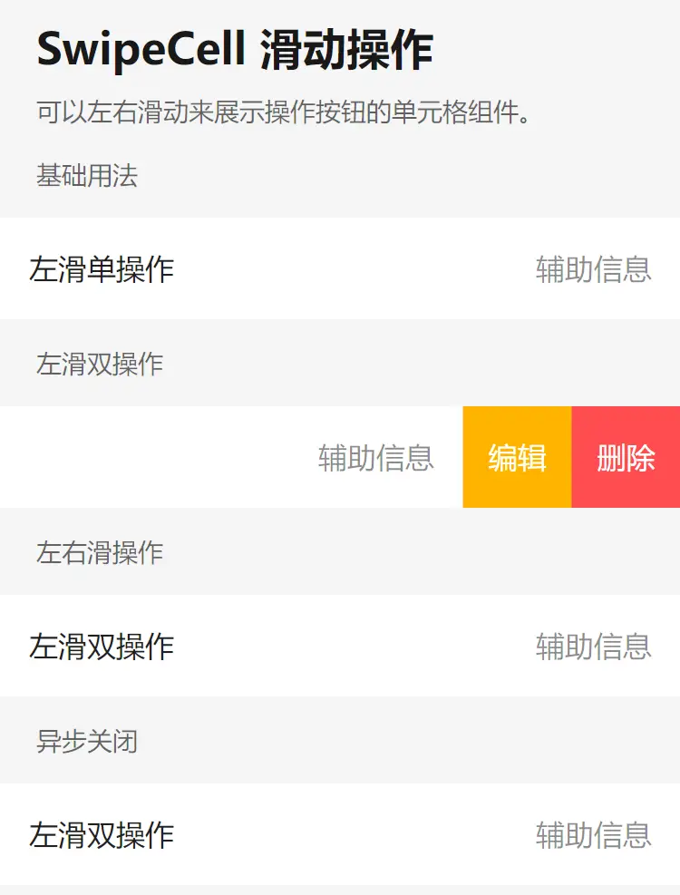
基础用法
SwipeCell 组件提供了 left 和 right 两个插槽,用于定义两侧滑动区域的内容。
<l-swipe-cell>
  <l-cell title="左滑单操作" note="辅助信息" :bordered="false" />
  <template #left>
    <view class="btn select-btn"><text>选择</text></view>
  </template>
  <template #right>
    <view class="btn delete-btn"><text>删除</text></view>
  </template>
</l-swipe-cell>
默认打开状态
通过设置 opened 属性可以控制滑动单元格的默认打开状态。当同时存在左右两侧操作区域时,opened 可以是一个数组,分别控制左右两侧的打开状态。
<!-- 默认打开右侧 -->
<l-swipe-cell :opened="true">
  <l-cell title="默认打开右侧" note="辅助信息" :bordered="false" />
  <template #right>
    <view class="btn delete-btn"><text>删除</text></view>
  </template>
</l-swipe-cell>

<!-- 默认打开左侧 -->
<l-swipe-cell :opened="[true, false]">
  <l-cell title="默认打开左侧" note="辅助信息" :bordered="false" />
  <template #left>
    <view class="btn select-btn"><text>选择</text></view>
  </template>
  <template #right>
    <view class="btn delete-btn"><text>删除</text></view>
  </template>
</l-swipe-cell>
异步关闭
通过传入 before-close 回调函数,可以自定义两侧滑动内容关闭时的行为。返回 Promise 可以实现异步控制。
<l-swipe-cell :before-close="beforeClose">
  <l-cell title="左滑双操作" note="辅助信息" :bordered="false" />
  <template #left>
    <view class="btn favor-btn"><text>选择</text></view>
  </template>
  <template #right>
    <view class="btn delete-btn" @click="onDelete"><text>删除</text></view>
  </template>
</l-swipe-cell>
// 组合式API
const beforeClose = (direction) => {
return new Promise((resolve) => {
if (direction == 'right') {
// 存储resolve函数,在确认删除时调用
resolveClose = resolve;
} else {
// 其他方向直接关闭
resolve(true);
}
});
};
let resolveClose = null;
const onDelete = () => {
uni.showModal({
title: '温馨提示',
content: '确定要删除吗?',
success(res) {
if (res.confirm) {
// 用户点击确认,关闭滑动单元格
resolveClose?.(true);
}
}
});
};
// 选项式API
export default {
methods: {
beforeClose(direction) {
return new Promise((resolve) => {
if (direction === 'right') {
this.resolveClose = resolve;
} else {
resolve(true);
}
});
},
onDelete() {
uni.showModal({
title: '温馨提示',
content: '确定要删除吗?',
success: (res) => {
if (res.confirm) {
this.resolveClose?.(true);
}
}
});
}
}
};禁用状态
通过设置 disabled 属性为 true 可以禁用滑动操作。
<l-swipe-cell :disabled="true">
  <l-cell title="禁用状态" note="不可滑动操作" />
  <template #right>
    <view class="btn delete-btn">删除</view>
  </template>
</l-swipe-cell>
点击外部关闭
设置是否在点击单元格外部时自动关闭单元格。但这功能仅在APP、WEB有效。为了全端统一,可以不设置closeOnClickOutside,使用函数关闭
<l-swipe-cell :closeOnClickOutside="true">
  <l-cell title="左滑双操作" />
  <template #right>
    <view class="btn delete-btn">删除</view>
  </template>
</l-swipe-cell>
// 在非APP/WEB时可以使用closeOutside关闭所有
import { closeOutside } from '@/uni_modules/lime-swipe-cell'
const closeAll = () => {
closeOutside()
}Vue2使用说明
main.js中添加以下代码:
// vue2项目中使用
import Vue from 'vue'
import VueCompositionAPI from '@vue/composition-api'
Vue.use(VueCompositionAPI)详细配置请参考官方文档:Vue Composition API
插件标签说明
l-swipe-cell 为组件标签
lime-swipe-cell 为演示标签
API文档
Props 属性说明
| 参数 | 说明 | 类型 | 默认值 |
|---|---|---|---|
| name | 标识符,可用于区分不同的滑动单元格 | string | - |
| disabled | 是否禁用滑动 | boolean | false |
| closeOnClickOutside | 是否在点击外部时关闭滑动单元格 | boolean | false |
| left | 左侧滑动操作项配置 | SwipeActionItem[] | - |
| right | 右侧滑动操作项配置 | SwipeActionItem[] | - |
| opened | 操作项是否呈现为打开态,值为数组时表示分别控制左右滑动的展开和收起状态 | boolean | boolean[] | false |
| before-close | 关闭前的回调函数,返回 Promise 可以异步控制关闭行为 | (direction: 'left' | 'right' | 'cell') => Promise\<boolean> | - |
| l-style | 自定义组件样式 | string | object | - |
SwipeActionItem 数据结构
| 键名 | 说明 | 类型 |
|---|---|---|
| text | 操作项文本 | string |
| icon | 操作项图标 | string | object |
| className | 操作项类名 | string |
| style | 操作项样式 | string |
| onClick | 点击操作项时的回调函数 | () => void |
Events 事件
| 事件名 | 说明 | 回调参数 |
|---|---|---|
| open | 打开滑动单元格时触发 | direction: 'left' | 'right' |
| close | 关闭滑动单元格时触发 | - |
Methods 方法
通过 ref 可以获取到 SwipeCell 实例并调用实例方法,组件类型为 LSwipeCellComponentPublicInstance
| 方法名 | 说明 | 参数 |
|---|---|---|
| close | 关闭滑动单元格 | - |
Slots 插槽
| 名称 | 说明 |
|---|---|
| default | 默认显示的内容 |
| left | 左侧滑动区域的内容 |
| right | 右侧滑动区域的内容 |
支持与赞赏
如果你觉得本插件解决了你的问题,可以考虑支持作者:
| 支付宝赞助 | 微信赞助 |
|---|---|
 |
 |
 下载 72771
 赞赏 580

 下载 12345450
 赞赏 1925


 赞赏
赞赏
 京公网安备:11010802035340号