

 收藏人数:
收藏人数:
 下载插件并导入HBuilderX
 下载插件ZIP
 赞赏(0)
赞赏(0)
更新记录
0.0.2(2021-08-06)
- 增加示例代码
0.0.1(2021-08-06)
- 集成纯CSS进度条,调整了布局基于em相对单位,并增加了test类型
- 集成了一款强大的进度条组件,并对内置显示百分比进行了修复
平台兼容性
| Vue2 | Vue3 |
|---|---|
| √ | × |
| App | 快应用 | 微信小程序 | 支付宝小程序 | 百度小程序 | 字节小程序 | QQ小程序 |
|---|---|---|---|---|---|---|
| HBuilderX 3.1.0 app-vue | × | √ | √ | √ | √ | √ |
| 钉钉小程序 | 快手小程序 | 飞书小程序 | 京东小程序 |
|---|---|---|---|
| × | × | × | × |
| H5-Safari | Android Browser | 微信浏览器(Android) | QQ浏览器(Android) | Chrome | IE | Edge | Firefox | PC-Safari |
|---|---|---|---|---|---|---|---|---|
| √ | √ | √ | √ | √ | × | √ | √ | √ |
wxy-progress
组件来源
对插件市场下载量比较高或自己比较喜欢的进度条进行了集成,在此先感觉这些优秀的作者:
- 纯css动态进度条(已完成集成)
- 一款强大的进度条组件(已完成集成)
- 圆形进度条
- vus-sphere-progress 球形进度条
- cmd-progress进度条组件
- 文件上传球形进度/百分比进度条插件
- Loading可以运用到上传下载中的进度条显示状态
- 一款带波浪的圆环进度条
集成的特点
- 布局采用相对单位em和百分比,尤其是纯CSS进度条,对样式和效果进行了优化,并增加了test的类型
- 转为uni-modules组件,集成和二次开发更方便
- 对集成进行H5、APP和小程序三个平台进行测试,保留跨端的组件
属性
mode {String} 目前可选css和progress,默认是css 至于集成组件属性可参考上面集成的
示例代码
CSS进度条
<template>
<view>
<wxy-progress mode="css" :Width="width" Type="aqua"></wxy-progress>
<wxy-progress mode="css" :Width="width" Type="copper"></wxy-progress>
<wxy-progress mode="css" :Width="width" Type="candy"></wxy-progress>
<wxy-progress mode="css" :Width="width" Type="neon"></wxy-progress>
<wxy-progress mode="css" :Width="width" Type="shine"></wxy-progress>
<wxy-progress mode="css" :Width="width" Type="zigzag"></wxy-progress>
<wxy-progress mode="css" :Width="width" Type="diamond"></wxy-progress>
<wxy-progress mode="css" :Width="width" Type="hearts"></wxy-progress>
<wxy-progress mode="css" :Width="width" Type="test"></wxy-progress>
</view>
<template>
<script>
export default {
data() {
return {
width:'70'
};
},
methods: {}
};
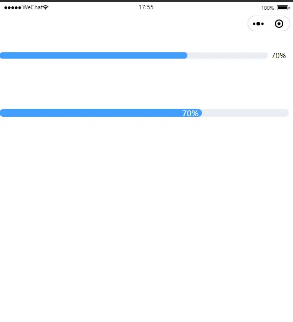
</script>另一款进度条
<template>
<view>
<wxy-progress mode="progress" :percentage="width" ></wxy-progress>
<wxy-progress mode="progress" :percentage="width" strokeWidth="20" textInside></wxy-progress>
</view>
<template>
<script>
export default {
    data() {
        return {
            width:'70'
        };
    },
    methods: {}
};
</script>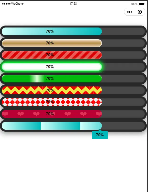
 下载 2043
 赞赏 0
赞赏 0

 下载 7774524
 赞赏 921


 赞赏
赞赏
 京公网安备:11010802035340号