

 收藏人数:
收藏人数:
 https://gitee.com/wangziwl/c-designc.git
 下载插件并导入HBuilderX
 赞赏(0)
赞赏(0)
更新记录
1.0.2(2023-04-13) 下载此版本
新增boderWidth属性 可设置边框宽度
1.0.1(2023-03-27) 下载此版本
兼容vue2
1.0.0(2023-01-05) 下载此版本
初次提交
查看更多平台兼容性
uni-app
| Vue2 | Vue3 | Chrome | Safari | app-vue | app-nvue | Android | iOS | 鸿蒙 |
|---|---|---|---|---|---|---|---|---|
| √ | √ | √ | √ | √ | × | - | - | - |
| 微信小程序 | 支付宝小程序 | 抖音小程序 | 百度小程序 | 快手小程序 | 京东小程序 | 鸿蒙元服务 | QQ小程序 | 飞书小程序 | 小红书小程序 | 快应用-华为 | 快应用-联盟 |
|---|---|---|---|---|---|---|---|---|---|---|---|
| √ | - | - | - | - | - | - | - | - | - | - | - |
其他
| 多语言 | 暗黑模式 | 宽屏模式 |
|---|---|---|
| × | × | √ |
c-progress-circle
- c-progress-circle 环形进度条
c-design交流:
示例预览
https://cloud.vuedata.wang/cdesign/#/pages/progress-circle/progress-circle
一、使用示例
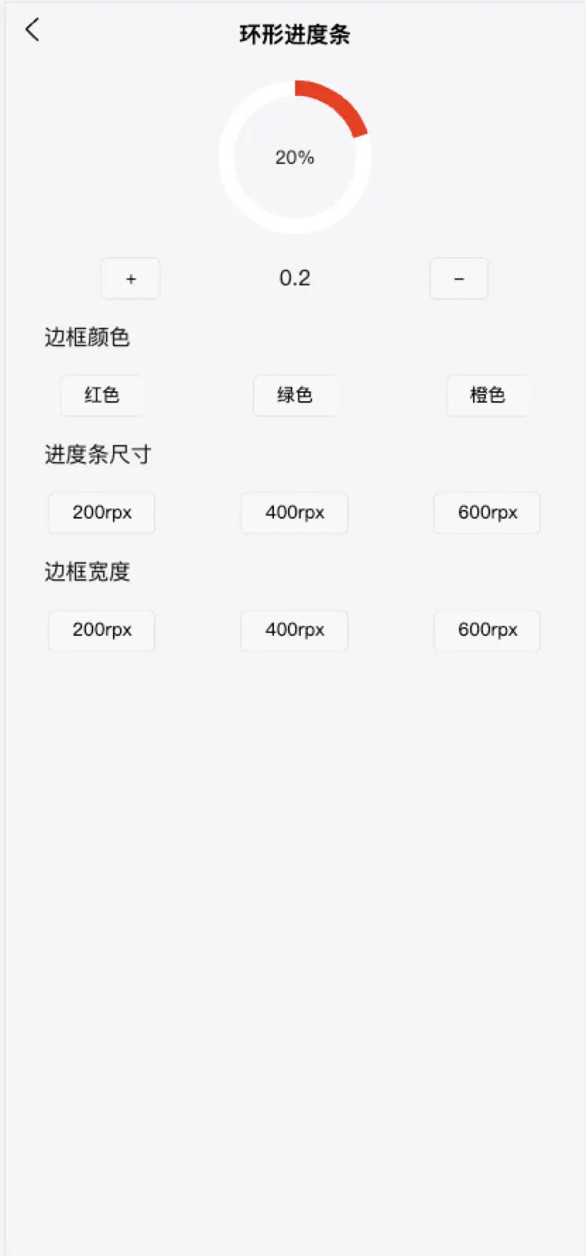
<template>
    <view class="content">
        <c-progress-circle :progress='progress' :color='color' :size='size' :boderWidth="boderWidth"></c-progress-circle>
        <view class="btnBox">
            <button size="mini" @click="add">+</button>
            <view style="width: 100rpx;text-align: center;">
                {{progress}}
            </view>
            <button size="mini" @click="reduce" type="default">-</button>
        </view>
        <view class="btnBox" style="padding-left: 100rpx;">边框颜色</view>
        <view class="btnBox">
            <button size="mini" @click="color='red'">红色</button>
            <button size="mini" @click="color='green'">绿色</button>
            <button size="mini" @click="color='orange'">橙色</button>
        </view>
        <view class="btnBox" style="padding-left: 100rpx;">进度条尺寸</view>
        <view class="btnBox">
            <button size="mini" @click="size='200rpx'">200rpx</button>
            <button size="mini" @click="size='400rpx'">400rpx</button>
            <button size="mini" @click="size='600rpx'">600rpx</button>
        </view>
        <view class="btnBox" style="padding-left: 100rpx;">边框宽度</view>
        <view class="btnBox">
            <button  size="mini" @click="boderWidth='200rpx'">200rpx</button>
            <button  size="mini" @click="boderWidth='400rpx'">400rpx</button>
            <button  size="mini" @click="boderWidth='600rpx'">600rpx</button>
        </view>
    </view>
</template>

<script>
    export default {
        data() {
            return {
                progress: 0.2,
                color:'red',
                size:'200rpx',
                boderWidth:'200rpx'
            }
        },
        methods: {
            add() {
                if(this.progress<1){
                    this.progress +=0.1
                    this.progress=this.progress.toFixed(1)*1
                }
            },
            reduce(){
                if(this.progress>0){
                    this.progress -=0.1
                    this.progress=this.progress.toFixed(1)*1
                }
            }
        },
    }
</script>

<style lang="scss">
    .content{
        display: flex;
        flex-direction: column;
        align-items: center;
        padding-top: 20rpx;
        font-size: 28rpx;
    }
    .btnBox{
        width: 100%;
        display: flex;
        align-items: center;
        margin-top:30rpx;
    }
</style>
二、属性介绍
| 字段 | 类型 | 必填 | 默认值 | 描述 |
|---|---|---|---|---|
| progress | Number | 否 | 0 | 进度 0-1 |
| color | String | 否 | #3ec3c1 | 进度条颜色 |
| size | String | 否 | 200rpx | 进度条尺寸 单位rpx |
| boderWidth | String | 否 | 200rpx | 边框宽度 单位rpx |
 下载 3013
 赞赏 2
赞赏 2

 下载 12251488
 赞赏 1922


 赞赏
赞赏
 京公网安备:11010802035340号