更新记录
1.0.0(2023-05-13)
下载此版本
1.0.0
平台兼容性
uni-app
| Vue2 |
Vue3 |
Chrome |
Safari |
app-vue |
app-nvue |
Android |
iOS |
鸿蒙 |
| √ |
√ |
√ |
√ |
√ |
√ |
- |
- |
- |
| 微信小程序 |
支付宝小程序 |
抖音小程序 |
百度小程序 |
快手小程序 |
京东小程序 |
鸿蒙元服务 |
QQ小程序 |
飞书小程序 |
小红书小程序 |
快应用-华为 |
快应用-联盟 |
| √ |
√ |
√ |
√ |
√ |
√ |
- |
√ |
√ |
- |
√ |
√ |
其他
l-circularProgress
传入的值单位都是px 需自行转化适配
例如:宽度{
需要传入的宽度px = 想要的宽度rpx / 750 * wx.getSystemInfoSync().windowWidth
}
使用方法
配置easycom规则后,自动按需引入,无需import组件,直接引用即可。
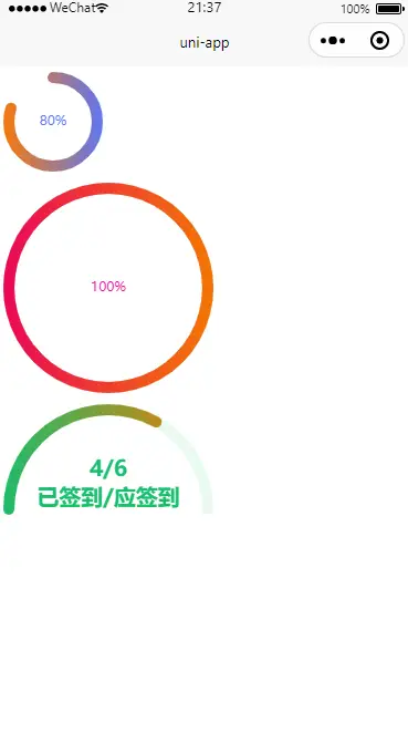
<template>
    <l-circularProgress :isBgShow="false" :lineWidth="10" boxWidth="100" boxHeight="100" progressColor="#ff7900" fontColor="#5677fc" gradualColor="#5677fc"
      :percent="80"></l-circularProgress>
    <l-circularProgress progressColor="#EB0559" :lineWidth="10" fontColor="#EB0999" gradualColor="#f57900" :percent="100">
    </l-circularProgress>
    <l-circularProgress :fontShow="false" :percent="66" type="halfCircular" :lineWidth="10" gradualColor="#f57900" progressColor="#19be6b" fontColor="#19be6b"
      bgColor="rgba(25,190,107,0.1)" @end="end">
      <view class="text">
        <view>{{num}}/6</view>
        <view class="">已签到/应签到</view>
      </view>
    </l-circularProgress>
</template>
组件属性
| 属性 |
类型 |
默认值 |
说明 |
| boxWidth |
Number |
100 |
宽度 |
| boxHeight |
Number |
100 |
高度 |
| lineWidth |
Number |
4 |
进度条线条宽度 |
| isBgShow |
Boolean |
true |
是否显示背景进度条 |
| bgColor |
String |
#CCCCCC |
背景进度条颜色 |
| type |
String |
circular |
进度条类型 circular圆形 halfCircular 半圆 |
| percent |
Number |
0 |
进度百分比 |
| progressColor |
String |
#5677fc |
进度条颜色 |
| gradualColor |
String |
'' |
进度条渐变颜色 跟progressColor一起使用 |
| fontShow |
Boolean |
true |
是否显示进度文字 |
| fontSize |
Number |
12 |
进度字体大小 |
| fontColor |
String |
#5677fc |
进度字体颜色 |
组件事件
插槽


 收藏人数:
收藏人数:
 下载插件并导入HBuilderX
 赞赏(25)
 下载 3586
 赞赏 25
赞赏 25

 下载 12345840
 赞赏 1925


 赞赏
赞赏


 京公网安备:11010802035340号