

 收藏人数:
收藏人数:
 下载插件并导入HBuilderX
 赞赏(2)
赞赏(2)
更新记录
1.2.1(2024-03-05) 下载此版本
- 修复一些加载样式。
1.2.0(2024-01-26) 下载此版本
- 修复一些样式
1.1.9(2023-12-19) 下载此版本
- 优化一些加载样式
平台兼容性
uni-app
| Vue2 | Vue3 | Chrome | Safari | app-vue | app-nvue | Android | iOS | 鸿蒙 |
|---|---|---|---|---|---|---|---|---|
| × | √ | √ | √ | √ | - | - | - | - |
| 微信小程序 | 支付宝小程序 | 抖音小程序 | 百度小程序 | 快手小程序 | 京东小程序 | 鸿蒙元服务 | QQ小程序 | 飞书小程序 | 小红书小程序 | 快应用-华为 | 快应用-联盟 |
|---|---|---|---|---|---|---|---|---|---|---|---|
| √ | - | - | - | - | - | - | - | - | - | - | - |
其他
| 多语言 | 暗黑模式 | 宽屏模式 |
|---|---|---|
| × | × | √ |
uniapp loading加载动画提示
组件名:uaLoading 代码块:
<ua-loading>
uaLoading基于uniapp vue3自定义loading加载提示组件。支持自定义加载图标、文字水平/垂直排列、包裹内容块、全屏提示等功能。
引入方式
本组件符合easycom规范,只需将本组件放在components目录,在页面template中即可直接使用。
基本用法
示例
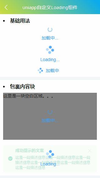
- 基础用法
<script setup>
    import { ref } from 'vue'

    const loaded = ref(true)
    const loading = ref(true)
    const loadingfull = ref(false)
    const loadingstyle = ref(false)
    const loadingstyle2 = ref(false)

    const handleOpen = () => {
        console.log('opened!')
    }
    const handleClose = () => {
        console.log('closed!')
    }
</script>
<ua-loading v-model="loaded" background="rgba(0,0,0,.75)" spinner="ve-icon-loading" fullscreen="false">
<template #text><div>加载中...</div></template>
</ua-loading>
<ua-loading v-model="loaded" text="Loading..." background="rgba(0,0,0,.75)" fullscreen="false" />
<ua-loading v-model="loaded" text="加载中" size="16px" mode="horizontal" background="rgba(0,0,0,.5)" fullscreen="false" />- 自定义全屏loading
<ua-loading
    v-model="loadingfull"
    text="加载中"
    time="3"
    size="50px"
    background="rgba(5,50,10,.9)"
    fullscreen="true"
    @open="handleOpen"
    @close="handleClose"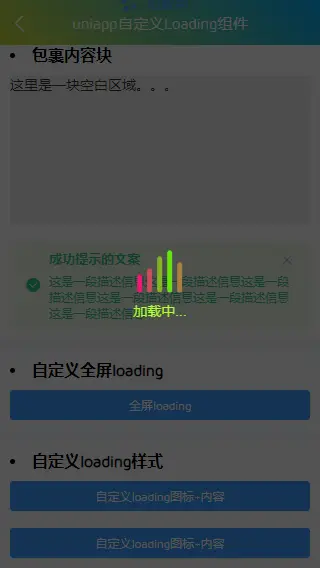
/>- 自定义loading动画样式
<ua-loading v-model="loadingstyle" background="rgba(0,0,0,.75)" shadeClose>
    <template #spinner>
        <span class="custom-loading">
            <em></em><em></em><em></em><em></em><em></em>
        </span>
    </template>
    <template #text><div style="color: greenyellow;">加载中...</div></template>
</ua-loading>
.custom-loading {display: inline-flex; align-items: flex-end; gap: 5px; min-height: 45px;}
.custom-loading em {
background: #ff007f; border-radius: 6px; display: inline-block; height: 100%; width: 5px;
animation: animHeart 1s linear infinite;
}
@keyframes animHeart {
0%,100% {height: 15px; background: #ff007f;}
50% {height: 45px; background: #55ff00;}
}
.custom-loading em:nth-child(2) {animation-delay: .2s;}
.custom-loading em:nth-child(3) {animation-delay: .4s;}
.custom-loading em:nth-child(4) {animation-delay: .6s;}
.custom-loading em:nth-child(5) {animation-delay: .8s;}API
uaLoading Props
| 属性名 | 类型 | 默认值 | 说明 |
|---|---|---|---|
| modelValue | Boolean | false | 是否显示loading |
| text | String | - | 加载提示内容 |
| spinner | String | - | 自定义加载图标类名 |
| background | String | - | 遮罩层背景 |
| mode | String | vertical | 显示模式(vertical / horizontal) |
| size | Number/String | 24 | 加载图标大小 |
| loadingStyle | String | - | 自定义样式 |
| shade | Boolean | true | 是否显示加载遮罩层 |
| shadeClose | Boolean | false | 点击遮罩层关闭loading |
| opacity | Number/String | - | 遮罩层透明度 |
| fullscreen | Boolean | true | 是否全屏loading |
| time | Number | 0 | loading显示时间 |
| zIndex | Number/String | 2023 | loading层级 |
事件
- @open 打开触发
- @close 关闭触发
💝最后
基于uniapp+vue3短视频直播商城同步上架工房,感兴趣的可以去了解一下哟!
https://gf.bilibili.com/item/detail/1105131011
开发不易,希望各位小伙伴们多多支持下哈~~ ☕️☕️


 下载 5289
 赞赏 76
赞赏 76

 下载 12375068
 赞赏 1927


 赞赏
赞赏

 京公网安备:11010802035340号