

 收藏人数:
收藏人数:
 下载插件并导入HBuilderX
 赞赏(4)
赞赏(4)
更新记录
1.1.6(2023-10-22) 下载此版本
- 修复一些图标间距样式问题
1.1.5(2023-09-19) 下载此版本
- 支持自定义iconfont图标
1.1.4(2023-08-18) 下载此版本
- 修复一些样式
平台兼容性
uni-app
| Vue2 | Vue3 | Chrome | Safari | app-vue | app-nvue | Android | iOS | 鸿蒙 |
|---|---|---|---|---|---|---|---|---|
| √ | × | √ | √ | √ | - | - | - | - |
| 微信小程序 | 支付宝小程序 | 抖音小程序 | 百度小程序 | 快手小程序 | 京东小程序 | 鸿蒙元服务 | QQ小程序 | 飞书小程序 | 小红书小程序 | 快应用-华为 | 快应用-联盟 |
|---|---|---|---|---|---|---|---|---|---|---|---|
| √ | - | - | - | - | - | - | - | - | - | - | - |
其他
| 多语言 | 暗黑模式 | 宽屏模式 |
|---|---|---|
| × | × | √ |
uniapp Navbar导航栏
**组件名:uaNavbar 代码块:
<ua-navbar>
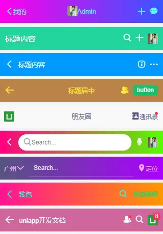
一款轻量级的uniapp顶部自定义导航栏组件。
注意事项 如果页面开启了自定义导航
"navigationStyle":"custom",记得设置组件属性custom: true。
引入方式
本组件符合easycom规范,HBuilderX 2.5.5起,只需将本组件导入项目,在页面template中即可直接使用,无需在页面中import和注册components。
使用前
注意:需要在 App.vue 中获取顶部状态栏高度。
<script>
    import Vue from 'vue'

    export default {
        globalData: {
            // 全局设置状态栏和导航栏高度
            statusBarH: 0,
            customBarH: 0,
        },
        onLaunch: function() {
            uni.getSystemInfo({
                success: (e) => {
                    // 获取手机状态栏高度
                    let statusBar = e.statusBarHeight
                    let customBar

                    // #ifndef MP
                    customBar = statusBar + (e.platform == 'android' ? 50 : 45)
                    // #endif

                    // #ifdef MP-WEIXIN
                    // 获取胶囊按钮的布局位置信息
                    let menu = wx.getMenuButtonBoundingClientRect()
                    // 导航栏高度 = 胶囊下距离 + 胶囊上距离 - 状态栏高度
                    customBar = menu.bottom + menu.top - statusBar
                    // #endif

                    // #ifdef MP-ALIPAY
                    customBar = statusBar + e.titleBarHeight
                    // #endif

                    // 注意:此方法不支持原生Nvue页面
                    Vue.prototype.statusBarH = statusBar
                    Vue.prototype.customBarH = customBar

                    // 支持nvue页面写法(兼容H5/小程序/APP/APP-Nvue)
                    this.globalData.statusBarH = statusBar
                    this.globalData.customBarH = customBar
                }
            })
        },
        // ...
    }
</script>
基本用法
示例
<navbar :back="true" title="标题内容" bgcolor="#09f" color="#fff" fixed zIndex="1010" />- 自定义背景色、颜色、沉浸式透明及自定义插槽内容
<navbar custom bgcolor="linear-gradient(to right, #ff007f, #0000ff)" color="#55ffff" center transparent zIndex="3003">
    <template slot="back"><text class="iconfont icon-arrL"></text></template>
    <template slot="backText"><text>我的</text></template>
    <template slot="title"><image src="/static/img2.jpg" style="height:20px;width:20px;" /> Admin</template>
    <template slot="right">
            <view class="ml-20" @click="handleAdd"><text class="iconfont icon-tianjia"></text></view>
            <view class="ml-20"><text class="iconfont icon-msg"></text></view>
    </template>
</navbar>
API
Navbar Props
| 属性名 | 类型 | 默认值 | 说明 |
|---|---|---|---|
| custom | Boolean | false | 是否页面开启自定义导航 |
| back | Boolean | true | 是否有返回按钮 |
| title | String | '' | 标题 |
| color | String | '#fff' | 标题颜色 |
| bgcolor | String | '#22d59c' | 导航条背景色 |
| center | Boolean | false | 标题是否居中显示 |
| fixed | Boolean | false | 是否固定导航 |
| transparent | Boolean | false | 是否透明沉浸式背景 |
| zIndex | Number | 2021 | 导航条层级 |
💝最后
基于uniapp+vue3短视频直播商城同步上架工房,感兴趣的可以去了解一下哟!
https://gf.bilibili.com/item/detail/1105131011
开发不易,希望各位小伙伴们多多支持下哈~~ ☕️☕️

 下载 5291
 赞赏 76
赞赏 76

 下载 12395609
 赞赏 1930


 赞赏
赞赏


 京公网安备:11010802035340号