更新记录
1.0.0(2023-08-20)
下载此版本
组合树,自用插件
平台兼容性
uni-app
| Vue2 |
Vue3 |
Chrome |
Safari |
app-vue |
app-nvue |
Android |
iOS |
鸿蒙 |
| √ |
- |
- |
- |
- |
- |
- |
- |
- |
| 微信小程序 |
支付宝小程序 |
抖音小程序 |
百度小程序 |
快手小程序 |
京东小程序 |
鸿蒙元服务 |
QQ小程序 |
飞书小程序 |
小红书小程序 |
快应用-华为 |
快应用-联盟 |
| - |
- |
- |
- |
- |
- |
- |
- |
- |
- |
- |
- |
安装方式
只需在main.js中引入直接使用,无需在页面中import和注册components。
基本用法
在 template 中使用组件
<!-- 基础用法 -->
<u-select
    :value="value"
    :data="[{id: 0,text:'全部'},{id: 1,text:'小明'},{id: 2,text:'小红'}]"
></u-select>
<!-- 自用插件,如需使用+V: wxid_xcxkf -->
export default {
    data() {
        return {
            value: '0'
        }
    },
}
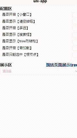
功能说明
- 表单输入框,树机构展示、下拉展示,。
- 支持,搜索框。
- 支持懒加载。
- 等等...(更多支持项,请查看示例)
属性
| 属性名 |
类型 |
默认值 |
说明 |
| clearable |
Boolean |
false |
是否显示清空按钮 |
| type |
String |
select |
数据结构展示(tree/select) |
| lazy |
Boolean |
false |
是否懒加载 |
| multiple |
Boolean |
false |
是否多选 |
| isSearch |
Boolean |
false |
是否显示搜索框 |
| selectOnlyRootNode |
Boolean |
false |
tree结构时是否只能选择根节点 |
|value |String、Array | | 单选时类型为String,多选时为Array |
|data |Array |[] | 数据源 |
|props |Object |{id: 'id',text: 'text',children: 'children',disabled: false,isLeaf: 'isLeaf'} | 配置选项 |
|selectedData |Array |[] | 默认回显选中数据 |
props 参数说明
| 参数 |
类型 |
默认值 |
说明 |
| id |
String |
id |
id(绑定的id; 注:唯一) |
| text |
String |
text |
显示的名称 |
| children |
String |
children |
子选项集合名 |
| disabled |
String |
disabled |
是否禁用 |
| isLeaf |
String |
isLeaf |
是否为根节点 |
事件
| 事件名 |
说明 |
返回值 |
| @load |
懒加载时进入 |
(dataHistory : Array,item : Object) |
| @submit |
选择确认后进入 |
(data : Array) |
@load,懒加载时。返回值说明如下:
| 返回值 |
类型 |
说明 |
| dataHistory |
Array |
面包屑导航数据记录 |
| item |
Object |
当前选中的值 |
@submit ,选择完成后。返回值说明如下:
| 参数 |
类型 |
说明 |
| data |
Array |
选中数据集合 |


 收藏人数:
收藏人数:
 下载插件并导入HBuilderX


 下载 216
 赞赏 1
赞赏 1


 下载 12354964
 赞赏 1926


 赞赏
赞赏
 京公网安备:11010802035340号