

 收藏人数:
收藏人数:
 下载插件并导入HBuilderX
 下载示例项目ZIP
 赞赏(0)
赞赏(0)
更新记录
1.1.8(2024-02-05) 下载此版本
修改组件的弹框虚影不关闭
1.1.7(2024-01-29) 下载此版本
修复高度问题
1.1.6(2023-12-15) 下载此版本
初始化会自动关闭弹框
平台兼容性
uni-app
| Vue2 | Vue3 | Chrome | Safari | app-vue | app-nvue | Android | iOS | 鸿蒙 |
|---|---|---|---|---|---|---|---|---|
| √ | - | √ | √ | - | - | - | - | - |
| 微信小程序 | 支付宝小程序 | 抖音小程序 | 百度小程序 | 快手小程序 | 京东小程序 | 鸿蒙元服务 | QQ小程序 | 飞书小程序 | 小红书小程序 | 快应用-华为 | 快应用-联盟 |
|---|---|---|---|---|---|---|---|---|---|---|---|
| √ | - | - | - | - | - | - | - | - | - | - | - |
其他
| 多语言 | 暗黑模式 | 宽屏模式 |
|---|---|---|
| × | × | √ |
msj-down
vue2 头部导航栏下拉弹窗组件。
使用使用
可通过下方的示例及文档说明,进一步了解使用组件相关细节参数。
功能统计
- 点击事件(插槽 :文字插槽 、 图标插槽)
- 点击排序(插槽 :文字插槽)
- 下拉列表(单选)(插槽 :文字插槽 、 内容插槽)
- 筛选(单选、多选)(插槽 :文字插槽 、 内容插槽)
点击俩次菜单 关闭弹框,只允许以下才会有效果
- down 下拉列表
- filter 筛选
组件参数
| 属性 | 类型 | 默认值 | 必填 | 说明 |
|---|---|---|---|---|
| menuList | Array |
[] |
是 | 导航菜单数据 |
| themeColor | String |
#0090e9 |
否 | 选中颜色 |
| textColor | String |
#333333 |
否 | 常规颜色 |
| fixedTop | Boolean |
false |
否 | 是否固定在顶部 |
| duration | [Number, String] |
300 |
否 | 弹窗过渡时间 |
| height | [Number, String] |
40 |
否 | 高度 |
| gapHeaderHeight | [Number, String] |
0 |
否 | 距离头部还有多少高度 |
| border | Boolean |
false |
否 | 是否显示边框 |
| isGrow | Boolean |
false |
否 | 是否自定义样式,默认排版,非flex |
| fontSize | String |
14 |
否 | 字体大小 单位px |
提示:
fixedTop固定是头部和菜单一起固定,暂时不能单独固定
gapHeaderHeight,如果滚动会出现 顶部有些数据隐藏,那么就是没有给顶部高度,要从当前件上面的数据进行测量高度 。gapHeaderHeight如果这个组件上面还有元素的话,那么需要进行测量高度上面元素的高度
导航菜单
menuList 参数
提示:每个类型不同,相应配置参数会不同,以下是基本参数
| 属性 | 类型 | 默认值 | 必填 | 说明 |
|---|---|---|---|---|
| title | String |
- | 是 | 菜单名称 |
| type | String |
- | 是 | 菜单类型 |
| slot | String |
- | 否 | 菜单 title 插槽,自定义, 那 title 就会失效 以 slot 为主 |
| class | String |
- | 否 | 菜单 class 类 |
| isRest | Boolean |
- | 否 | 是否默认初始化 |
| emit | String |
类型默认值 | 否 | 点击按钮时的处理,返回函数( 下方会介绍 ) |
type 类型
- click 点击
- sort 排序
- down 下拉列表
- filter 筛选
click 点击
| 属性 | 类型 | 默认值 | 必填 | 说明 |
|---|---|---|---|---|
| icon | String |
- | 否 | 图标,( 🚫 目前不可用 ) |
| slotIcon | String |
- | 否 | 通过插槽方式 自定义文字右边的数据,如图标 |
| emit | String |
click | 否 | 返回函数,返回参数( item , index )=>{} |
Events
| 事件名 | 参数 | 说明 |
|---|---|---|
click ( 根据参数emit 而定义 ) |
item 点击项 , index 索引 | 点击事件绑定值 |
案例
<!-- 常规形式 -->
<msj-down
  :menuList="menuList"
  @dianji="dianjiClick"
>
</msj-down>

<!-- 插槽形式 -->
<msj-down
  :menuList="menuList"
  @dianji="dianjiClick"
>
  <template #click>
    <div>slot插槽 - 插槽名为 click </div>
  </template>
  <template #slotIconClick>
    <div>图标插槽 - 插槽名为 slotIconClick </div>
  </template>
</msj-down>
// 常规形式
const menuList = [
{
title: '点击事件',
type: 'click',
class: 'click',
emit: 'dianji'
},
]
// 插槽形式
const menuList = [
{
// title: '点击事件', // 用 slot , title 失效
type: 'click',
class: 'click',
slot: 'click',
slotIcon:'slotIconClick',
emit: 'dianji'
},
]
// 以下正常:
// emit 回掉函数 参数 item 当前点击项 index 索引
function dianjiClick(item,index){}sort 排序
| 属性 | 类型 | 默认值 | 必填 | 说明 |
|---|---|---|---|---|
| value | String |
asc | 是 | 排序,参数值 仅有 asc 、desc 俩个选项 |
| emit | String |
sort | 否 | 返回函数,返回参数( item , index )=>{} |
Events
| 事件名 | 参数 | 说明 |
|---|---|---|
sort ( 根据参数emit 而定义 ) |
item 点击项 , index 索引 | 点击事件绑定值 |
案例
<!-- 常规形式 -->
<msj-down
  :menuList="menuList"
  @paixu="paixuClick"
>
</msj-down>

<!-- 插槽形式 -->
<msj-down
  :menuList="menuList"
  @paixu="paixuClick"
>
  <template #paixuTitle>
    <div>slot插槽 - 插槽名为 paixuTitle </div>
  </template>
</msj-down>
// 常规形式
const menuList = [
{
title: '排序',
type: 'click',
class: 'click',
value: 'asc',
emit: 'paixu'
},
]
// 插槽形式
const menuList = [
{
// title: '排序', // 用 slot , title 失效
type: 'sort',
class: 'sort',
slot: 'paixuTitle',
value: 'asc',
emit: 'paixu'
},
]
// 以下正常:
// emit 回掉函数 参数 item 当前点击项 index 索引
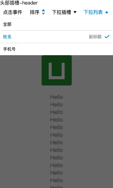
function paixuClick(item,index){}down 下拉列表
| 属性 | 类型 | 默认值 | 必填 | 说明 |
|---|---|---|---|---|
| value | String |
all | 是 | 选中值 |
| isAll | Boolean |
- | 否 | 是否存在全部,不是插槽的情况下有效 |
| popupSlot | String |
popupDown | 否 | 插槽 弹框内容 如使用后,value 、options 、isAll 失效 |
| options | Array |
[] | 否 | 下拉列表数据 |
| emit | String |
down | 否 | 返回函数,返回参数( item , index )=>{} |
| emitConfim | String |
downConfirm | 否 | 返回函数,返回参数( value, item, itemIndex, index )=>{} |
Events
| 事件名 | 参数 | 说明 |
|---|---|---|
down( 根据参数emit 而定义 ) |
item 点击项 , index 索引 | 点击项事件 |
| downConfirm | value 选中值, item 点击项, itemIndex 点击项索引, index 选中值索引 | 确认选定的值时触发 |
options 下拉列表数据
| 属性 | 类型 | 默认值 | 必填 | 说明 |
|---|---|---|---|---|
| label | String |
- | 否 | 选项的标签 展示 |
| value | String |
- | 否 | 选项的值 唯一值,不可重复 |
| suffix | String |
- | 否 | 副标题 |
案例
<!-- 常规形式 -->
<msj-down
  :menuList="menuList"
  @noDownSolt="noDownSoltClick"
  @downConfirmEmit="downConfirmNoSolt"
>
</msj-down>

<!-- 插槽形式 -->
<msj-down
  :menuList="menuList"
  @downSolt="isDownSoltClick"
>
  <template #isSlotTitle>
    <div>slot 插槽 - 插槽名为 isSlotTitle </div>
  </template>

  <template #downPopup>
    <div>插槽内容</div>
  </template>
</msj-down>
// 常规形式
const menuList = [
{
title: '下拉列表',
type: 'down',
class: 'down',
value: 'name',
isAll: true,
options: [
{
label: '姓名',
value: 'name',
suffix: '副标题'
},
{
label: '手机号',
value: 'phone'
}
],
emit: 'noDownSolt',
emitConfim: 'downConfirmEmit'
},
]
// 插槽形式
const menuList = [
{
// title: '下拉列表插槽', // 用 slot , title 失效
type: 'down',
class: 'no-down',
slot: 'isSlotTitle',
popupSlot: 'downPopup',
emit: 'downSolt',
},
]
// 常规形式
// emit 回掉函数 参数 item 当前点击项 index 索引
function noDownSoltClick(item,index){}
// emitConfim 回掉函数 参数 value 选中值, item 点击项, itemIndex 点击项索引, index 选中值索引
function downConfirmNoSolt(value, item, itemIndex, index) {}
// 插槽形式
// emit 回掉函数 参数 item 当前点击项 index 索引
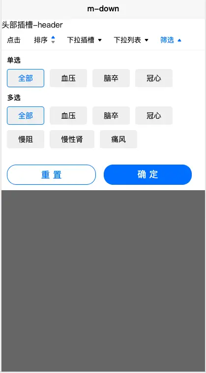
function isDownSoltClick(item,index){}filter 筛选
| 属性 | 类型 | 默认值 | 必填 | 说明 |
|---|---|---|---|---|
| isBtn | Boolean |
true |
否 | 是否显示确认 重置 按钮 |
| popupSlot | String |
popupFilter | 否 | 插槽 弹框内容 如使用后,value 、options 、isAll 失效 |
| options | Array |
[] | 否 | 下拉列表数据 |
| emit | String |
filter | 否 | 返回函数,返回参数( value,item , index )=>{} |
| emitConfim | String |
filterConfirm | 否 | 返回函数,返回参数( value, item, itemIndex, index )=>{} |
Events
| 事件名 | 参数 | 说明 |
|---|---|---|
down( 根据参数emit 而定义 ) |
item 点击项 , index 索引 | 点击项事件 |
| filterConfirm | value 选中值, item 点击项, index 点击项索引 | 确定 按钮选定的值时触发 |
options 下拉列表数据
type 类型
- radio 单选
- checkbox 多选
| 属性 | 类型 | 默认值 | 必填 | 说明 |
|---|---|---|---|---|
| type | String |
- | 是 | 下拉列表类型 |
| title | String |
- | 是 | 下拉列表名称 |
| isAll | Boolean |
- | 否 | 是否存在全部 |
| value | String、Array |
- | 否 | radio、checkbox |
| options | Array |
[] | 否 | radio、checkbox 数据 |
value
radio 默认值为: all
checkbox 默认值为: ['all']
radio、checkbox
options 下拉列表数据
| 属性 | 类型 | 默认值 | 必填 | 说明 |
|---|---|---|---|---|
| label | String |
- | 否 | 选项的标签 展示 |
| value | String |
- | 否 | 选项的值 唯一值,不可重复 |
案例
<!-- 常规形式 -->
<msj-down
  :menuList="menuList"
  @filterSolt="filterSolt"
  @filterEmitConfim="filterEmitConfim"
>
</msj-down>

<!-- 插槽形式 -->
<msj-down
  :menuList="menuList"
  @filterSolt="filterSolt"
  @filterEmitConfim="filterEmitConfim"
>
  <template #filterTitle>
    <div>slot 插槽 - 插槽名为 filterTitle </div>
  </template>

  <template #popupFilter>
    <div>插槽内容</div>
  </template>
</msj-down>
// 常规形式
const menuList = [
{
title: '筛选',
type: 'filter',
class: 'filter',
options: [
{
type: 'radio',
title: '单选',
value: 'all',
isAll: true, // 是否存在全部,不是插槽的情况下有效
options: [
{
label: '血压',
value: 'xueya'
},
{
label: '脑卒',
value: 'naozu'
},
{
label: '冠心',
value: 'guanxin'
}
]
},
{
type: 'checkbox',
title: '多选',
value: ['all'],
isAll: true, // 是否存在全部,不是插槽的情况下有效
options: [
{
label: '血压',
value: 'xueya'
},
{
label: '脑卒',
value: 'naozu'
},
{
label: '冠心',
value: 'guanxin'
},
{
label: '慢阻',
value: 'manzu'
},
{
label: '慢性肾',
value: 'manxingshen'
},
{
label: '痛风',
value: 'tongfeng'
}
]
}
],
emit: 'filterSolt', // 默认的时候 filterConfirm ,并不是插槽
emitConfim: 'filterEmitConfim'
// slot: 'filterTitle', // text
// popupSlot: 'popupFilter', // 弹框内容
}
]
// 插槽形式
const menuList = [
{
// title: '筛选', // 用 slot , title 失效
type: 'filter',
class: 'filter',
emit: 'filterSolt', // 点击文字时 有 slot 失效 默认的时候 filterConfirm ,并不是插槽
emitConfim: 'filterEmitConfim', // 确实按钮
slot: 'filterTitle', // text
popupSlot: 'popupFilter', // 弹框内容
}
]
// 常规形式
// emit 回掉函数 参数 item 当前点击项 index 索引
function filterSolt(item,index){}
// emitConfim 回掉函数 参数 value 选中值, item 点击项, index 点击项索引
function downConfirmNoSolt(value, item, index) {}
// 插槽形式
// emit 回掉函数 参数 item 当前点击项 index 索引
function filterSolt(item,index){}
// emitConfim 回掉函数 参数 value 选中值, item 点击项, index 点击项索引
function downConfirmNoSolt(value, item, index) {}
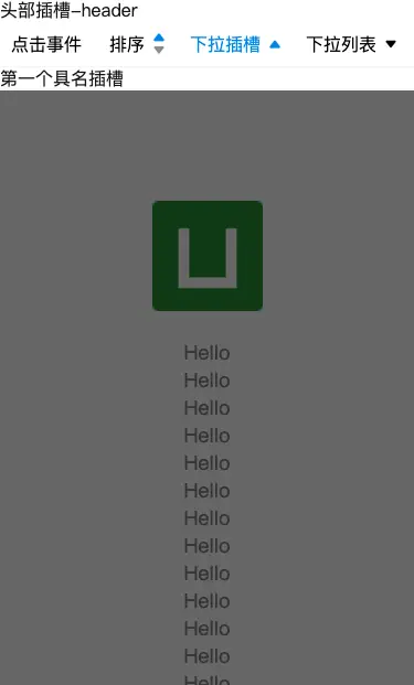
公共插槽
| 插槽名 | 说明 |
|---|---|
| header | 导航菜单 上部代码 |
| 默认slot | 导航菜单 下部代码,可以理解为内容版块 |
提示:
header如fixedTop为false, 那header代码在 导航菜单 上面, 如fixedTop为true, 那header代码在 导航菜单 里面 就可以固定,但菜单数据还是显示在header下方
案例
<msj-down
  :menuList="menuList"
>
  <template #header>
    <div>头部插槽-header</div>
  </template>
  <template>
    <div>内容插槽-无</div>
  </template>
</msj-down>
初始化,恢复默认值
| 参数 | 默认值 | 必填 | 类型 | 说明 |
|---|---|---|---|---|
| header | null | 否 | Array、null |
数组索引 , 如果传入 null ,使用默认的初始化 |
| isAll | true | 否 | Boolean |
是否全部初始化 true : 初始化 |
初始化会自动关闭弹框
案例
<msj-down
  :menuList="menuList"
  ref="baseDown"
>
</msj-down>
// 第一种情况 全部初始化
this.$refs.baseDown.initData()
this.$refs.baseDown.initData(null)
this.$refs.baseDown.initData(null, true)
this.$refs.baseDown.initData([0,1])
this.$refs.baseDown.initData([0,1], true)
// 第二种情况 使用默认初始化
// 数组为
// 每一项中 有 isRest 才会初始化
const menuList = [
{
title: '类型筛选',
type: 'down',
value: 'all',
options: [
{
label: '全部',
value: 'all'
},
{
label: 'CC',
value: 'cici'
},
],
isRest: true
}
]
this.$refs.baseDown.initData(null, false)
// 第三种情况 使用索引
// 数组为
const menuList = [
{
title: '类型筛选',
type: 'down',
value: 'all',
options: [
{
label: '全部',
value: 'all'
},
{
label: 'CC',
value: 'cici'
},
]
},
{
title: '筛选',
type: 'down',
value: 'all',
options: [
{
label: '全部',
value: 'all'
},
{
label: 'XX',
value: 'xixi'
},
]
}
]
this.$refs.baseDown.initData([0,1], false)关闭弹窗
案例
<msj-down
  ref="baseDown"
>
</msj-down>
this.$refs.baseDown.handlePopupHide()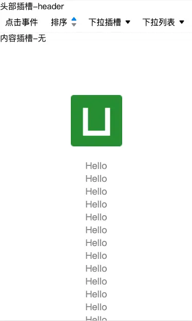
 下载 45
下载 45
 赞赏 0
赞赏 0

 下载 12296513
 赞赏 1922


 赞赏
赞赏
 京公网安备:11010802035340号