


 收藏人数:
收藏人数:
 https://github.com/xzcwx/xz-easy-uni
 下载插件并导入HBuilderX
 赞赏(0)
赞赏(0)
更新记录
0.0.1(2024-06-11) 下载此版本
xz-tooltip 首次上架
平台兼容性
uni-app
| Vue2 | Vue3 | Chrome | Safari | app-vue | app-nvue | Android | iOS | 鸿蒙 |
|---|---|---|---|---|---|---|---|---|
| × | √ | - | - | √ | - | - | - | - |
| 微信小程序 | 支付宝小程序 | 抖音小程序 | 百度小程序 | 快手小程序 | 京东小程序 | 鸿蒙元服务 | QQ小程序 | 飞书小程序 | 小红书小程序 | 快应用-华为 | 快应用-联盟 |
|---|---|---|---|---|---|---|---|---|---|---|---|
| √ | √ | √ | - | √ | √ | - | √ | √ | - | - | - |
xz-tooltip
[toc]
一、使用说明
xz-tooltip 是基于 uniapp 框架的一款文字气泡提示组件,组件干练简洁易用,只专注于移动端签名功能。
目前基于 TS 编写,暂未分离 TS 语法,需要项目支持 TS 依赖使用。
特点:
- 支持 easycom 导入,允许不导入组件直接使用。
- 自定义程度高,可根据具体需求,自定义 UI、内容。
- 提示方位齐全,用法与知名 Element-ui 框架一致,减少学习成本。
- 单组件下载版本无需第三方依赖,开箱直用,若需要使用多个该系列组件,建议使用体积更小的完整组件包。
注意:组件属于首发测试阶段,使用过程中遇到问题或有建议的话请提交 Issues · xzcwx/xz-easy-uni (gitee.com),感谢您的配合❤。
二、使用示例
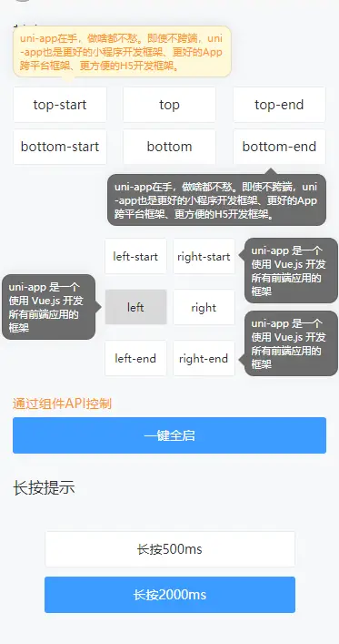
1)、基本使用
<script setup lang="ts">
  import { reactive, type ComponentPublicInstance } from "vue";
  const $state = reactive({
      text: "uni-app 是一个使用 Vue.js 开发所有前端应用的框架"
  });

</script>

<template>
  <view>
    <xz-tooltip :tips="$state.text" direction="bottom">
      <uv-button text="bottom" custom-text-style="font-size: 24rpx" />
    </xz-tooltip>
    <xz-tooltip :tips="$state.text" direction="left-start">
      <uv-button text="left-start" custom-text-style="font-size: 24rpx" />
    </xz-tooltip>
    <xz-tooltip :tips="$state.text" direction="right-end">
      <uv-button text="right-end" custom-text-style="font-size: 24rpx" />
    </xz-tooltip>
  </view>
</template>
2)、手动切换显示隐藏
通过组件实例暴露的 switch 方法,手动控制提示显示与隐藏。
<script setup lang="ts">
  import { reactive, type ComponentPublicInstance } from "vue";

  type RefComponent = Record<string, ComponentPublicInstance<Record<string, any>>[] | null>;

  const $refs: RefComponent = reactive({
    xztooltip: null
  });

  function startupEvent() {
    if (!$refs.xztooltip) {
      return;
    }
    $refs.xztooltip.switch(true);
  }

</script>

<template>
  <view>
    <xz-tooltip :ref="ref => $refs.xztooltip = ref" tips="uni-app 是一个使用 Vue.js 开发所有前端应用的框架" direction="bottom">
      <uv-button text="bottom" custom-text-style="font-size: 24rpx" />
    </xz-tooltip>

    <view class="tooltip-demo__control">
        <text class="tooltip-demo__control__title">通过组件API控制</text>
        <uv-button type="primary" text="一键全启" @click="startupEvent" />
    </view>
  </view>
</template>
3)、自定义插槽
不仅限于文字,通过自定义插槽,可以实现更多的效果、兼容更多的UI原型。
<template>
  <view>
    <xz-tooltip square color="#333" bgc="#FCFCFC" text-align="center" direction="top-end">
    <template #default>
        <view style="display: flex;align-items: center">
                <uv-icon name="error-circle" color="inherit" size="20" />
                <text>摘下花吗</text>
        </view>
    </template>
    <template #tips>
        <view style="display: flex;flex-direction: column">
            <view style="display: flex;justify-content: center;align-items: center;">
                <text>喜欢一朵花🌷,不一定要摘下来</text>
                <uv-icon name="close" color="#930000" size="20" />
            </view>
            <view style="display: flex;justify-content: center;align-items: center">
                <text>喜欢一阵风🌀,不一定能一直闻着</text>
                <uv-icon name="warning" color="#EAC100" size="20" />
            </view>
            <view style="display: flex;justify-content: center;align-items: center">
                <text>喜欢一朵云☁,不可能能永远罩着</text>
                <uv-icon name="empty-page" color="inherit" size="20" />
            </view>
            <text>一生一世皆是断崖和无情</text>
            <text>谎言多了,就连本人也能骗了</text>
            <text>但愿人长久 千里共婵娟</text>
        </view>
    </template>
    </xz-tooltip>
  </view>
</template>
三、组件Props属性
| 属性名 | 类型 | 默认值 | 说明 |
|---|---|---|---|
| tips | string | "" |
提示内容 |
| width | string | "#F0F0F0" |
提示气泡宽度 |
| direction | XzTooltipDirection | "top" |
显示位置 |
| duration | number | 3000 |
autoClose为 true 情况下,提示气泡显示持续时间 |
| longpressDuration | number | 500 |
longpress为 true 时,长按持续时间 |
| lineHidden | number | 5 |
超出指定行数进行文本省略,默认为5行 |
| color | string | "#FFF" |
文字颜色 |
| bgc | string | "#6C6C6C" |
背景颜色 |
| textAlign | string | "left" |
提示文字对齐方式 |
| square | boolean | false |
是否小方角样式 |
| border | boolean | true |
是否显示边框 |
| autoClose | boolean | true |
是否自动关闭提示气泡 |
| longpress | boolean | false |
是否启用长按 |
四、组件Events
| 事件名 | 参数 | 说明 |
|---|---|---|
| close | () => void | 隐藏提示时触发 |
| open | () => void | 显示提示时触发 |
五、组件Slots
| 插槽名 | 作用域 | 说明 |
|---|---|---|
| default | {} |
需要文字提示的元素 |
| tips | {} |
自定义气泡提示内容 |
六、组件方法
| 方法名 | 类型 | 说明 |
|---|---|---|
| switch | (show?: boolean, ignore: boolean = false) => void | 切换文字提示的显示 show:指定是否显示,不传默认取相反 ignore:在启用长按模式时,是否忽略长按 |
七、类型定义
| 类型名 | 类型 |
|---|---|
| XzTooltipDirection | "top" | "top-start" | "top-end" | "bottom" | "bottom-start" | "bottom-end" | "left" | "left-start" | "left-end" | "right" | "right-start" | "right-end"; |
便捷导航
- 作者博客地址:https://blog.csdn.net/XianZhe_
- 项目仓库地址:

 下载 862
 赞赏 0
赞赏 0

 下载 12443496
 赞赏 1935


 赞赏
赞赏
 京公网安备:11010802035340号