

 收藏人数:
收藏人数:
 下载插件并导入HBuilderX
 赞赏(0)
赞赏(0)
更新记录
1.0.0(2020-06-29) 下载此版本
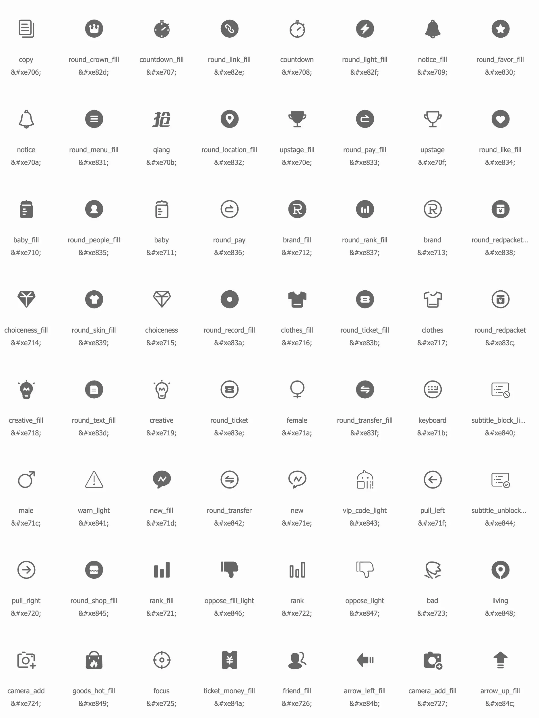
自定义图标
平台兼容性
Icons自定义图标
自定义图标,组件名:icons,代码块: icons。
使用方式
在 script 中引用组件
全局引用,在main.js中引用
import NavBar from '@/components/lz-icons/icons.vue'
Vue.component("Icons", Icons);
按需引用
import navBar from "@/components/lz-icons/icons.vue"
export default {
    components: {Icons}
}
在 template 中使用组件
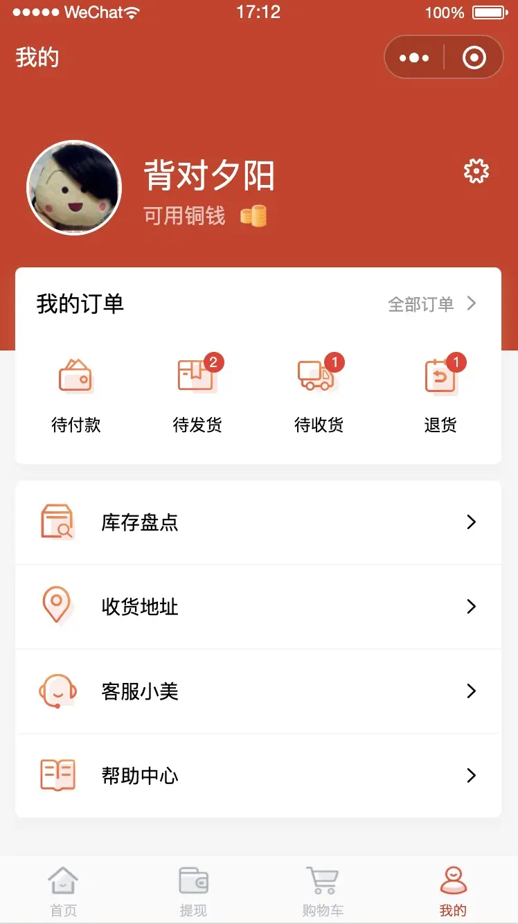
<icons type="home" size="28upx" color="#333" @click="clickMe"></icons>属性说明
| 属性名 | 类型 | 默认值 | 说明 |
|---|---|---|---|
| Type | String | 图标类型 | |
| color | String | #333 | 图标类型,参考示例 |
| size | String | inherit | 标题内容 |
事件说明
| 事件名 | 说明 | 返回值 |
|---|---|---|
| @click | 点击 Icon 触发事件 | - |
插件预览地址
https://www.iconfont.cn/collections/detail?cid=33
Tips
- 本组件图标库来源于
iconfont官方图标库手机淘宝图标库,作者明飒 - 图标
type命名方式为官方图标库名称修改为驼峰命名,例:like_fill修改为likeFill - 设置
size大小请自带单位并且默认值为inherit是为了方便与上下文文字大小保持一致,响应式单位建议使用rpx,uni-app在 App 端、H5 端都支持了rpx
 下载 3957
 赞赏 0
赞赏 0

 下载 12228677
 赞赏 1918


 赞赏
赞赏
 京公网安备:11010802035340号