


 收藏人数:
收藏人数:
 购买源码授权版(
 试用
试用
 使用 HBuilderX 导入示例项目
 赞赏(0)
赞赏(0)
更新记录
1.5.4(2026-09-24)
微信小程序端增加 PoPTabContentRenderer 组件
1.5.3(2026-09-22)
添加tab切换事件uni.$emit(${EMIT_TABBAR_SWITCH}-${item.key}),用于tab页监听此事件 去刷新该页数据
1.5.2(2026-09-15)
下一层级 tab 页标题区,增加返回按钮,点击返回上一层级页面
查看更多平台兼容性
uni-app x(5.0)
| Chrome | Safari | Android | iOS | 鸿蒙 | 微信小程序 |
|---|---|---|---|---|---|
| √ | √ | √ | √ | √ | √ |
其他
| 多语言 | 暗黑模式 | 宽屏模式 |
|---|---|---|
| × | × | √ |
sunrains-tabbar-pro 插件使用指南
在使用插件过程中遇到问题 请进群交流
服务端配套支持 1:网络请求解密,验签,返回结果加密;2:身份证ocr识别 3:人脸注册,识别,人证比对 4:活体检测 5:人脸核身 6:车牌号识别
注:活体检测、人脸核身 页面用到camera组件,camera组件官方只支持 小程序、ios、安卓端,其它平台可自己录制视频,直接调用插件中api(全平台支持)
开发文档
目录
- [1. 功能列表及各平台兼容汇总]
- [2. 基础配置]
- [3. 动态配置 TabBar]
- [4. 数字角标功能]
- [5. 主题配置]
- [6. page页跳转自定义tab页]
- [7. 拓展底部tabbar类型,(切换、弹出、进入)页面]
- [8. 多层级tabbar,可返回上一层,返回首层]
- [9. tabbar与tab页之前事件驱动]
- [10. mine.uvue示例代码 ]
- [11. 同层级tab页跳转tab页]
- [12. 增加当前主题信息及主题列表相关功能]
- [13. 增加tab菜单,所有tabbar由服务端动态配置]
-
[14. tabbar类型为tabPage时(既切换页面时,非弹出、进入页面),触发点击事件,可用于刷新页面数据]
菜单与主题动态配置录制视频
1.功能列表及各平台兼容汇总
| 功能\平台 | Android | iOS | HarmonyOS | 微信小程序 | H5 |
|---|---|---|---|---|---|
| 动态tabbar | ✔ | ✔ | ✔ | ✔ | ✔ |
| 数字角标 | ✔ | ✔ | ✔ | ✔ | ✔ |
| 主题切换 | ✔ | ✔ | ✔ | ✔ | ✔ |
| page页跳转tab页 | ✔ | ✔ | ✔ | ✔ | ✔ |
| tabbar类型,(切换、弹出、进入)页面 | ✔ | ✔ | ✔ | ✔ | ✔ |
| 多层级tabbar | ✔ | ✔ | ✔ | ✔ | ✔ |
| tabbar与tab页之间事件驱动 | ✔ | ✔ | ✔ | ✔ | ✔ |
| 多层级tabbar虚拟按键返回 | ✔ | ✘ | ✔ | ✘ | ✘ |
| 同层级所有tab页不切换层级时只加载一次 | ✔ | ✔ | ✔ | ✘ | ✔ |
| 同层级tab页跳转tab页(类型都是tabPage) | ✔ | ✔ | ✔ | ✔ | ✔ |
| 当前主题信息及主题列表相关功能 | ✔ | ✔ | ✔ | ✔ | ✔ |
| tab菜单,所有tabbar由服务端动态配置 | ✔ | ✔ | ✔ | ✔ | ✔ |
| tabbar类型为tabPage时触发点击事件 | ✔ | ✔ | ✔ | ✔ | ✔ |
注: 同层级所有tab页(类型为tabPage)不切换层级时只加载一次(tab页remount为false时),指定的tab页 remount 为true时同层tabbar每次切换到该tab页都重新挂载页面(其他为false的可以不在重新挂载、卸载),切换到其它tab页时卸载,只对tabType为tabPage有效
2. 基础配置
2.1 配置 tabbar-config.uts(可以是任何名称,配置在自己项目中,用于 App.uvue 初始化操作,或相关逻辑直接写在 App.uvue里) 文件
在项目中新建 tabbar-config.uts 初始化文件,配置注册全局tab组件和导航栏设置。
完整示例:
import { minioOutUrl } from "./baseconf.uts"
import {
    setDefTabInfo,setNavbarConfig, setComponentRegistry, setDefaultTabItems, RefreshTabbarType, refreshTabbar,TabItemType,
     getStoreLoginItems, NavBarConfigType, clearStorage, getBaseTabItemsIndexKey, setDefTheme, setTabPageTheme,
     getCustomCurrentThemeInfo
} from '@/uni_modules/sunrains-tabbar-pro/utssdk/outtypes'
//导入所有自定义tab页
import Recommend from '@/pages/home/recommend.uvue'
import Order from '@/pages/order/order.uvue'
import Mine from '@/pages/mine/mine.uvue'
import Detail from '@/pages/detail/detail.uvue'
import Face from '@/pages/face/face.uvue'
import Ocr from '@/pages/ocr/ocr.uvue'
import facePage from '@/uni_modules/sunrains-face/utssdk/facePage.uvue'
import canvas from '@/pages/canvas/canvas.uvue'
import xj from '@/pages/xj/xj.uvue'
import A from '@/pages/dj/a.uvue'
import B from '@/pages/dj/b.uvue'
import C from '@/pages/dj/c.uvue'
import D from '@/pages/dj/d.uvue'
import E from '@/pages/dj/e.uvue'
import F from '@/pages/dj/f.uvue'
import G from '@/pages/dj/g.uvue'
import H from '@/pages/dj/h.uvue'
import I from '@/pages/dj/i.uvue'
import XLSX from '@/pages/dj/xlsx.uvue'

export const minioDomain = ref(minioOutUrl)

console.log("=================加载tabbar-config===========================")
//注册所有需要切换的tab页或需要弹出的页面  即类型为 tabPage:tab页面  tabPop:弹窗组件
setComponentRegistry('home', Recommend);
setComponentRegistry('order', Order);
setComponentRegistry('mine', Mine);
setComponentRegistry('detail', Detail);
setComponentRegistry('ocr', Ocr);
setComponentRegistry('face', Face);
setComponentRegistry('facePage', facePage);
setComponentRegistry('canvas', canvas);
setComponentRegistry('xj', xj);

setComponentRegistry('A', A);
setComponentRegistry('B', B);
setComponentRegistry('C', C);
setComponentRegistry('D', D);
setComponentRegistry('E', E);
setComponentRegistry('F', F);
setComponentRegistry('G', G);
setComponentRegistry('H', H);
setComponentRegistry('I', I);
setComponentRegistry('XLSX', XLSX);

// 2. 配置导航栏(不设置会使用默认配置且默认配置显示导航栏)

let setNavbarConf : NavBarConfigType = {
    showTitle: false,//是否显示tab页 导航栏
    titleFontSize: 34,
    titleFontWeight: 'bold',
    titleColor: '#333333',
    navBarBackgroundColor: '#ffffff',
    navBarBackgroundImage: "",
    navBarHeight: 88
}
setNavbarConfig(setNavbarConf)

let setTabConf = {
    fontSize: 24,
    fontColor: "black",
    activeFontColor: "white",
    fontWeight: "bold",
    iconW: 48,
    iconH: 48
}
setDefTabInfo(setTabConf)
/**
 * 默认主题
 * openApp 是否是启动APP
 */
function defTheme(openApp : boolean) {
    if (openApp) {
        setDefTheme()
    } else {
        let res = getCustomCurrentThemeInfo()
        setTabPageTheme(res.themes!.find(t => t.id == res.id)!)
    }
}

function defTabItems() : Array<TabItemType> {
    let res = new Array<TabItemType>()
    let home : TabItemType = {
        id:-10,
        parentId:-11,
        key: 'home',
        path: "",
        fontSize: 24,
        fontColor: "black",
        activeFontColor: "white",
        fontWeight: "bold",
        name: '首页',
        icon: "",
        activeIcon: "",
        eventIcon: '',
        iconW: 0,
        iconH: 0,
        tabType: "tabPage",
        remount: false,
        enableEvent: false
    }
    let mine : TabItemType =
        {
            id:-9,
            parentId:-11,
            key: 'mine',
            path: "",
            fontSize: 24,
            fontColor: "black",
            activeFontColor: "white",
            fontWeight: "bold",
            name: '我的',
            icon: "",
            activeIcon: "",
            eventIcon: '',
            iconW: 0,
            iconH: 0,
            tabType: "tabPage",
            remount: true,
            enableEvent: false
        }
    res.push(home)
    res.push(mine)
    return res
}

/**
* 初始化tabbar区域按钮
*
* 3. 设置默认 Tabbar 列表(至少设置一个固定的,也可以全部设置,其它可通过请求服务端接口动态配置),
* 或通过网络请求初始化 游客 显示哪些  有 角色的 按角色 初始化
* tabType 值为 page时 path 必传页面路径(例如 /pages/detail/detail ) ,当为其他值时 传空字符串即可
* App.uvue onLaunch 初始化
* import {initDefaultTabItems} from '@/uni_modules/sunrains-tabbar-pro'
*   onLaunch(() => {
*   console.log('App Launch')
*   initDefaultTabItems()
*   }
*/
export function initDefaultTabItems() {
    let items = defTabItems()
    try {
        let storeItem = getStoreLoginItems()
        if (storeItem != null) {
            items = storeItem
        }
    } catch (err) {
        clearStorage("all")
    }

    let isLogin = true
    //判断是否登录
    if (isLogin) {
        if (items == null) {
            setDefaultTabItems(items,
                "home" //设置首页
            )
            defTheme(true)
        } else {
            let key : string | null = getBaseTabItemsIndexKey()
            setDefaultTabItems(items, key ?? items[0].key)
        }
    } else {
        setDefaultTabItems(items,
            "home" //设置首页
        )
        defTheme(true)
    }

}

/**
 * 退出登录
 */
export function loginOut() {
    clearStorage("all")
    let items = defTabItems()
    const res : RefreshTabbarType = {
        indexKey: "mine",
        tabItems: items,
        type: "refreshBase"
    }
    //重置tabbar
    refreshTabbar(res);

    //设置默认主题,非必须
    defTheme(false);
}
在APP.uvue中导入配置
import {initDefaultTabItems} from './tabbar-config.uts'
onLaunch(() => {
    initDefaultTabItems()
}
关键步骤说明:
- 导入组件:将所有需要作为 Tab 的页面组件导入
- 注册组件:使用
setComponentRegistry注册每个组件(第一个参数为唯一标识,即 TabItemType 的 key) - 配置导航栏:可选配置,根据项目需求调整
- 设置默认 Tab:至少配置一个固定 Tab,其余可动态添加
2.2 必需配置
必须在 pages.json 中配置自定义 TabBar 入口页面(必须放在第一个位置),tab页无需在pages.json中配置:
{
    "pages": [{
            "path": "uni_modules/sunrains-tabbar-pro/utssdk/custompage",
            "style": {
                "navigationStyle": "custom"
            }
        }
    ]
}
2.2 完整示例
{
    "pages": [{
            "path": "uni_modules/sunrains-tabbar-pro/utssdk/custompage",
            "style": {
                "navigationStyle": "custom"
            }
        },
        {
            "path": "pages/detail/detail",
            "style": {
                "navigationBarTitleText": "详情"
            }
        },
        {
            "path": "pages/dj/i",
            "style": {
                "navigationBarTitleText": "页面i"
            }
        }
    ],
    "globalStyle": {
        "navigationBarTextStyle": "black",
        "navigationBarTitleText": "uni-app x",
        "navigationBarBackgroundColor": "#F8F8F8",
        "backgroundColor": "#F8F8F8"
    },
    "uniIdRouter": {}
}
注意事项:
- 自定义 TabBar 入口页面必须配置在
pages数组的第一位 - 所有 Tab 页面不需要在
pages中声明 navigationStyle设置为"custom"以隐藏原生导航栏
2.3 微信小程序端配置
4.1 配置 mp-tab-renderer.uvue
注意: 仅在需要支持微信小程序时需要配置,App 端可忽略此步骤。
在 uni_modules/sunrains-tabbar-pro/utssdk/mp-tab-renderer.uvue 中配置:
//导入所有需要在tabbar区域的页面
<template>
    <view style="width: 100%; height: 100%;">
        <Recommend v-if="currentTab === 'home'" style="width: 100%; height: 100%;" />
        <Order v-if="currentTab === 'order'" style="width: 100%; height: 100%;" />
        <Mine v-if="currentTab === 'mine'" style="width: 100%; height: 100%;" />
        <Detail v-if="currentTab === 'detail'" style="width: 100%; height: 100%;" />
    </view>
</template>

<script setup lang="uts">
    //导入所有需要在tabbar区域的页面
    import Recommend from '@/pages/home/recommend.uvue'
    import Order from '@/pages/order/order.uvue'
    import Mine from '@/pages/mine/mine.uvue'
    import Detail from '@/pages/detail/detail.uvue'

    interface Props {
        currentTab : string
    }
    defineProps({
        currentTab: {
            type: String
        }
    })
</script>
配置说明:
- 条件编译:使用
#ifndef MP-WEIXIN和#ifdef MP-WEIXIN区分平台 - App 端:使用
<component :is="...">动态渲染组件 - 小程序端:必须静态导入并声明所有可能的 Tab 组件
- 导入位置:在
#ifdef MP-WEIXIN块内导入组件
3. 动态配置 TabBar
3.1 使用场景
当需要根据用户权限、服务端配置等动态调整 TabBar 时,可以在任意页面触发刷新。
3.2 实现示例
以下面文档 mine.uvue 页面为例:
关键点:
- 使用 refreshTabbar方法触发 TabBar 刷新
- 确保所有动态 Tab 对应的组件已在
tabbar-config.uts中注册
4. 数字角标功能
4.1 功能说明
支持为任意 Tabbar 设置数字角标,用于显示未读消息数、待处理事项等。
特性:
- ✔ 动态设置/更新角标
- ✔ 超过 99 自动显示 "99+"
- ✔ 角标为 0 或 null 时不显示
- ✔ 响应式更新,立即生效
4.2 使用方法
方法一:通过调用方法设置(推荐)
在任意页面通过 调用 setTabBadge 方法:
import { setTabBadge} from '@/uni_modules/sunrains-tabbar-pro/utssdk/outtypes'
// 设置算法 tab 的角标为 5
setTabBadge("order",5)
// 清除角标(设置为 0)
setTabBadge("order",0)
// 设置超过 99 显示 99+
setTabBadge("order",150)
方法二:初始化时设置
在创建 TabItemType 时传入 badge 参数:
import { TabItemType } from '@/uni_modules/sunrains-tabbar-pro/utssdk/outtypes'

// 带角标的 tab
    let mine:TabItemType =
    {
        key: 'home',
        path: "",
        fontSize: 12,
        fontColor: "red",
        activeFontColor: "black",
        fontWeight: "bold",
        name: '首页',
        icon: '/static/tab/main1.png',
        activeIcon: '/static/tab/main1_active.png',
        eventIcon:'',
        iconW: 24,
        iconH: 24,
        tabType: "tabPage",
        enableEvent:false,
        badge: 20 //不写则不带角标
    }
4.3 完整示例
以 文档后面 mine.uvue 页面为例,实现动态设置角标功能:
4.4 实际应用场景
场景 1:算法未读数
// 从服务端获取未读算法数
async function loadUnreadOrderCount() {
  const res = await getOrderCount()
  setTabBadge("order",res.data.count)
}

// 页面加载时调用
onShow(() => {
  loadUnreadOrderCount()
})
场景 2:消息通知
// WebSocket 收到新消息
websocket.onMessage((msg) => {
  if (msg.type === 'new_message') {
    const currentBadge = getCurrentBadge('message')
    setTabBadge("newMessage",currentBadge + 1)
  }
})
场景 3:购物车数量
// 添加商品到购物车后更新角标
function addToCart(product: Product) {
  cartItems.push(product)
  setTabBadge("cart",cartItems.length)
}
5. 主题切换
5.1 主题功能说明
插件支持自定义 TabBar 的主题样式,支持网络背景图、本地图片背景图、纯颜色背景(支持rgba透明)、导航栏、tabbar区域背景、图标大小、图标(支持网络图标)、文字颜色、文字大小、等属性 满足不同项目的视觉需求。
主题特性:
- ✔ 支持全局主题配置
- ✔ 支持动态切换主题
- ✔ 支持自定义主题参数
5.2 初始化时配置主题
可在 tabbar-config.uts 文件中配置主题
5.3 动态切换主题
在任意页面通过调用 setTabPageTheme 方法动态切换主题:
import {CustomThemeType} from '@/uni_modules/sunrains-tabbar-pro/utssdk/outtypes'
// 动态修改背景色和选中颜色
let theme : CustomThemeType = {
    bgType: bgType,
    bg: bg,
    navBarConfig: navBarConfig,
    tabbarStyle: tabbarStyle
}
setTabPageTheme(theme)
5.4 在页面中动态切换主题
以下面mine.uvue为例,实现主题切换功能
5.5 主题配置注意事项
- 颜色格式:颜色值必须为有效的 CSS 颜色格式(如
#ffffff、rgb(255,255,255)等) - tabbar区域高度单位:高度值为数字类型,单位为 rpx
- 动态修改:通过
setTabPageTheme(theme)动态修改的主题会立即生效
6 page页跳转自定义tab页
使用 pageToTab 方法 跳转到tab页
以 detail.uvue 页面为例:
<template>
    <view class="detail-root">
        <view class="detail-content">
            <view class="con">
                <view>
                    <input style="height: 50px; border:1px solid grey;margin: 5px 0;" v-model="addr"
                        placeholder="输入跳转tabbar key" />
                    <button type="warn" @click="tz">跳转tab页</button>
                </view>

            </view>

        </view>

    </view>

</template>

<script setup lang="uts">
    import { ref, computed } from 'vue'
    import { pageToTab } from "@/uni_modules/sunrains-tabbar-pro/utssdk/outtypes"

    onMounted(() => {
        console.log('【组件挂载====detail===】')
    })

    onUnmounted(() => {
        console.log('【组件销毁====detail===】')
    })
    const addr = ref("")
    function tz() {
        if (addr.value.length < 1) {
            uni.showToast({
                title: '请输入跳转的tabbar key'
            });
        } else {
            pageToTab(addr.value)
        }

    }
</script>

<style scoped>
    .com {
        display: flex;
        align-items: center;
        margin: 10px 0;
    }

    .con {
        margin: 10px 0;
        padding: 10px;
        background-color: #e3eda1;
    }
</style>
7 拓展底部tabbar类型,(切换、弹出、进入)页面
/**
 * path 组件或页面路径  当类型为 page 时不可为空,其它传空字符串即可
 * tabType 类型 tabPage:tab页面  tabPop:弹窗组件  page:普通页面
 */
export type TabItemType = {
    key : string;
    path : string;
    tabType : string;
}
注: 类型为 tabPop 打开页面 、点击虚拟返回按键关闭 或 页面中调用方法 closeTabPop()关闭
closeTabPop()关闭方法导入 import { closeTabPop} from "@/uni_modules/sunrains-tabbar-pro/utssdk/outtypes"
8 多层级tabbar,可返回上一层,返回首层
toNextTabItems:下一层级的tabbar 返回方法 goBack() 返回上一层 传 back 返回首层 传 backBase
<template>
    <view class="box">
        <text class="txt">AAAAA</text>
    </view>
    <view class="order-item">
        <button @click="back('backBase')" type="warn">
            返回首页
        </button>
    </view>
    <view class="order-item">
        <button @click="back('back')" type="warn">
            返回上一层
        </button>
    </view>
</template>

<script setup>
    import {
        toNextTabItems, RefreshTabbarType, goBack
    } from '@/uni_modules/sunrains-tabbar-pro/utssdk/outtypes'
    function back(type : string) {
        goBack(type)
    }
</script>

<style>

</style>
9. tabbar与tab页之前事件驱动
下面示例主要展示: tabbar与tab页之间(页面刷新、返回顶端)事件驱动 1:当页面在顶端时(未向下滑动到阈值)点击事件驱动tabbar会自动下拉刷新 2:当页面向下滑动到设置阈值,tabbar图标会变化,此时再点击图标会返回到顶端
核心点:
1: tab页监听tabbar的点击事件(uni.$off(${EMIT_TABBAR_SEND}-key))
2: tab页通过tabSendIconEvent方法向tabbar发送图标变动事件
<template>
    <scroll-view class="mine-page" direction="vertical" show-scrollbar="false" enable-back-to-top="true"
        refresher-enabled="true" refresher-default-style="none" refresher-background="rgba(228, 217, 104, 1.0)"
        :refresher-triggered="data.refreshing2" refresher-max-drag-distance="200px"
        @refresherpulling="onRefresherpulling2" @refresherrefresh="onRefresherrefresh2"
        @refresherrestore="onRefresherrestore2" :scroll-top="scrollTop" @scroll="" <!-- #ifdef APP-ANDROID -->
        :scroll-with-animation="true"
        <!-- #endif -->
        >
        <uni-refresh-box slot="refresher" :pulling-distance="data.pullingDistance2" :refreshing="data.refreshing2"
            loading-class="loading-dark" text-class="uni-text-class-buildin"
            style="flex-direction: column;height: 46px;padding-top: 6px;" pulling-text="继续下拉可刷新" loosing-text="释放后会刷新"
            loading-text="加载中..." />

        <view class="page-title">
            <text class="text">tabbar与tab页之间(页面刷新、返回顶端)事件驱动\n
                1:当页面在顶端时(未向下滑动到阈值)点击事件驱动tabbar会自动下拉刷新\n
                2:当页面向下滑动到设置阈值,tabbar图标会变化,此时再点击图标会返回到顶端
            </text>
        </view>

        <view v-for="i in listData" :key="i" class="item">
            <text class="text">{{ i }}</text>
        </view>
    </scroll-view>
</template>

<script setup lang="uts">
    import { ref, onMounted, onUnmounted } from 'vue'
    import {tabSendIconEvent, EMIT_TABBAR_SEND} from '@/uni_modules/sunrains-tabbar-pro/utssdk/outtypes'

    const scrollTop = ref(0)

    const isExecuting = ref(false)
    let isAvtive = false

    const listData = ref([1, 2, 3, 4, 5, 6, 7, 8, 9, 10, 11, 12, 13, 14, 15])
    const data = reactive({
        refreshing2: false,
        pullingDistance2: 0

    })
    function onRefresherpulling2(e : RefresherEvent) {
        data.pullingDistance2 = e.detail.dy
    }
    const refreshing = ref(false)

    function onRefresherrefresh2() {
        if (data.refreshing2 == true || isExecuting.value) {
            return
        }
        isExecuting.value = true
        data.refreshing2 = true
        console.log('触发刷新')
        setTimeout(() => {
            data.refreshing2 = false
            isExecuting.value = false
            console.log('刷新完成')
        }, 1500)
    }

    function onRefresherrestore2() {
        data.pullingDistance2 = 0
    }

    function onRefresherabort2() {
        data.pullingDistance2 = 0
    }

    function (event : UniScrollEvent) {
        let num = event.detail.scrollTop
        if (num > 0) {
            scrollTop.value = num
        }
        if (scrollTop.value > 170) {
            if (!isAvtive) {
                tabSendIconEvent(true)
            }
            isAvtive = true
        } else {
            if (isAvtive) {
                tabSendIconEvent(false)
            }
            isAvtive = false
        }

    }

    const tabbarEvent = () => {
        if (!isAvtive) {
            onRefresherrefresh2()
        } else {
            scrollTop.value = 0
        }
    }

    onMounted(() => {
        console.log('【组件挂载====XLSX##===】')
        uni.$off(`${EMIT_TABBAR_SEND}-XLSX`)
        uni.$on(`${EMIT_TABBAR_SEND}-XLSX`, tabbarEvent)
    })

    onUnmounted(() => {
        console.log('【组件销毁====XLSX===】')
    })
</script>

<style scoped lang="scss">
    .mine-page {
        height: 99%;
        width: 100%;
    }

    .item {
        padding: 20px;
        border-bottom: 1px solid #eee;
        background-color: #f1c8d1;
        margin: 15px;
        height: 200px;
        display: flex;
        align-items: center;
        justify-content: center;

        .text {
            font-size: 50px;

        }
    }

    .page-title {
        margin: 15px;
        display: flex;
        align-items: center;
        justify-content: center;
        background-color: #eff1c5;
        border-radius: 10px;

        .text {
            margin: 10px;
            color: black;
            font-size: 20px;
            font-weight: bold;
        }
    }
</style>
10. mine.uvue示例代码
该示例包含 动态设置tabbar、主题切换、数字角标 功能
<template>
<view class = "content">
<scroll-view direction="vertical" class="mine-page" show-scrollbar="false">
<view class="page-title">
<text style="color:black;font-size: 26px;font-weight: bold;">动态设置中心</text>
</view>
<view class="tabbar">
<view class="tabbar-item">
<text class="item-text">tabbar设置</text>
<button class="tabbar-btn" @click="refresh1">动态tabbar(首页、我的、事件驱动)</button>
<button class="tabbar-btn" @click="refresh2">动态tabbar(算法、首页、我的、弹出详情、进入详情)</button>
</view>
<view class="tabbar-item">
<text class="item-text">设置角标(示例只注册了 mine order home 任选一个填入)</text>
<input class="input-item" v-model="tabbar" placeholder="请输入需要设置角标的tabbar key" />
<input class="input-item" v-model="badge" placeholder="请输入角标" />
<button class="tabbar-btn" @click="setBadge">确定</button>
</view>
<view class="tabbar-item">
<text class="item-text">主题切换设置</text>
<view class="zt">
<button class="tabbar-btn1" @click="theme">主题1</button>
<button class="tabbar-btn1" @click="theme2">主题2</button>
<button class="tabbar-btn1" @click="theme3">主题3</button>
<button class="tabbar-btn1" @click="clear()">登 出</button>
</view>
</view>
</view>
</scroll-view>
</view>
</template>
<script setup lang="uts">
import { ref, onMounted, onUnmounted } from 'vue'
import {loginOut} from '@/tabbar-config.uts'
import {
TabItemType, CustomThemeType, TabbarIconType, TabbarStyleType, NavBarConfigType,
setTabBadge, setTabbarColorHeight, refreshTabbar, setTabPageTheme, closeTabPop, clearStorage, RefreshTabbarType
} from '@/uni_modules/sunrains-tabbar-pro/utssdk/outtypes'
onMounted(() => {
console.log('【组件挂载====mine===】')
})
onUnmounted(() => {
console.log('【组件销毁====mine===】')
})
function clear() {
loginOut()
// clearStorage("all")
}
const bgColor = ref<string>('pink')
const tabHeight = ref<string>('240')
const badge = ref<string>('0')
// tab 选项配置
const tabbar = ref<string>("")
const selectedTab = ref<string>('mine')
const selectedTabIndex = ref<number>(0)
function setBadge() {
//动态设置指定tabbar 角标
const badgeNum = parseInt(badge.value)
if (isNaN(badgeNum)) {
uni.showToast({
title: '请输入有效数字',
icon: 'none'
})
return
}
setTabBadge(tabbar.value, badgeNum)
uni.showToast({
title: `已设置 ${tabbar.value} 角标为 ${badgeNum}`,
icon: 'success'
})
}
function refresh1() {
console.log("动态tabbar(我的)")
let params : RefreshTabbarType = {
tabItems: [
{
key: 'home',
path: "",
fontSize: 24,
fontColor: "black",
activeFontColor: "white",
fontWeight: "bold",
name: '首页',
icon: '/static/tab/main1.png',
activeIcon: '/static/tab/main1_active.png',
eventIcon: "",
iconW: 48,
iconH: 48,
tabType: "tabPage",
remount:false,
enableEvent: false
},
{
key: 'mine',
path: "",
fontSize: 24,
fontColor: "black",
activeFontColor: "white",
fontWeight: "bold",
name: '我的',
icon: '/static/tab/main3.png',
activeIcon: '/static/tab/main3_active.png',
eventIcon: "",
iconW: 48,
iconH: 48,
tabType: "tabPage",
remount:true,
enableEvent: false
},
{
key: 'XLSX',
path: "",
fontSize: 24,
fontColor: "black",
activeFontColor: "white",
fontWeight: "bold",
name: '事件驱动',
icon: '/static/难过.png',
activeIcon: '/static/微笑.png',
eventIcon: "/static/爱心.png",
iconW: 48,
iconH: 48,
tabType: "tabPage",
remount:false,
enableEvent: true
}
],
type: "refreshBase"
}
refreshTabbar(params);
}
function refresh2() {
console.log("动态tabbar(我的、算法、首页、弹出详情、进入详情)")
let params : RefreshTabbarType = {
tabItems: [
{
key: 'order',
path: "",
fontSize: 24,
fontColor: "black",
activeFontColor: "white",
fontWeight: "bold",
name: '算法',
icon: '/static/tab/main2.png',
activeIcon: '/static/tab/main2_active.png',
eventIcon: "",
iconW: 48,
iconH: 48,
tabType: "tabPage",
remount:false,
enableEvent: false
},
{
key: 'home',
path: "",
fontSize: 24,
fontColor: "black",
activeFontColor: "white",
fontWeight: "bold",
name: '首页',
icon: '/static/tab/main1.png',
activeIcon: '/static/tab/main1_active.png',
eventIcon: "",
iconW: 48,
iconH: 48,
tabType: "tabPage",
remount:false,
enableEvent: false
},
{
key: 'mine',
path: "",
fontSize: 24,
fontColor: "black",
activeFontColor: "white",
fontWeight: "bold",
name: '我的',
icon: '/static/tab/main3.png',
activeIcon: '/static/tab/main3_active.png',
eventIcon: "",
iconW: 48,
iconH: 48,
tabType: "tabPage",
remount:true,
enableEvent: false
},
{
key: 'detail',
path: "",
fontSize: 24,
fontColor: "red",
activeFontColor: "",
fontWeight: "bold",
name: '弹出详情',
icon: '/static/弹出详情.png',
activeIcon: '',
eventIcon: "",
iconW: 48,
iconH: 48,
tabType: "tabPop",
remount:false,
enableEvent: false
},
{
key: 'detail',
path: "/pages/detail/detail",
fontSize: 24,
fontColor: "red",
activeFontColor: "",
fontWeight: "bold",
name: '进入详情',
icon: '/static/详情.png',
activeIcon: '',
eventIcon: "",
iconW: 48,
iconH: 48,
tabType: "page",
remount:false,
enableEvent: false
}
],
type: "refreshBase",
indexKey: "mine"
}
refreshTabbar(params);
}
function theme() {
//主题背景类型
let bgType = "IMG"
//背景 如果是图片传图片路径 颜色则传 具体颜色
let bg : string = "/static/2.png"
// let bg:string = "black"
let navBarConfig : NavBarConfigType = {
showTitle: true,
titleFontSize: 34,
titleFontWeight: 'bold',
titleColor: '#FFA500',
navBarBackgroundColor: "rgba(191, 191, 191, 0.5)",
navBarBackgroundImage: "",
navBarHeight: 90
}
let tabbarIcon : TabbarIconType = {
key: "mine",
icon: "https://gimg3.baidu.com/search/src=https%3A%2F%2Fpic.rmb.bdstatic.com%2Fbjh%2Fuser%2F779083e57f84a4ce5345b17aaf7f8459.jpeg&refer=http%3A%2F%2Fwww.baidu.com&app=2021&size=r1,1&n=0&g=4&er=404&q=100&maxorilen2heic=2000000?sec=1782483600&t=4feca8b5a1149e3ed0f28ee030f767b4",
activeIcon: "/static/tab/main3_active.png",
eventIcon: "",
iconW: 48, iconH: 48,
fontSize: 24,
fontColor: "white",
activeFontColor: "green",
fontWeight: "bold"
}
let tabbarIcon1 : TabbarIconType = {
key: "home",
icon: "",
activeIcon: "",
eventIcon: "",
iconW: 0, iconH: 0,
fontSize: 24,
fontColor: "white",
activeFontColor: "green",
fontWeight: "bold"
}
let tabbarIcon3 : TabbarIconType = {
key: "XLSX",
icon: "/static/tab/main2.png",
activeIcon: "/static/tab/main2_active.png",
eventIcon: "",
iconW: 48, iconH: 48,
fontSize: 24,
fontColor: "white",
activeFontColor: "red",
fontWeight: "bold"
}
let tabbarIcons : Map<string, TabbarIconType> = new Map();
tabbarIcons.set("mine", tabbarIcon)
tabbarIcons.set("home", tabbarIcon1)
tabbarIcons.set("XLSX", tabbarIcon3)
let tabbarStyle : TabbarStyleType = {
tabbarHeight: 120,
bgColor: "rgba(21, 20, 31, 0.8)",
tabbarIcons: tabbarIcons
}
let theme : CustomThemeType = {
bgType: bgType,
bg: bg,
navBarConfig: navBarConfig,
tabbarStyle: tabbarStyle
}
setTabPageTheme(theme)
}
function theme2() {
//主题背景类型
let bgType = "IMG"
//背景 如果是图片传图片路径 颜色则传 具体颜色
let bg : string = "/static/sm.jpg"
// let bg:string = "black"
let navBarConfig : NavBarConfigType = {
showTitle: true,
titleFontSize: 34,
titleFontWeight: 'bold',
titleColor: '#0c0c0c',
navBarBackgroundColor: "",
navBarBackgroundImage: "",
navBarHeight: 90
}
let tabbarIcon : TabbarIconType = {
key: "mine",
icon: "/static/jqr.gif",
activeIcon: "/static/jqr.gif",
eventIcon: "",
iconW: 160, iconH: 160,
fontSize: 0,
fontColor: "green",
activeFontColor: "red",
fontWeight: "bold"
}
let tabbarIcon3 : TabbarIconType = {
key: "order",
icon: "/static/tab/main2.png",
activeIcon: "/static/tab/main2_active.png",
eventIcon: "",
iconW: 48, iconH: 48,
fontSize: 24,
fontColor: "green",
activeFontColor: "red",
fontWeight: "bold"
}
let tabbarIcon1 : TabbarIconType = {
key: "home",
icon: "/static/sy1.png",
activeIcon: "/static/sy.png",
eventIcon: "",
iconW: 48, iconH: 48,
fontSize: 24,
fontColor: "green",
activeFontColor: "red",
fontWeight: "bold"
}
let tabbarIcons : Map<string, TabbarIconType> = new Map();
tabbarIcons.set("mine", tabbarIcon)
tabbarIcons.set("home", tabbarIcon1)
tabbarIcons.set("order", tabbarIcon3)
let tabbarStyle : TabbarStyleType = { tabbarHeight: 120, bgColor: "rgba(21, 20, 31, 0.4)", tabbarIcons: tabbarIcons }
let theme : CustomThemeType = { bgType, bg, navBarConfig, tabbarStyle }
setTabPageTheme(theme)
console.log("theme=",theme)
}
function theme3() {
//主题背景类型
let bgType = "IMG"
//背景 如果是图片传图片路径 颜色则传 具体颜色
let bg : string = "/static/端午3.png"
// let bg:string = "black"
let navBarConfig : NavBarConfigType = {
showTitle: true,
titleFontSize: 34,
titleFontWeight: 'bold',
titleColor: '#0c0c0c',
navBarBackgroundColor: "",
navBarBackgroundImage: "",
navBarHeight: 90
}
let tabbarIcon : TabbarIconType = {
key: "mine",
icon: "/static/aj.png",
activeIcon: "/static/aj1.png",
eventIcon: "",
iconW: 48, iconH: 48,
fontSize: 24,
fontColor: "white",
activeFontColor: "red",
fontWeight: "bold"
}
let tabbarIcon1 : TabbarIconType = {
key: "home",
icon: "/static/sy1.png",
activeIcon: "/static/sy.png",
eventIcon: "",
iconW: 48, iconH: 48,
fontSize: 24,
fontColor: "white",
activeFontColor: "red",
fontWeight: "bold"
}
let tabbarIcon3 : TabbarIconType = {
key: "order",
icon: "/static/tab/main2.png",
activeIcon: "/static/tab/main2_active.png",
eventIcon: "",
iconW: 48, iconH: 48,
fontSize: 24,
fontColor: "white",
activeFontColor: "red",
fontWeight: "bold"
}
let tabbarIcons : Map<string, TabbarIconType> = new Map();
tabbarIcons.set("mine", tabbarIcon)
tabbarIcons.set("home", tabbarIcon1)
tabbarIcons.set("order", tabbarIcon3)
let tabbarStyle : TabbarStyleType = { tabbarHeight: 120, bgColor: "rgba(10, 13, 31, 0.8)", tabbarIcons: tabbarIcons }
let theme : CustomThemeType = { bgType, bg, navBarConfig, tabbarStyle }
setTabPageTheme(theme)
}
</script>
<style scoped lang="scss">
.content{
width: 100%;
height: 100%;
}
.mine-page {
height: 99.5%;
// border: 1px solid red;
// background: rgba(489, 235, 481, 0.5);
border-radius: 5px;
padding: 5px 5px 0 5px;
margin: 1px;
}
.page-title {
margin-bottom: 15px;
display: flex;
align-items: center;
justify-content: center;
width: 100%;
height: 100px;
background: cadetblue;
border-radius: 10px;
}
.tabbar {
width: 100%;
display: flex;
flex-direction: column;
.tabbar-item {
background: rgba(221, 483, 485, 0.6);
margin: 10px 0;
border-radius: 10px;
.tabbar-btn {
margin: 15px;
border-radius: 8px;
background: #6c6de3;
border: 1px solid #e5e5e5;
padding: 16px 40px;
font-size: 16px;
}
.zt {
display: flex;
flex-direction: row;
flex-wrap: wrap;
.tabbar-btn1 {
width: 50%;
margin: 10px auto;
border-radius: 8px;
background: #6c6de3;
border: 1px solid #e5e5e5;
padding: 16px 40px;
font-size: 16px;
}
}
.tabbar-btn:last-child {
margin-bottom: 0;
}
.item-text {
font-size: 20px;
margin: 10px auto;
}
.input-item {
height: 45px;
border: 1px solid #ccc;
border-radius: 6px;
padding-left: 10px;
background: #fff;
margin: 10px;
padding-left: 20px;
}
}
}
</style>11. 同层级tab页跳转tab页
调用方法 tabToTab 参数 同层级 tabbar的key值 必须两个tab页类型都是 tabPage
12. 增加当前主题信息及主题列表相关功能(及实战示例)
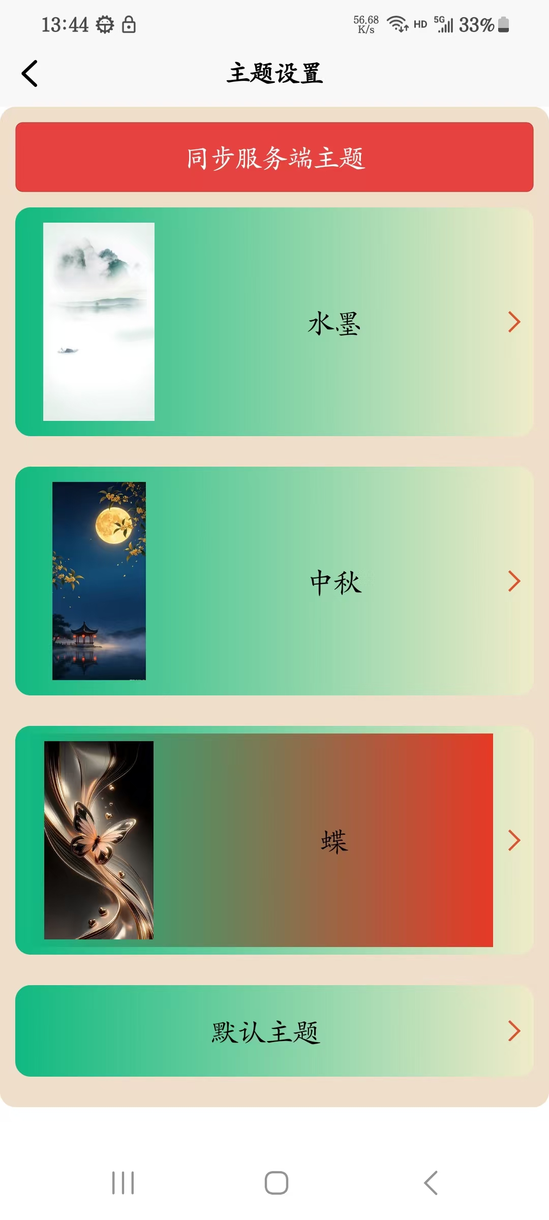
该示例包含 主题切换、同步服务端主题 主题列表 等从服务端获取数据,并将 主题切换数据、获得的主题列表数据同步到插件内 持久化保存 setCustomCurrentThemeInfo:切题切换(只传id及themeName)、设置主题列表(支传themes),返回当前主题信息及主题列表 getCustomCurrentThemeInfo:获取当前主题信息及列表
效果图
<template>
    <scroll-view style="height: 100%;">
        <view class="tabbar-item">
            <view class="zt">
                <button type="warn" @click="synTheme()">同步服务端主题</button>
                <template v-for="(item,index) in cuThemes" :key=index>
                    <ArrowView class="arrow" background="linear-gradient(to right, #10b981, #f0ebc9)"
                        text-font-size="40rpx" text-color="#0c0504" font-weight="bold" arrow-size="10px"
                        arrow-color="#e0532f" arrow-border-width="1.5px">
                        <view class="detail" :class="`${currentThemeId==item.id?'active':''}`" @click="setTheme(item)">
                            <image class="img" v-if="item.bgType=='IMG'" :src="item.bg" mode="aspectFit"
                                @click.stop="previewImg(item.bg)"></image>
                            <text class="txt">{{item.themeName??`主题${index}`}}</text>
                        </view>
                    </ArrowView>
                </template>
            </view>
        </view>

    </scroll-view>

</template>

<script setup>
    import ArrowView from "@/uni_modules/sunrains-arrow-view/components/sunrains-arrow-view/sunrains-arrow-view.uvue"
    import {
        TabItemType, CustomThemeType, TabbarIconType, TabbarStyleType, NavBarConfigType,
        setTabBadge, setTabbarColorHeight, refreshTabbar, setTabPageTheme, closeTabPop, clearStorage, RefreshTabbarType, setCustomCurrentThemeInfo,
        getCustomCurrentThemeInfo, CustomCurrentThemeType
    } from '@/uni_modules/sunrains-tabbar-pro/utssdk/outtypes'
    import { minioOutUrl } from "@/baseconf.uts"
    import { getThemeList } from "@/api/themeApi.uts"
    const currentThemeId = ref(0);

    function previewImg(imageUrl : string) {
        uni.previewImage({
            urls: [imageUrl],
            current: imageUrl
        })
    }
    const cuThemes = ref<Array<CustomThemeType>>([])

    async function synTheme() {

        let themes = new Array<CustomThemeType>()
        let res = await getThemeList();
        res.forEach(t => {
            let tabbarIcons : Map<string, TabbarIconType> = new Map();
            let tabbarStyle : TabbarStyleType = {
                tabbarHeight: t.tabbarHeight,
                bgColor: t.bgColor,
                tabbarIcons: tabbarIcons
            }
            let details = t.details;
            details.forEach(d => {
                let detail : TabbarIconType = {
                    key: d.tabbarKey,
                    icon: d.icon ? `${minioDomain.value + d.icon}` : '',
                    activeIcon: d.activeFontColor ? `${minioDomain.value + d.activeIcon}` : '',
                    eventIcon: d.eventIcon ? `${minioDomain.value + d.eventIcon}` : '',
                    iconW: d.iconW,
                    iconH: d.iconH,
                    fontSize: d.fontSize,
                    fontColor: d.fontColor,
                    activeFontColor: d.activeFontColor,
                    fontWeight: d.fontWeight ?? 'bold'
                }
                tabbarIcons.set(d.tabbarKey, detail)
            })
            let navBarConfig : NavBarConfigType = {
                showTitle: t.showTitle,
                titleFontSize: t.titleFontSize,
                titleFontWeight: t.titleFontWeight,
                titleColor: t.titleColor,
                navBarBackgroundColor: t.navBarBackgroundColor ?? '',
                navBarBackgroundImage: t.navBarBackgroundImage ? `${minioDomain.value + t.navBarBackgroundImage}` : '',
                navBarHeight: t.navBarHeight

            }
            let bgType = t.bgType
            let bg = t.bg
            if (("IMG" == bgType) && (bg != null && bg.length > 4)) {
                bg = `${minioDomain.value + bg}`
            }

            let theme : CustomThemeType = {
                bgType: bgType,
                bg: bg ?? '',
                navBarConfig: navBarConfig,
                tabbarStyle: tabbarStyle,
                preview: t.preview == null || t.preview.length == 0 ? (bgType == 'IMG' ? t.bg : '') : t.preview,
                themeName: t.name,
                id: t.id
            }
            themes.push(theme)
        })
        let current = setCustomCurrentThemeInfo({ id: null, themeName: null, themes })
        cuThemes.value = current.themes!
        currentThemeId.value = current.id!
    }

    onLoad(() => {
        let current = getCustomCurrentThemeInfo()
        cuThemes.value = current.themes!
        currentThemeId.value = current.id!
    })

    function setTheme(theme : CustomThemeType) {
        setTabPageTheme(theme)
        currentThemeId.value = theme.id!
    }
</script>

<style scoped lang="scss">
    .tabbar-item {
        background: rgba(235, 215, 189, 0.8);
        margin-bottom: 10px;
        border-radius: 10px;
        padding: 5px;

        .zt {
            margin: 5px;

            .arrow {
                border-radius: 10px;
                margin-top: 10px;
                margin-bottom: 10px;

                .detail {
                    width: 100%;
                    min-height: 50px;
                    max-height: 160px;
                    margin-left: 5px;
                    display: flex;
                    flex-direction: row;
                    align-items: center;

                    .img {
                        margin: 5px;
                        flex: initial;
                        width: 80px;
                        max-height: 130px;
                    }

                    .txt {
                        margin: auto;
                        font-size: 40rpx;
                    }
                }

                .active {
                    background: linear-gradient(to right, #10b981, #e93724);
                }
            }

        }
    }
</style>
13. 增加tab菜单,所有tabbar由服务端动态配置
从服务端获取菜单并刷新底部tabbar
<template>
    <view class="content">
        <scroll-view direction="vertical" class="mine-page" show-scrollbar="false">
            <view class="page-title">
                <text style="color:black;font-size: 26px;font-weight: bold;">动态设置中心</text>
            </view>
            <view class="tabbar">
                <navigator class="tabbar-item" url="/pages/setTheme/index">
                    <ArrowView label="主题设置" height="100%" background="#e1b459" text-font-size="40rpx"
                        text-color="#0c0504" font-weight="bold" arrow-size="18rpx" arrow-color="#e0532f"
                        arrow-border-width="1.5px" />
                </navigator>
                <navigator class="tabbar-item" url="/pages/sunrainsplugin/sunrainsplugin">
                    <ArrowView label="本应用所使用的suanrains-*类插件" height="100%" background="#e1b459" text-font-size="40rpx"
                        text-color="#0c0504" font-weight="bold" arrow-size="18rpx" arrow-color="#e0532f"
                        arrow-border-width="1.5px" />
                </navigator>

                <view class="tabbar-item">
                    <ArrowView height="100%" background="#e1b459" text-font-size="40rpx" text-color="#0c0504"
                        font-weight="bold" arrow-size="10px" arrow-color="#e0532f" arrow-border-width="1.5px">
                        <view style="
                                margin-left:0;
                                display:flex;
                                flex-direction: row;
                                align-items: center;
                                justify-content:flex-start;">
                            <image style="height: 48rpx; width: 48rpx;" mode="aspectFit"
                                :src="`${minioDomain}/sunrainsicon/logo/logo.png`"></image>
                            <uni-link style="margin-left: 15rpx;flex:auto;font-size: 40rpx;font-weight: bold;color: #ea4225;
                                    text-decoration-line: none;" blankFallback="copy-link-modal"
                                href="https://ha.sunrains.top/#/mineapp" target="_blank">访问官网</uni-link>
                        </view>

                    </ArrowView>
                </view>

                <view class="tabbar-item">
                    <text class="item-text">模拟登录成功后</text>

                    <view>
                        <button type="primary" @click="synServerBaseTabItems">真实同步服务端菜单</button>
                    </view>
                </view>
                <view class="tabbar-item">
                    <text class="item-text">设置角标</text>
                    <input class="input-item" v-model="tabbar" placeholder="请输入需要设置角标的tabbar key" />
                    <input class="input-item" v-model="badge" placeholder="请输入角标" />
                    <button class="tabbar-btn" @click="setBadge">确定</button>
                </view>
                <view class="tabbar-item">
                    <text selectable=true class="item-text">{{message}}</text>
                </view>
                <view class="tabbar-item">
                    <view class="lx">
                        <text class="item-text" selectable="true">微信小程序端</text>
                        <image class="img" :src="`${minioDomain}/sunrainsicon/qrcode/wx.jpg`" mode="aspectFit"
                            @click.stop="previewImage(`${minioDomain}/sunrainsicon/qrcode/wx.jpg`)" />
                    </view>
                </view>
            </view>
        </scroll-view>
    </view>
</template>

<script setup lang="uts">
    import { ref, onMounted, onUnmounted } from 'vue'
    import { loginOut } from '@/tabbar-config.uts'
    import {
        TabItemType, CustomThemeType, TabbarIconType, TabbarStyleType, NavBarConfigType,
        setTabBadge, setTabbarColorHeight, refreshTabbar, setTabPageTheme, closeTabPop, clearStorage, RefreshTabbarType,
        getDefTabInfo,setAppMenu,getBaseIndexKey,AppMenuType,getBaseMenu
    } from '@/uni_modules/sunrains-tabbar-pro/utssdk/outtypes'
    import { getMineHeaderDesc } from "./handleService.uts"
    import { getMinioOutUrl } from "@/utils/MinoUtil.uts"
    import { minioOutUrl } from "@/baseconf.uts"

    import ArrowView from "@/uni_modules/sunrains-arrow-view/components/sunrains-arrow-view/sunrains-arrow-view.uvue"
    import { getAllAppMenu } from "@/api/tabbarMenuApi.uts"
    import TabDirComponent from "@/uni_modules/sunrains-tabbar-pro/components/tabDirComponent.uvue"

    const cuThemes = ref<Array<CustomThemeType>>([])

    const message = ref("")
    async function init() {
        message.value = await getMineHeaderDesc()
    }

    /**
     * 同步服务端菜单
     */
    function synServerBaseTabItems() {
        let defTab : TabItemType = getDefTabInfo()
        getAllAppMenu().then((res : AppMenuType | null) => {
            if(res==null){
                return
            }
            setAppMenu(res)

            let items = getBaseMenu()
            if (items.length == 0) {
                return
            }
            let indexKey = getBaseIndexKey()
            let its : TabItemType[] = []
            items.forEach(t => {
                let tabTypes : TabItemType = {
                    id:t.id,
                    parentId:t.parentId,
                    key: t.tabbarKey!,
                    path: t.path ?? '',
                    fontSize: t.fontSize ?? defTab.fontSize,
                    fontColor: t.fontColor ?? defTab.fontColor,
                    activeFontColor: t.activeFontColor ?? defTab.activeFontColor,
                    fontWeight: t.fontWeight ?? defTab.fontWeight,
                    name: t.name,
                    icon: "",
                    activeIcon: "",
                    eventIcon: "",
                    iconW: 0,
                    iconH: 0,
                    tabType: t.tabType!,
                    remount: t.remount == 1,
                    enableEvent: t.enableEvent == 1
                }
                its.push(tabTypes)
            })
            /**
             * 刷新底部tabbar
             */
            refreshTabbar({
                    tabItems: its,
                    type: "refreshBase",
                    indexKey: "mine"
                })

        })
    }

    onMounted(() => {
        init()
        // synServerBaseTabItems()
        console.log('【组件挂载====mine===】')
    })

    onUnmounted(() => {
        console.log('【组件销毁====mine===】')
    })

    const bgColor = ref<string>('pink')
    const tabHeight = ref<string>('240')
    const badge = ref<string>('0')

    // tab 选项配置
    const tabbar = ref<string>("")
    const selectedTab = ref<string>('mine')
    const selectedTabIndex = ref<number>(0)

    function setBadge() {
        //动态设置指定tabbar 角标
        const badgeNum = parseInt(badge.value)
        if (isNaN(badgeNum)) {
            uni.showToast({
                title: '请输入有效数字',
                icon: 'none'
            })
            return
        }
        setTabBadge(tabbar.value, badgeNum)
        uni.showToast({
            title: `已设置 ${tabbar.value} 角标为 ${badgeNum}`,
            icon: 'success'
        })
    }

    function previewImage(url : string) {
        if (url.length == 0) {
            return
        }

        uni.previewImage({
            urls: [url],
            current: url
        })
    }
</script>

<style scoped lang="scss">
    .content {
        width: 100%;
        height: 100%;
    }

    .mine-page {
        height: 99.5%;
        // border: 1px solid red;
        // background: rgba(489, 235, 481, 0.5);
        border-radius: 5px;
        padding: 5px 5px 0 5px;
        margin: 1px;
    }

    .page-title {
        margin-bottom: 15px;
        display: flex;
        align-items: center;
        justify-content: center;
        width: 100%;
        height: 50px;
        background: rgba(235, 215, 189, 0.8);
        border-radius: 10px;
    }

    .tabbar {
        width: 100%;
        display: flex;
        flex-direction: column;

        .tabbar-item {
            background: rgba(235, 215, 189, 0.8);
            margin: 10px 0;
            border-radius: 10px;

            .cjs {
                background: rgba(228, 232, 151, 1.0);
                box-shadow: 2px 2px 2px 1px grey;
                border-radius: 5px;
                margin: 5px;

                .text {
                    font-size: 15px;
                    margin: 5px;
                }
            }

            .tabbar-btn {
                background: rgba(228, 232, 151, 0);
                font-size: 16px;
            }

            .zt {

                display: flex;
                flex-direction: row;
                flex-wrap: wrap;

                .tabbar-btn1 {
                    width: 50%;

                    margin: 10px auto;
                    border-radius: 8px;
                    background: #e3e88c;
                    border: 2px solid #2b260f;
                    padding: 16px;
                    font-size: 16px;
                }
            }

            .lx {

                margin: 5px;

                .img {
                    margin: 10px auto;
                    height: 200px;
                    width: 200px;
                }
            }

            .tabbar-btn:last-child {
                margin-bottom: 0;
            }

            .item-text {
                font-size: 20px;
                margin: 10px auto;

            }

            .input-item {
                height: 45px;
                border: 1px solid #ccc;
                border-radius: 6px;
                padding-left: 10px;
                background: #fff;
                margin: 10px;
                padding-left: 20px;
            }
        }
    }

    .tabbar-item>.refresh {
        margin-top: 0;
    }

    .refresh {
        margin: 10px 0;
        min-height: 180rpx;
    }
</style>
切换到对应tab页,(使用TabDirComponent组件)渲染该tab页中的子菜单
<template>
    <view style="height: 100%;">
        <view class="box">
            <text class="txt">AAAAA</text>
        </view>
        <view class="order-item">
            <TabDirComponent></TabDirComponent>
        </view>
        <view class="order-item">
            <button @click="back('backBase')" type="warn">
                返回首页
            </button>
        </view>
        <view class="order-item">
            <button @click="back('back')" type="warn">
                返回上一层
            </button>
        </view>
    </view>
</template>

<script setup>
    import { goBack} from '@/uni_modules/sunrains-tabbar-pro/utssdk/outtypes'
    //TabDirComponent组件,渲染子菜单
    import TabDirComponent from "@/uni_modules/sunrains-tabbar-pro/components/tabDirComponent.uvue"
    function back(type : string) {
        goBack(type)
    }

    onMounted(() => {
        console.log('【组件挂载===a====】')
    })

    onUnmounted(() => {
        console.log('【组件销毁====a===】')
    })
</script>

<style>

</style>
服务端地址及mysql移动端菜单表结构
CREATE TABLE `sunrains_app_menu` (
  `id` bigint NOT NULL AUTO_INCREMENT COMMENT 'ID',
  `key_id` bigint DEFAULT NULL COMMENT 'tabbar标识',
  `parent_id` bigint DEFAULT '0' COMMENT '父tabbar id',
  `name` varchar(32) DEFAULT NULL COMMENT 'tabbar名称',
  `icon` varchar(127) DEFAULT NULL COMMENT '图标地址',
  `active_icon` varchar(127) DEFAULT NULL COMMENT '选中图标地址',
  `event_icon` varchar(127) DEFAULT NULL COMMENT '事件图标地址',
  `font_color` varchar(32) DEFAULT NULL COMMENT '字体颜色',
  `active_font_color` varchar(32) DEFAULT NULL COMMENT '选中字体颜色',
  `font_weight` varchar(8) DEFAULT NULL COMMENT '字体粗细',
  `icon_w` int DEFAULT NULL COMMENT '图标宽度(单位rpx)',
  `icon_h` int DEFAULT NULL COMMENT '图标高度(单位rpx)',
  `font_size` int DEFAULT NULL COMMENT '字体大小(单位rpx)',
  `tab_type` varchar(8) DEFAULT NULL COMMENT 'tab类型 tabPage:tab页面  tabPop:弹窗组件  page:普通页面',
  `path` varchar(128) DEFAULT NULL COMMENT '当tab_type为page时必填',
  `remount` int DEFAULT '0' COMMENT 'tab_type为tab时是否每次打开都重新挂载',
  `enable_event` int DEFAULT '0' COMMENT '开启tabbar点击事件',
  `index_key` varchar(32) DEFAULT NULL COMMENT '下一层tabbar 首页key',
  `perms` varchar(100) DEFAULT NULL COMMENT '权限标识',
  `dname` varchar(32) DEFAULT NULL COMMENT '目录名',
  `dicon` varchar(255) DEFAULT NULL COMMENT '目录图标',
  `dicon_w` int DEFAULT NULL COMMENT '目录图标宽度',
  `dicon_h` int DEFAULT NULL COMMENT '目录图标高度',
  `dfont_color` varchar(32) DEFAULT NULL COMMENT '目录字体颜色',
  `dfont_size` int DEFAULT NULL COMMENT '目录字体大小',
  `dfont_weight` varchar(32) DEFAULT NULL COMMENT '目录字体粗细',
  `menu_type` char(8) CHARACTER DEFAULT '' COMMENT '目录菜单类型(D:tabbar页面中的目录(改节点可挂载下一层tabbar) P:tabbar页面页面目录中的page页(该节点下不能挂载下一层tabbar,只能挂载page页) R:根节点)',
  `flag` varchar(8) DEFAULT NULL COMMENT '该层层级标识:tabbar:底部tabbar   dir:tab页中目录(menu_type为D时目录下挂载,(tab_type为tabPage时)底部tabbar,底部tabbar挂载tab页目录)',
  `sort` int DEFAULT '0' COMMENT '显示顺序',
  `type` varchar(32) DEFAULT 'toNext' COMMENT 'refreshBase 基层刷新tabbar toNext 进入下一层级tabbar',
  `remark` varchar(255) DEFAULT NULL COMMENT '备注',
  `create_by` varchar(32) DEFAULT NULL COMMENT '创建人',
  `create_time` datetime DEFAULT CURRENT_TIMESTAMP COMMENT '创建时间',
  `update_by` varchar(32) DEFAULT NULL COMMENT '修改人',
  `update_time` datetime DEFAULT NULL ON UPDATE CURRENT_TIMESTAMP COMMENT '修改时间',
  PRIMARY KEY (`id`)
) ENGINE=InnoDB AUTO_INCREMENT=75 DEFAULT CHARSET=utf8mb4 COLLATE=utf8mb4_0900_ai_ci COMMENT='移动端tabbar菜单表';
14. tabbar类型为tabPage时(既切换页面时,非弹出、进入页面),触发点击事件,可用于刷新页面数据
注: tab页 中监听事件,事件标识为 EMIT_TABBAR_SWITCH + 该tab页 key
    import {EMIT_TABBAR_SWITCH} from '@/uni_modules/sunrains-tabbar-pro/utssdk/outtypes'
    onMounted(() => {
    uni.$off(`${EMIT_TABBAR_SWITCH}-mine`)
    uni.$on(`${EMIT_TABBAR_SWITCH}-mine`, init)
    console.log('【组件挂载====mine===】')
})
⚠️ 常见问题
Q1: 为什么小程序端需要单独配置?
A: 微信小程序不支持动态组件渲染,必须静态声明所有可能使用的组件。
Q2: 动态 Tab 刷新失败怎么办?
A: 检查以下几点:
- 组件是否在 App.uvue初始化逻辑 中正确注册
- 是否正确使用了
getComponentRegistryByKey.get("key")获取组件 - TabItemType 的参数是否完整且类型正确
Q3: 如何设置数字角标?
A: 使用 setTabBadge(key, badgeNum) 即可,详见第 4 章。
Q4: 角标设置后不显示怎么办?
A: 检查以下几点:
- badge 值是否大于 0(0 或负数不显示)
- tab key 是否正确(必须与 TabItemtype 的 key 一致)
- 是否重新赋值了整个数组(直接修改对象属性不会触发响应式)
Q5: 退出登录如何清除 tabbar相关缓存
A: 调用 clearStorage 方法
import {clearStorage} from '@/uni_modules/sunrains-tabbar-pro/utssdk/outtypes'/**
* 清除tabbar相关缓存
* all 所有
* theme 主题
* tabbarItems 所有tabbar
* badge 角标
*/
/**
* 清除tabbar相关缓存
* all 所有
* theme 主题
* tabbarItems 所有tabbar
* badge 角标
*/
export function clearStorage(type:string){
switch (type){
case "theme":
uni.removeStorageSync(STORE_CUSTOM_THEME)
break;
case "tabbarItems":
uni.removeStorageSync(STORE_LOGIN_TABBAR_ITEMS)
break;
case "badge":
uni.removeStorageSync(STORE_TABBAR_BADGES)
break;
default:
uni.removeStorageSync(STORE_CUSTOM_THEME)
uni.removeStorageSync(STORE_LOGIN_TABBAR_ITEMS)
uni.removeStorageSync(STORE_TABBAR_BADGES)
uni.removeStorageSync(STORE_BASE_INDEX_KEY)
}
}


 下载 57
下载 57
 赞赏 0
赞赏 0


 下载 12638599
 赞赏 1950





























 赞赏
赞赏

 京公网安备:11010802035340号