


 收藏人数:
收藏人数:
 下载插件并导入HBuilderX
 赞赏(0)
赞赏(0)
更新记录
1.1.1(2026-10-13) 下载此版本
更新文档
1.1.0(2026-09-25) 下载此版本
添加点击事件
1.0.8(2026-09-23) 下载此版本
css样式修改,不在嵌套
查看更多平台兼容性
uni-app(4.75)
| Vue2 | Vue3 | Chrome | Safari | app-vue | app-nvue | Android | iOS | 鸿蒙 |
|---|---|---|---|---|---|---|---|---|
| - | √ | √ | √ | √ | - | √ | √ | √ |
| 微信小程序 | 支付宝小程序 | 抖音小程序 | 百度小程序 | 快手小程序 | 京东小程序 | 鸿蒙元服务 | QQ小程序 | 飞书小程序 | 小红书小程序 | 快应用-华为 | 快应用-联盟 |
|---|---|---|---|---|---|---|---|---|---|---|---|
| √ | - | - | - | - | - | - | - | - | - | - | - |
uni-app x(4.75)
| Chrome | Safari | Android | iOS | 鸿蒙 | 微信小程序 |
|---|---|---|---|---|---|
| √ | √ | √ | √ | √ | √ |
sunrains-arrow-view
在使用插件过程中遇到问题 请进群交流
服务端配套支持 1:网络请求解密,验签,返回结果加密;2:身份证ocr识别 3:人脸注册,识别,人证比对 4:活体检测 5:人脸核身 6:车牌号识别
注:活体检测、人脸核身 页面用到camera组件,camera组件官方只支持 小程序、ios、安卓端,其它平台可自己录制视频,直接调用插件中api(全平台支持)
开发文档
参数说明
| 参数 | 类型 | 默认值 | 说明 |
|---|---|---|---|
| label | string |
'' |
展示的文本内容 |
| background | string |
'' |
组件容器背景色,支持色值、渐变 |
| width | string |
100% |
组件容器宽度,支持 px / rpx / 百分比 |
| height | string |
100rpx |
组件容器高度,支持 px / rpx / 百分比 |
| text‑font‑size | string |
28rpx |
文字大小 |
| font‑weight | string |
'' |
文字字重,如 bold / 400 / 600 |
| text‑color | string |
#333333 |
文字颜色 |
| arrow‑size | string |
8px |
箭头整体宽高,控制箭头大小 |
| arrow‑color | string |
#999999 |
箭头颜色 |
| arrow‑border‑width | string |
1px |
箭头边框线条粗细 |
<template>
    <view class="content" :style="contentStyle">
        <text class="item-text" :style="textStyle">{{ label }}</text>
        <view class="slot-box">
            <slot></slot>
        </view>
        <view class="right_arrow" :style="arrowStyle"></view>

    </view>
</template>
uniappx 使用示例
<template>
    <view class="content">
        <scroll-view direction="vertical" class="mine-page" show-scrollbar="false">
            <view class="tabbar">
                <navigator class="tabbar-item" url="/pages/setTheme/index">
                    <ArrowView label="去设置主题" height="100%" background="#e1b459" text-font-size="40rpx"
                        text-color="#0c0504" font-weight="bold" arrow-size="10px" arrow-color="#e0532f"
                        arrow-border-width="1.5px" />
                </navigator>
            </view>
            <view class="tabbar">
                <view class="tabbar-item">
                    <ArrowView background="#e1b459" text-font-size="40rpx" text-color="#0c0504" font-weight="bold"
                        arrow-size="10px" arrow-color="#e0532f" arrow-border-width="1.5px">
                        <template #default>
                            <navigator style="width:100%;padding-left:5px;margin-right: 10px;" url="/pages/sunrainsplugin/sunrainsplugin">
                                <text style="font-size: 25px;color: blue;">sunrains*插件</text>
                            </navigator>
                        </template>
                    </ArrowView>
                </view>

            </view>
            <view class="tabbar-item">
                <ArrowView height="100%" background="#e1b459" text-font-size="40rpx" text-color="#0c0504"
                    font-weight="bold" arrow-size="10px" arrow-color="#e0532f" arrow-border-width="1.5px">
                    <view style="
                            margin-left:0;
                            display:flex;
                            flex-direction: row;
                            align-items: center;
                            justify-content:flex-start;">
                        <image style="height: 48rpx; width: 48rpx;" mode="aspectFit"
                            src="https://ha.sunrains.top/app/sunrainsapifile/sunrainsicon/logo/logo.png"></image>
                        <uni-link style="margin-left: 15rpx;flex:auto;font-size: 36rpx;font-weight: bold;color: #ea4225;
                                text-decoration-line: none;" blankFallback="copy-link-modal"
                            href="https://ha.sunrains.top/#/mineapp" target="_blank">访问官网</uni-link>
                    </view>
                </ArrowView>
            </view>
        </scroll-view>
    </view>
</template>

<script setup lang="uts">
    import ArrowView from "@/uni_modules/sunrains-arrow-view/components/sunrains-arrow-view/sunrains-arrow-view.uvue"

</script>

<style scoped lang="scss">
    .content {
        width: 100%;
        height: 100%;
    }

    .mine-page {
        height: 99.5%;
        border-radius: 5px;
        padding: 5px 5px 0 5px;
        margin: 1px;
    }

    .tabbar {
        width: 100%;
        display: flex;
        flex-direction: column;

        .tabbar-item {
            background: rgba(235, 215, 189, 0.8);
            margin: 10px 0;
            border-radius: 10px;
        }
    }
</style>
应用到主题设置实战
<template>
    <scroll-view style="height: 100%;">
        <view class="tabbar-item">
            <view class="zt">
                <button type="warn" @click="synTheme()">同步服务端主题</button>
                <template v-for="(item,index) in cuThemes" :key=index>
                    <ArrowView class="arrow" background="linear-gradient(to right, #10b981, #f0ebc9)"
                        text-font-size="40rpx" text-color="#0c0504" font-weight="bold" arrow-size="10px"
                        arrow-color="#e0532f" arrow-border-width="1.5px">
                        <view class="detail" :class="`${currentThemeId==item.id?'active':''}`" @click="setTheme(item)">
                            <image class="img" v-if="item.bgType=='IMG'" :src="item.bg" mode="aspectFit"
                                @click.stop="previewImg(item.bg)"></image>
                            <text class="txt">{{item.themeName??`主题${index}`}}</text>
                        </view>
                    </ArrowView>
                </template>
            </view>
        </view>

    </scroll-view>

</template>

<script setup>
    import ArrowView from "@/uni_modules/sunrains-arrow-view/components/sunrains-arrow-view/sunrains-arrow-view.uvue"
    import {
        TabItemType, CustomThemeType, TabbarIconType, TabbarStyleType, NavBarConfigType,
        setTabBadge, setTabbarColorHeight, refreshTabbar, setTabPageTheme, closeTabPop, clearStorage, RefreshTabbarType, setCustomCurrentThemeInfo,
        getCustomCurrentThemeInfo, CustomCurrentThemeType
    } from '@/uni_modules/sunrains-tabbar-pro/utssdk/outtypes'
    import { minioOutUrl } from "@/baseconf.uts"
    import { getThemeList } from "@/api/themeApi.uts"
    const currentThemeId = ref(0);

    function previewImg(imageUrl : string) {
        uni.previewImage({
            urls: [imageUrl],
            current: imageUrl
        })
    }
    const cuThemes = ref<Array<CustomThemeType>>([])

    async function synTheme() {

        let themes = new Array<CustomThemeType>()
        let res = await getThemeList();
        res.forEach(t => {
            let tabbarIcons : Map<string, TabbarIconType> = new Map();
            let tabbarStyle : TabbarStyleType = {
                tabbarHeight: t.tabbarHeight,
                bgColor: t.bgColor,
                tabbarIcons: tabbarIcons
            }
            let details = t.details;
            details.forEach(d => {
                let detail : TabbarIconType = {
                    key: d.tabbarKey,
                    icon: d.icon ? `${minioDomain.value + d.icon}` : '',
                    activeIcon: d.activeFontColor ? `${minioDomain.value + d.activeIcon}` : '',
                    eventIcon: d.eventIcon ? `${minioDomain.value + d.eventIcon}` : '',
                    iconW: d.iconW,
                    iconH: d.iconH,
                    fontSize: d.fontSize,
                    fontColor: d.fontColor,
                    activeFontColor: d.activeFontColor,
                    fontWeight: d.fontWeight ?? 'bold'
                }
                tabbarIcons.set(d.tabbarKey, detail)
            })
            let navBarConfig : NavBarConfigType = {
                showTitle: t.showTitle,
                titleFontSize: t.titleFontSize,
                titleFontWeight: t.titleFontWeight,
                titleColor: t.titleColor,
                navBarBackgroundColor: t.navBarBackgroundColor ?? '',
                navBarBackgroundImage: t.navBarBackgroundImage ? `${minioDomain.value + t.navBarBackgroundImage}` : '',
                navBarHeight: t.navBarHeight

            }
            let bgType = t.bgType
            let bg = t.bg
            if (("IMG" == bgType) && (bg != null && bg.length > 4)) {
                bg = `${minioDomain.value + bg}`
            }

            let theme : CustomThemeType = {
                bgType: bgType,
                bg: bg ?? '',
                navBarConfig: navBarConfig,
                tabbarStyle: tabbarStyle,
                preview: t.preview == null || t.preview.length == 0 ? (bgType == 'IMG' ? t.bg : '') : t.preview,
                themeName: t.name,
                id: t.id
            }
            themes.push(theme)
        })
        let current = setCustomCurrentThemeInfo({ id: null, themeName: null, themes })
        cuThemes.value = current.themes!
        currentThemeId.value = current.id!
    }

    onLoad(() => {
        let current = getCustomCurrentThemeInfo()
        cuThemes.value = current.themes!
        currentThemeId.value = current.id!
    })

    function setTheme(theme : CustomThemeType) {
        setTabPageTheme(theme)
        currentThemeId.value = theme.id!
    }
</script>

<style scoped lang="scss">
    .tabbar-item {
        background: rgba(235, 215, 189, 0.8);
        margin-bottom: 10px;
        border-radius: 10px;
        padding: 5px;

        .zt {
            margin: 5px;

            .arrow {
                border-radius: 10px;
                margin-top: 10px;
                margin-bottom: 10px;

                .detail {
                    width: 100%;
                    min-height: 50px;
                    max-height: 160px;
                    margin-left: 5px;
                    display: flex;
                    flex-direction: row;
                    align-items: center;

                    .img {
                        margin: 5px;
                        flex: initial;
                        width: 80px;
                        max-height: 130px;
                    }

                    .txt {
                        margin: auto;
                        font-size: 40rpx;
                    }
                }

                .active {
                    background: linear-gradient(to right, #10b981, #e93724);
                }
            }

        }
    }
</style>
uniapp 使用示例
<template>
    <view class="content">
        <scroll-view direction="vertical" class="mine-page" show-scrollbar="false">
            <navigator class="menu-item" url="/pages/setTheme/index">
                <ArrowView
                    label="去设置主题"
                    width="100%"
                    background="#e1b459"
                    text-font-size="40rpx"
                    text-color="#0c0504"
                    font-weight="bold"
                    arrow-size="10px"
                    arrow-color="#e0532f"
                    arrow-border-width="1.5px"
                />
            </navigator>

            <view class="menu-item">
                <ArrowView
                    background="#e1b459"
                    text-font-size="40rpx"
                    text-color="#0c0504"
                    font-weight="bold"
                    arrow-size="10px"
                    arrow-color="#0c0a23"
                    arrow-border-width="1.5px">
                    <template #default>
                        <navigator style="width:100%;margin-right: 10px;"
                            url="/pages/sunrainsplugin/sunrainsplugin">
                            <text style="font-size: 25px;color: blue;">uniappx 之 sunrains-* 插件uniappx 之 sunrains-* 插件sunrains*插件uniappx 之 sunrains-* 插件uniappx 之 sunrains-* 插件</text>
                        </navigator>
                    </template>
                </ArrowView>
            </view>

            <view class="menu-item">
                <ArrowView
                    width="100%"
                    background="#e1b459"
                    text-font-size="40rpx"
                    text-color="#0c0504"
                    font-weight="bold"
                    arrow-size="10px"
                    arrow-color="#e0532f"
                    arrow-border-width="1.5px">
                    <template #default>
                        <uni-link style="width:100%;padding-left:5px;margin-right: 10px;font-size: 20px;color: red;"
                            blankFallback="copy-link-modal" href="https://ha.sunrains.top/#/mineapp"
                            target="_blank">访问官网
                        </uni-link>
                    </template>
                </ArrowView>
            </view>
        </scroll-view>
    </view>
</template>

<script setup lang="ts">
    import ArrowView from "@/uni_modules/sunrains-arrow-view/components/sunrains-arrow-view/sunrains-arrow-view.vue"
</script>

<style scoped lang="scss">
.content {
    width: 100%;
    padding: 5px;
    box-sizing: border-box;
}

.mine-page {
    border: 1px solid red;
    border-radius: 5px;
    box-sizing: border-box;
}

.menu-item {
    width: 100%;
    margin: 20rpx 0;
    border-radius: 10rpx;
    box-sizing: border-box;
}
</style>
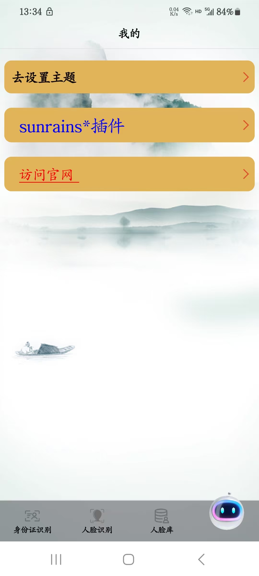
示例效果
支持与赞赏
如果你觉得本插件解决了你的问题,可以考虑支持作者:
| 微信赞助 |
|---|
 |


 下载 60
下载 60
 赞赏 0
赞赏 0


 下载 12678123
 赞赏 1956





























 赞赏
赞赏

 京公网安备:11010802035340号