

 收藏人数:
收藏人数:
 https://github.com/lifei5859/popup.git
 下载插件并导入HBuilderX
 下载示例项目ZIP
 赞赏(0)
赞赏(0)
更新记录
1.0.0(2020-12-06) 下载此版本
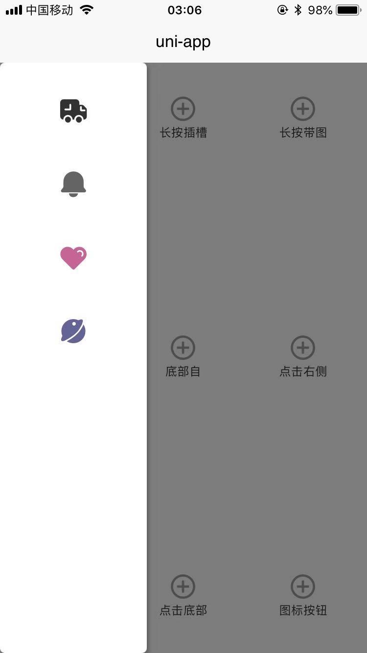
支持nvue,可根据手指位置定位弹层,可从左侧,右侧,底部弹出。
平台兼容性
使用文档
属性
| 属性名 | 说明 | 类型 | 默认值 | 可取值 |
|---|---|---|---|---|
| mask | 是否显示蒙层 | Boolean | true | true/false |
| maskColor | 蒙层颜色 | String | rgba(1, 1, 1, .5) | rgb,rgba, 16进制颜色 |
| type | 弹窗类型 | String | default | left/default/bottom/right |
| contentSize | 弹窗尺寸 | String | 空 | 如'200,300' 前边是宽度后面是高度 |
| contentPosition | 弹窗定位值 | String | 空 | 如'33,66'前面是定位x值后面是y值 |
| maskHide | 点击蒙层是否关闭弹窗 | Boolean | true | true/false |
| shadow | 阴影 | Boolean | true | true/false |
| list | 数据列表 | Array | [] | 下面有详细解释 |
| itemBorder | 列表每项间是否有边框 | Boolean | false | true/false |
事件
| 名称 | 说明 | 返回类型 |
|---|---|---|
| @tapListItem | 传入list时点击每一项的事件 | list的单项数据 |
- list格式为
[{icon: '\ue123',id: 0,text: '选项一哎呦不'}] - itemBorder只有在传入list时才有效
list格式
| 属性名 | 说明 | 类型 | 默认值 | 可取值 |
|---|---|---|---|---|
| icon | 图标 | String | 空 | 后期可自行改动iconfont库,目前有下面这些其实不太实用 |
| maskColor | 列表每项显示文字 | String | 空 | |
| id | key | Number/String | 空 |
- icon在传入时要改成这样的
=>\uedd2目前是因为什么不知道,总之要这么传


使用示例
<icon-btn @handleLong="longTap" title="长按列表" styleText="height: 150rpx; width: 150rpx;"></icon-btn>
<view style="position: fixed;">
            <popup type="default" @tapListItem="tapListItem" contentSize="260,320" :list="list" itemBorder ref="popup"></popup>
</view>
<script>
import iconBtn from '@/components/qdxns_icon/icon_btn.nvue'
import popup from '@/components/qdxns-qdxns-popup/popup.nvue'
export default {
components: {
iconBtn,
popup
},
data() {
return {
list: [{
id: 0,
text: '图标选项1',
icon: '\ue60e',
event: 'ev1',
style: 'color: rgb(50, 50, 50); font-size: 60rpx;'
},
{
id: 1,
text: '图标选项2',
icon: '\uedbc',
event: 'ev2',
style: 'color: rgb(100, 100, 100); font-size: 60rpx;'
},
{
id: 2,
text: '图标选项3',
icon: '\ue6ea',
event: 'ev3',
style: 'color: rgb(200, 100, 150); font-size: 60rpx;'
},
{
id: 3,
text: '图标选项4',
icon: '\ue670',
event: 'ev4',
style: 'color: rgb(100, 100, 150); font-size: 60rpx;'
}
]
}
},
methods: {
longTap(e) {
this.$nextTick(() => {
this.$refs.popup.show(e)
})
},
tapListItem({text,event}) {
this.$refs.popup.hide()
switch (event) {
case 'ev1':
uni.showToast({
title: text
})
break
case 'ev2':
uni.showToast({
icon: 'none',
title: text
})
break
case 'ev3':
uni.showModal({
title: '提示',
content: text,
showCancel: false
})
break
case 'ev4':
uni.showModal({
title: '提示',
content: text
})
break
}
},
}
}
</script>
- 组件通过ref方式调用以组件绑定popup为ref为例
this.$refs.popup.show可是调用组件当长按调用组件时可以根据传入的e 来给组件定位, 注意 点击调用时不要用 e 来定位有些平台会出现问题this.$refs.popup.hide()可以隐藏弹窗


 下载 2767
 赞赏 11
赞赏 11

 下载 12362319
 赞赏 1926


 赞赏
赞赏
 京公网安备:11010802035340号