更新记录
1.0.0(2023-06-22)
1.0.0(2023.06.22)
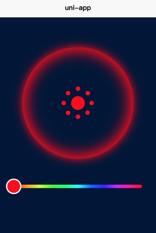
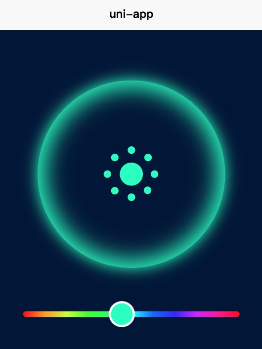
进度条控制颜色色值变化
平台兼容性
| App |
快应用 |
微信小程序 |
支付宝小程序 |
百度小程序 |
字节小程序 |
QQ小程序 |
| app-vue |
× |
× |
× |
× |
× |
× |
| 钉钉小程序 |
快手小程序 |
飞书小程序 |
京东小程序 |
| × |
× |
× |
× |
| H5-Safari |
Android Browser |
微信浏览器(Android) |
QQ浏览器(Android) |
Chrome |
IE |
Edge |
Firefox |
PC-Safari |
| √ |
√ |
√ |
√ |
√ |
√ |
√ |
√ |
√ |
使用示例
<template>
    <view class="wrapper">
        <view class="container">
            <div class="ring-box" :style="{ '--color': color }">
                <div class="ring-icon"></div>
                <div class="ring-icons"></div>
                <div class="back"></div>
            </div>
            <div class="progress-box">
                <!-- 使用组件 -->
                <progress-color
                        @getScore="getScore"
                        @getColor="getColor"
                        :min="0"
                        :max="100"
                ></progress-color>
            </div>
        </view>

    </view>
</template>
<script>
    import progressColor from '@/components/progress-color';
    export default {
        data() {
            return {
                score: 120,
                color: 'hsl(0, 100%, 50%)', // 初始颜色
            };
        },
        components: {
            progressColor
        },
        methods: {
            getScore(s) {
                console.log(s)
                this.score = s;
            },
            getColor(c) {
                console.log(c)
                this.color = c;
            },
        }
    }
</script>

<style lang="scss" scoped>
    .wrapper {
        position: relative;
        width: 100%;
        height: 100vh;
        background-color: #011638;
    }
    .container {
        position: absolute;
        width: 100%;
        display: flex;
        flex-direction: column;
        align-items: center;
        .ring-box {
            position: relative;
            display: flex;
            flex-direction: column;
            justify-content: center;
            width: 100%;
            height: 400px;
            border-radius: 50%;
            margin-bottom: 60px;
        }
        .progress-box {
            position: absolute;
            bottom: 60px;
            width: 80%;
        }
    }
    .ring-icon {
        width: 2rem;
        height: 2rem;
        border-radius: 50%;
        background-color: var(--color);
        position: absolute;
        z-index: 25;
        left: 50%;
        transform: translateX(-50%);
        display: flex;
        justify-content: center;
        align-items: center;
    }
    .ring-icons {
        position: absolute;
        z-index: 25;
        left: 50%;
        transform: translateX(-50%) scale(0.8);
        width: .8rem;
        height: .8rem;
        border-radius: 50%;
        box-shadow: 0rem -2.6rem 0rem 0rem var(--color), 1.8rem -1.8rem 0 0rem var(--color), 2.5rem 0rem 0 0rem var(--color), 1.75rem 1.75rem 0 0rem var(--color),
            0rem 2.5rem 0 0rem var(--color), -1.8rem 1.8rem 0 0rem var(--color), -2.6rem 0rem 0 0rem var(--color), -1.8rem -1.8rem 0 0rem var(--color);
    }
    .back {
        position: absolute;
        left: 50%;
        transform: translateX(-50%);
        z-index: 6;
        width: 260px;
        height: 260px;
        border-radius: 50%;
        box-shadow: 0 0 20px var(--color), inset 0 0 30px 10px var(--color);
    }
</style>


 收藏人数:
收藏人数:
 下载插件并导入HBuilderX
 下载插件ZIP
 赞赏(0)
赞赏(0)
 下载 171
 赞赏 1
赞赏 1

 下载 7756503
 赞赏 916


 赞赏
赞赏
 京公网安备:11010802035340号